News from the Front
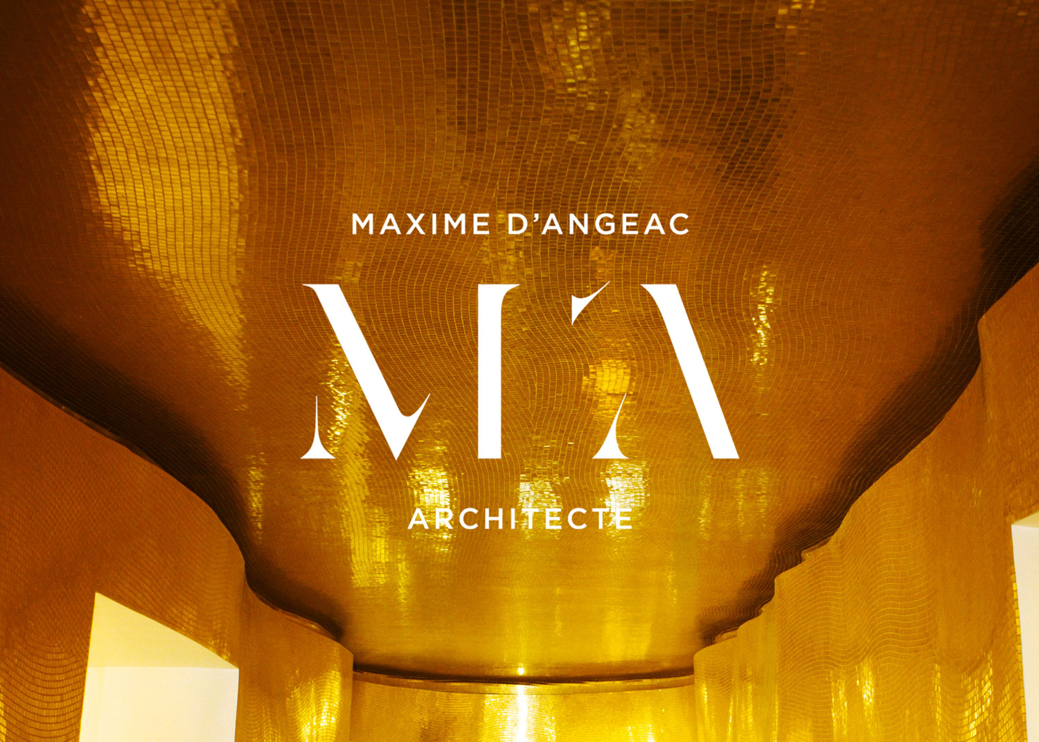
Logo of the architect Maxime d’Angeac
Emma Brante,
Creative director, graphic designer
& founder at Frontline Studio
The French architect Maxime d’Angeac entrusted us with the creation of his visual identity and his entire communication. In this context, Emma Brante, our Artistic Director, conceived the designer’s logo.
I love monograms because I find that typography alone – in the context of a visual communication – is sometimes poor. Of course there are cases where it can work very well, like for Orange Telecom which relies on a color. But I find that a strong emblematic sign fascinates more and marks the minds.
Why did you choose the monogram shape for this logo?
In the context of the graphic identity of the architect Maxime d’Angeac the monogram was perfectly adequate. It has a noble character that comes close to the nature of his work in its aesthetic dimension, his personality, the singular style of his architecture, the luxurious universe of his clients. Finally, the possible play around the particle specific to his name was also a singularity that pushed me to use it and make it a differentiating element.
How did you choose the typography?
I drew the letters from a classic typographic structure and then removed certain parts to give the logo a slender character and a contemporary look. In his architecture, Maxime d’Angeac draws on styles from all eras, but he remains an architect who designs contemporary interiors and houses.
How to deal with particles?
There remained to solve the question of the particle its name which moreover is controversial in France. I decided to reduce the particle to the apostrophe alone, giving it a more interesting look than if we had kept the whole thing with the letter D. In the end, it became the strong point of the logo.