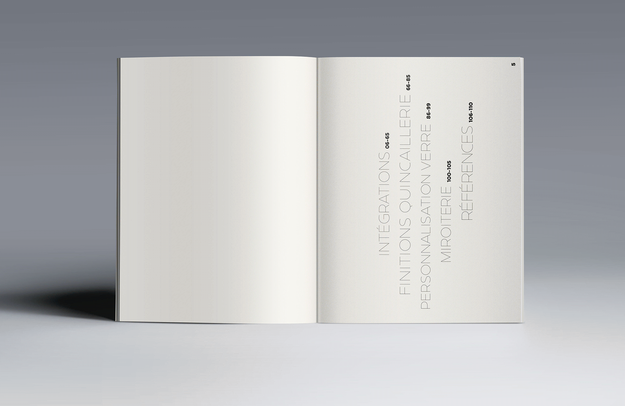
News from the Front
Designing a brochure for Glassdebourg
Glassdebourg commissioned Frontline-Studio to design a reference brochure for architects. We conceived the brochure’s editorial line, the photography and the graphic design.
How did you define the editorial line of the brochure?
As a specialist in high-end hotel projects, Glassdebourg had to seduce its target audience with a coherent brochure that, without falling into the trap of a catalog of projects, would promote its expertise and the quality of its know-how.
After an analysis of the brand’s DNA, we isolated the term “integration” as the key word at the center of our photographic and editorial work. Integration is the real strength of the company – concrete or brick, marble or corian, each material is “domesticated” by the glass arranged by Glassdebourg.
What was your photographic bias in producing the photos?
With the photographer Fabrice Fouillet, my partner in crime, we produced fifteen photo reports in Parisian hotels decorated by renowned interior designers: Dimore Studio, Tristan Auer, François Champsaur, Sarah Lavoine, Ora Ito… With all these settings, the temptation was to photograph the interiors as a whole, but in doing so, would we be highlighting the work of the studio or rather that of the decorator?
Our approach was to focus our attention on the details and rigor of each project. Some of these photos have also given rise to abstract photographs that emphasize the quality of the materials, the know-how of the workshop and the excellence of the execution. The main goal was to enhance the work of Glassdebourg, even if it meant leaving the functionality of the installations.
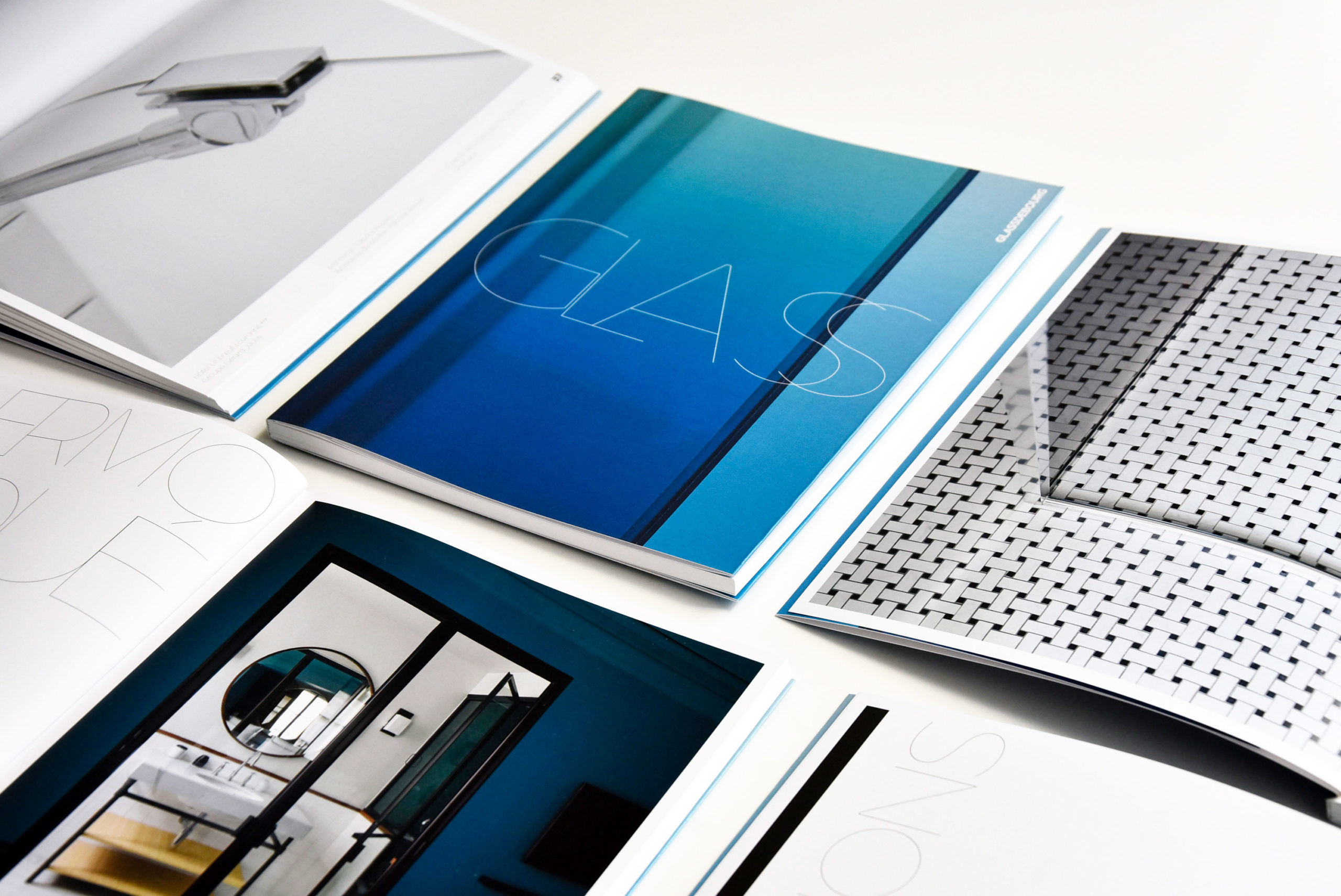
Why did you photograph the hardware store?
Any glass installation is enhanced by the metal: it provides structure, fixing and gives the whole thing a sparkle. In a way, without the metal the glass does not exist. After discussions with the client we decided to do a specific photographic work around the hardware. We approached these massive pieces as if they were photos of jewelry. Playing with reflective backgrounds, we designed each image with a graphic and minimal scenography. A simple hinge or hook was transformed into a piece of art.
Throughout the project we worked closely with photographer Fabrice Fouillet. Thanks to his rich experience in still life photography and his current specialization in architecture, we were able to approach the subject in perfect coherence.
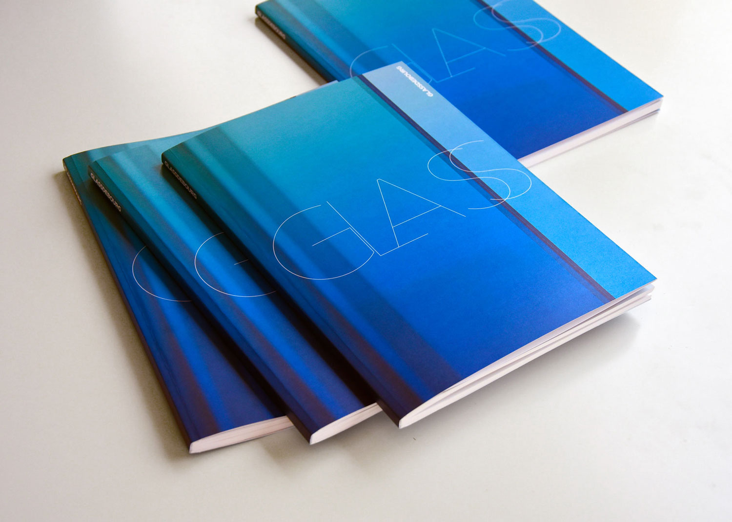
The cover of the brochure is very specific. What was your approach?
For the cover we wanted to convey the feeling of glass – cold and sharp. The iridescent paper on the cover is again reminiscent of the reflection of glass. In the line of this idea, we designed the typography taking up these characteristics of glass. Thin, sharp and designed, it stands out on the blue background of the cover.