Masha Kontchakova & Emma Brante,
Creative directors & founders at Frontline Studio
La Chambre entrusted Emma et Masha with the creation of their global branding. The both worked closely on storytelling, visual identity, web design and photography to position the brand in a competitive e-commerce market.
What was the starting point for this project ?
Alison and Ian came to us with an idea for an e-commerce business that wanted to offer an excellent quality sheets at affordable prices. The original slogan was even considered: “Why should we wait for the sales?
It was our first e-commerce brand and also the first brand that has being created with us. It was very exciting to work from scratch on a concept that is very defined and rooted in French culture. We proposed from the start to change the initial brand name that we found too complicated and came up with a simple name with a very direct connotation, which is La Chambre (room in French). This word had the advantage of being easily remembered and above all opened a very wide field for communication. That was our starting point.
How did your collaboration with Alison Ross and Ian Benton, the founders of the brand, happen?
It was an 8-handed collaboration. I don’t think we’ve ever had so much coffee with a client! We see each other 2-3 times a week. It was intense and creative.
Also, we love working with foreigners as we are of foreign origin ourselves. Alison is American, Ian – British, we like this mix of cultural references.
What were your inspirations at the very beginning of the project and how has it evolved during its development?
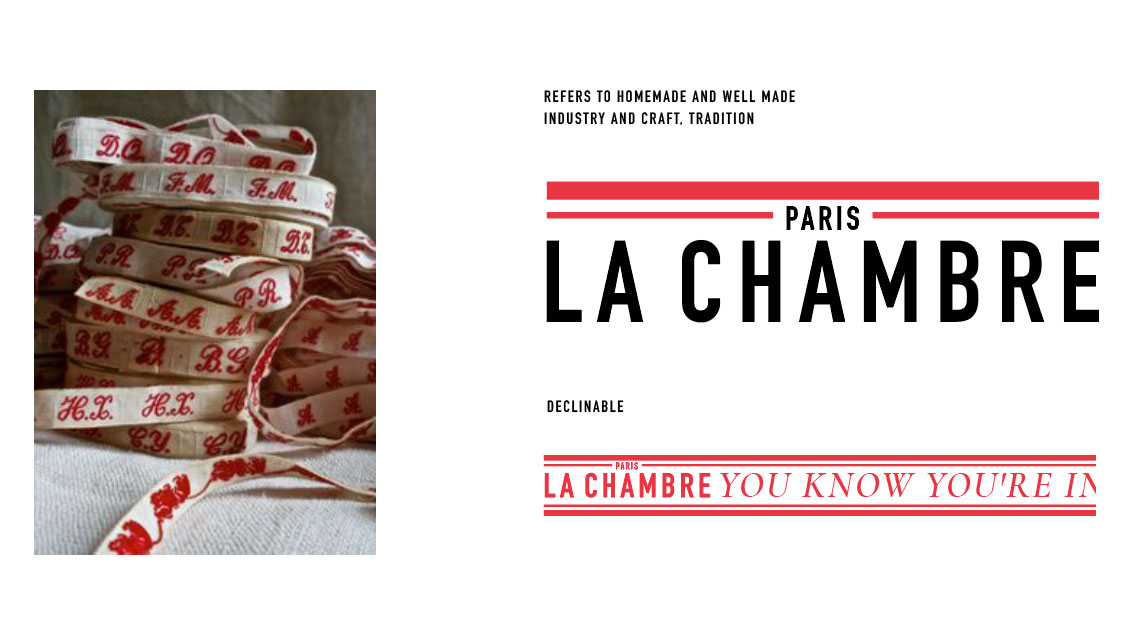
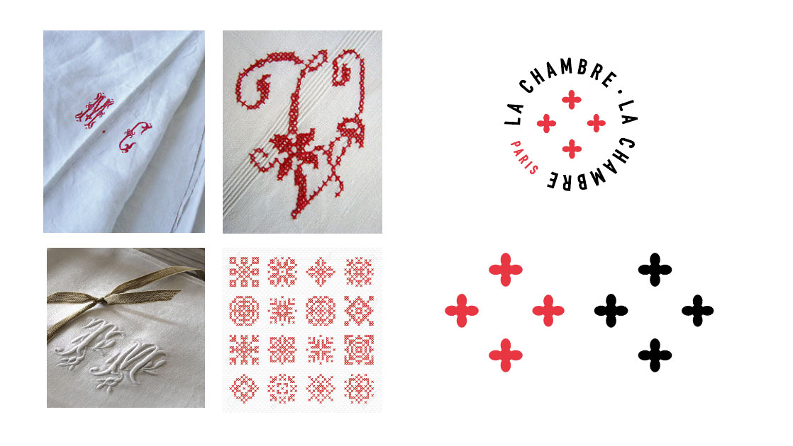
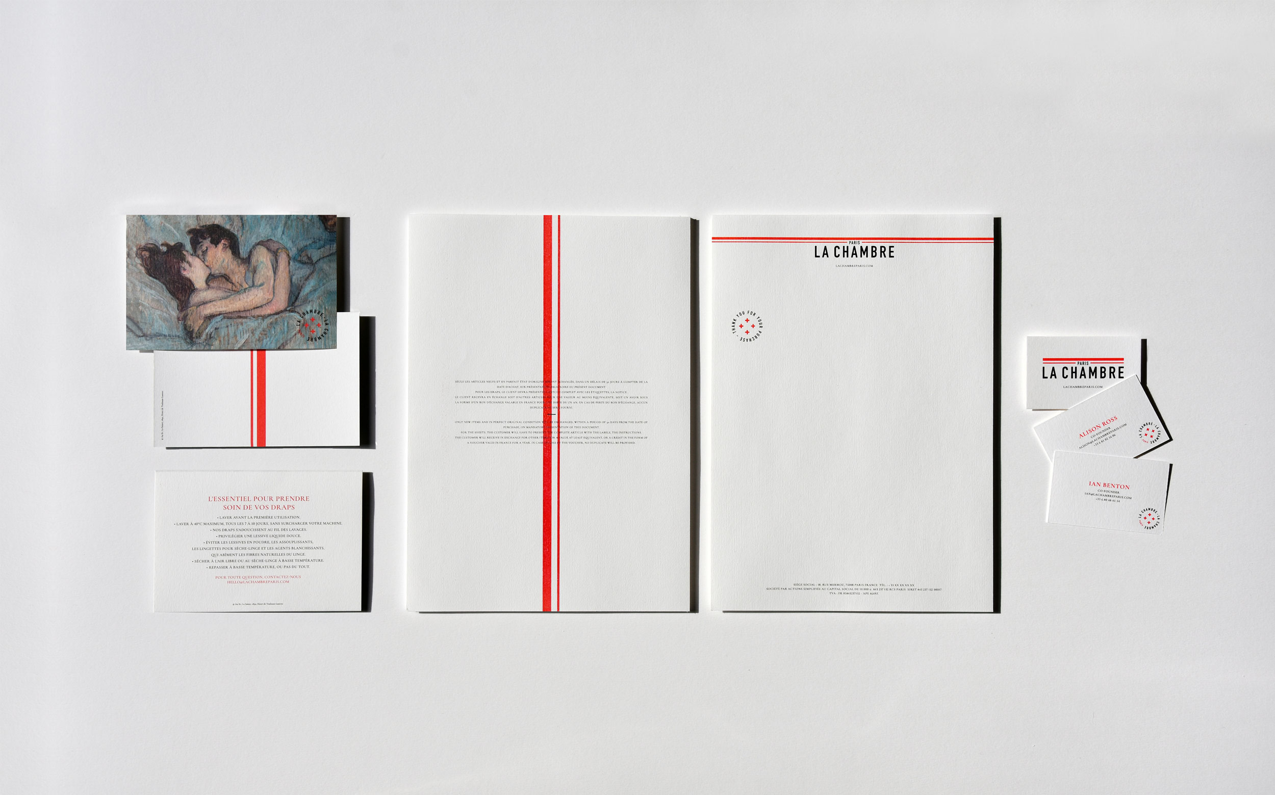
Alison and Ian wanted a very French brand, rooted in French culture, with the idea of one day exporting it abroad. So our inspiration was France. We wanted to bring a vintage feel to the French countryside, so we immersed ourselves in the textiles of our grandmothers: the linen cloths with red lines, cross-stitching red lines, ribbons, buttons, stamps…
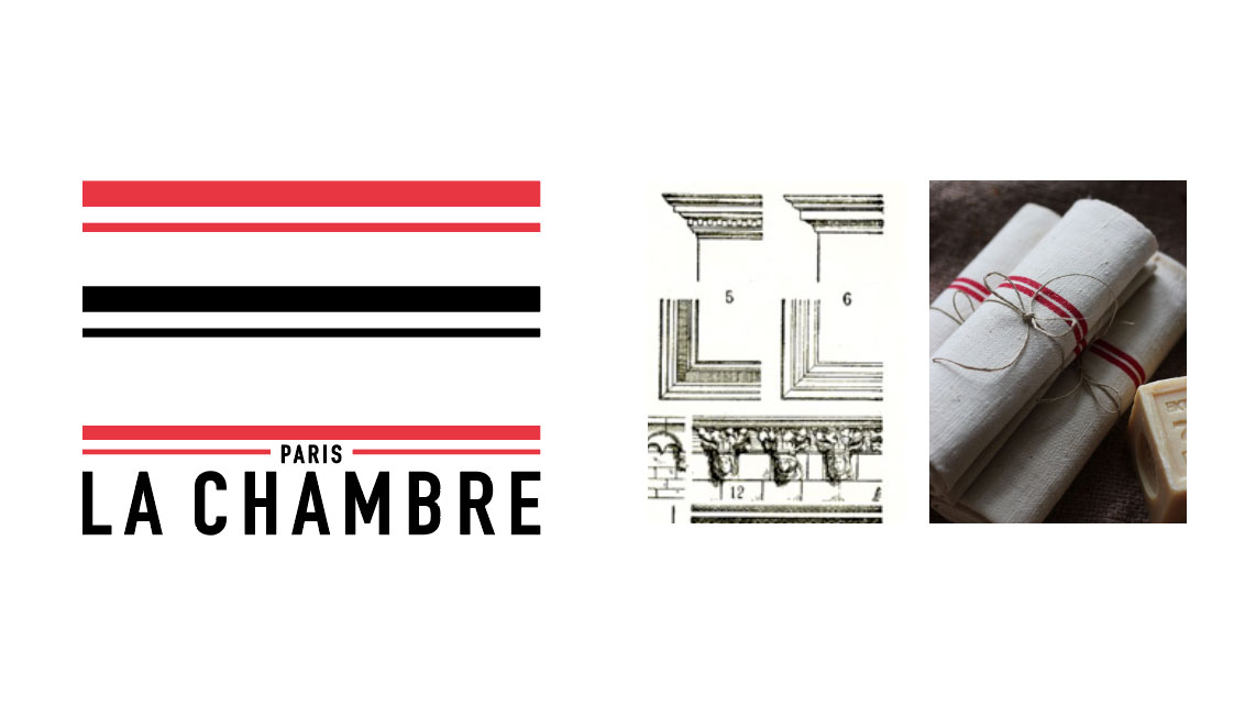
All of this is transcribed today in a rich graphic universe: the main logo with its characteristic red line, which recalls the linen towels but also the Hausmanian mouldings. This red line has become a leitmotif that runs through the entire graphic universe.
The second complementary logo is drawn more like a button with the points in a cross. And the design of the labels is conceived as a stamp that would be affixed directly to the fabric, as it was done at the time in laundries and dry cleaners.
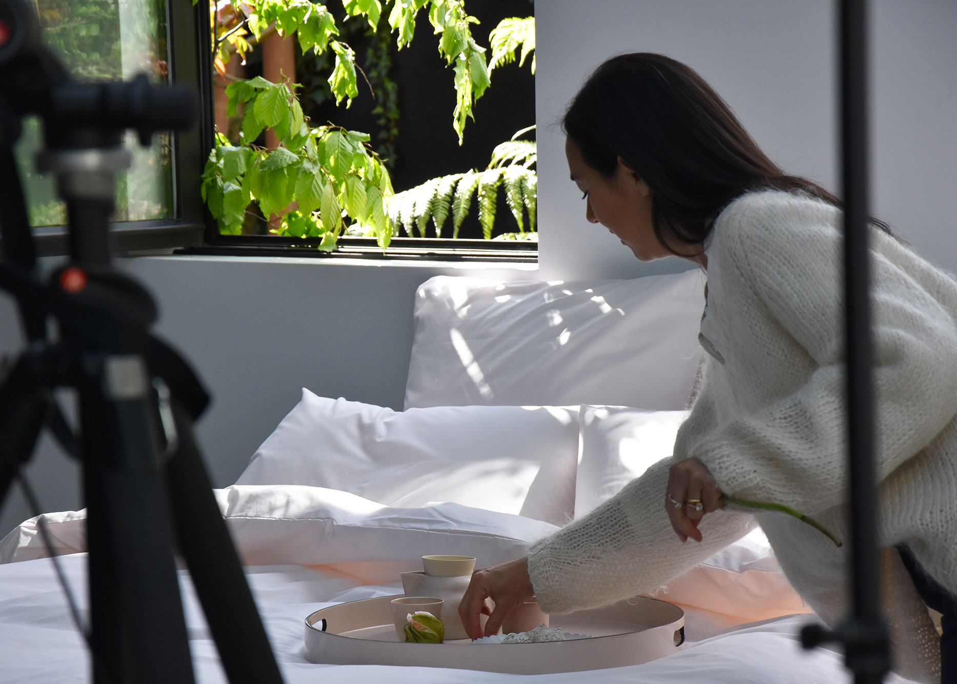
You also did the art direction and produced the photographs for La Chambre Paris. What were the main challenges in creating these images?
Photography was very important in this project, because the only sales channel for the brand is the web. It was necessary through the screen not only to attract but also to make people feel the material, its quality and its texture.
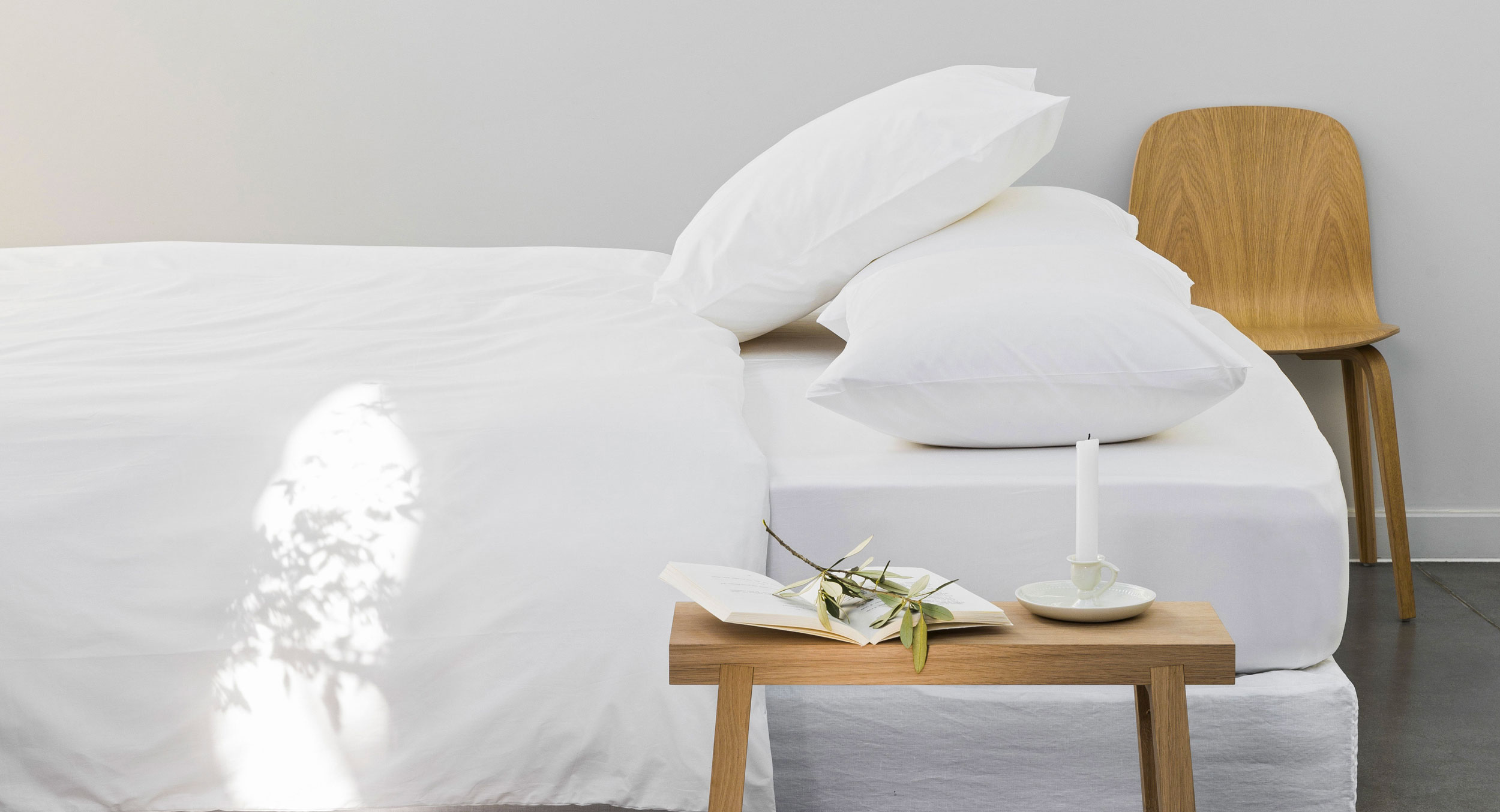
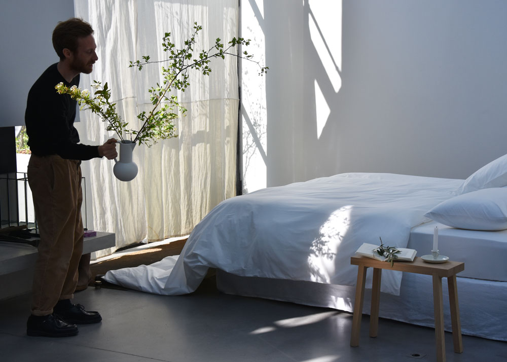
We had two directions – the first was to immerse the customer directly in the bed! We worked on the sleek, nonchalant yet sophisticated design and the natural light which gave the beautiful part to the material. We also chose the timeless environment – contemporary but devoid of any reference. This allowed the client to easily project themselves and imagine these sheets in their own home.
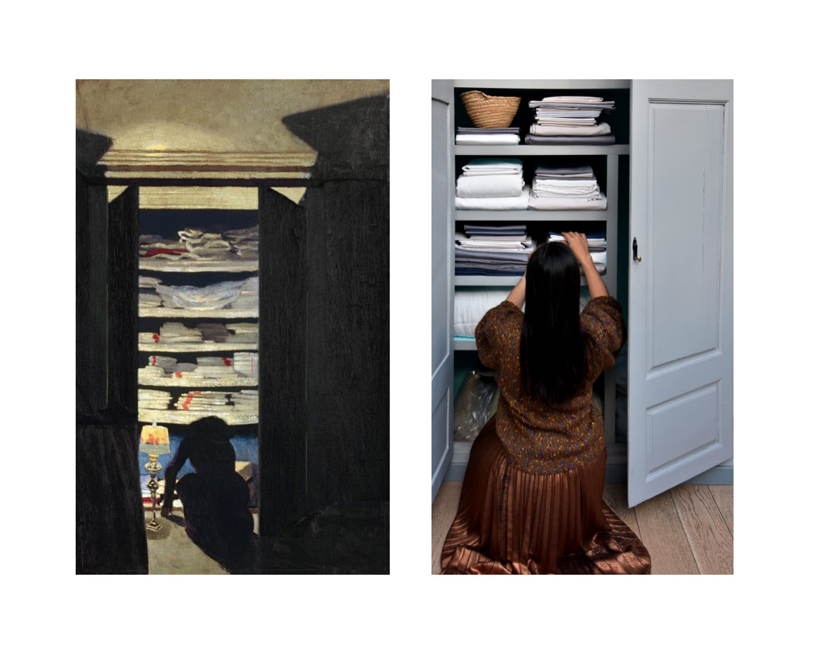
The second direction was the inspiration of the Nabi and French painters of the late nineteenth century, such as Bonnard, Vallotton, Toulouse-Lautrec who painted the interiors and the everyday environment. This gave rise to some photos and especially a communication axis for social networks.
What are the other particularities of photography for e-commerce?
In addition to inspiration photos, there is also the challenge of presenting the products themselves. We worked on the artistic direction of the packshots. How do you “package pack well”? We relied on a very rigorous and graphic presentation that which allows us to play with lines and colors.
In terms of e-commerce, what were the key points for creating an effective user experience?
At Frontline Studio we believe that the more digital we become, the more relationship with the customer must be personalized and meticulous. That’s why we put a lot of emphasis on the moment the customer receives the sheets: the packaging, the little card, the bags that protect the sheets, all these elements create a mini event and delight the customer. It’s in moments like this that the relationship of affection is created with the brand.
How did you manage to create a strong and recognizable brand identity in such a competitive industry?
We tried to create an identity that was as rich as possible by injecting several ideas and several cultural references.
How would you describe Chambre Paris’ identity in one sentence?
It’s an identity that confirms people’s image of a quality product with traditional French charm.
Discover the whole project La Chambre here.
Emma Brante,
Creative Director, Graphic Designer
Founder, Partner
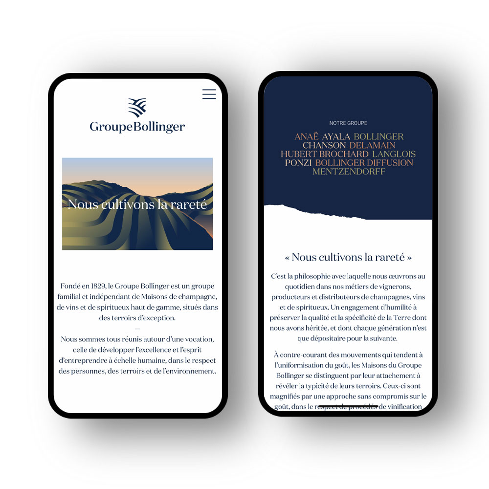
Let us tell you a story… The story of our collaboration with the Bollinger group, created in 1829 by the Bollinger champagne House. Between family transmission and cultural heritage, we invite you to discover the backstage of the creation of the brand identity and new corporate website that we imagined for this exceptional group.
What was the starting point of the project for the Bollinger Group?
The starting point was a brief. A brief is a magic box, a mix of « everything is possible » + « beware, you can’t just create anything you want that looks beautiful 🙂 ».
The group had been existing for decades and it was until now a discrete financial holding. As the group was becoming more important, welcoming new Houses, questions appeared internally as well as the desire to exist publicly as a group. Our mission was to create the public image they needed without overshadowing the brands. A visual and editorial line to express their values, the reputation and aura of their brands.
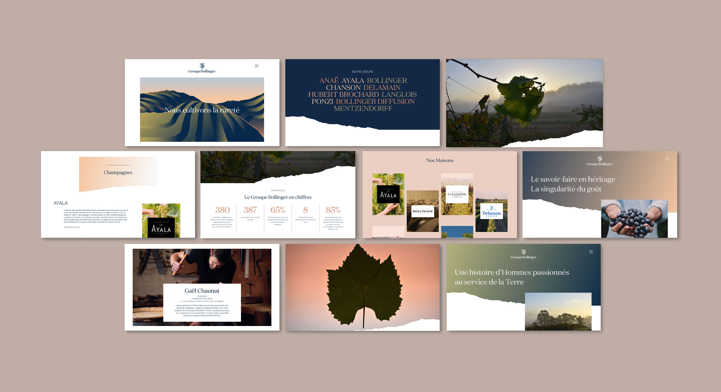
In phase one of our work, we built the identity language of the group: its name, its logo, its slogan and a universe. We continued this work in the same spirit in order to deploy and implement the new vision and identity of the group.
What were your inspirations for the new corporate identity of this independent family-owned group?
A group is the voice of a culture. For the Bollinger Group, we wanted something soft and inspiring – and therefore human – as opposed to a cold financial institutional image. Something that is close to nature.
What was the logo design process?
The lines drawn by the cultivated fields, so typical of the vineyards. This was the starting point. This landscape is one of the first images one has in mind when imagining vineyards. The second idea was to find a symbol to represent the historical dimension of these Houses. A character of nobility and belonging. The shape of the logo refers to a shield. And the last idea was to signify the concept of land in the sense of an estate, a property.
This logo is the final association of this landscape in the shape of a blazon.
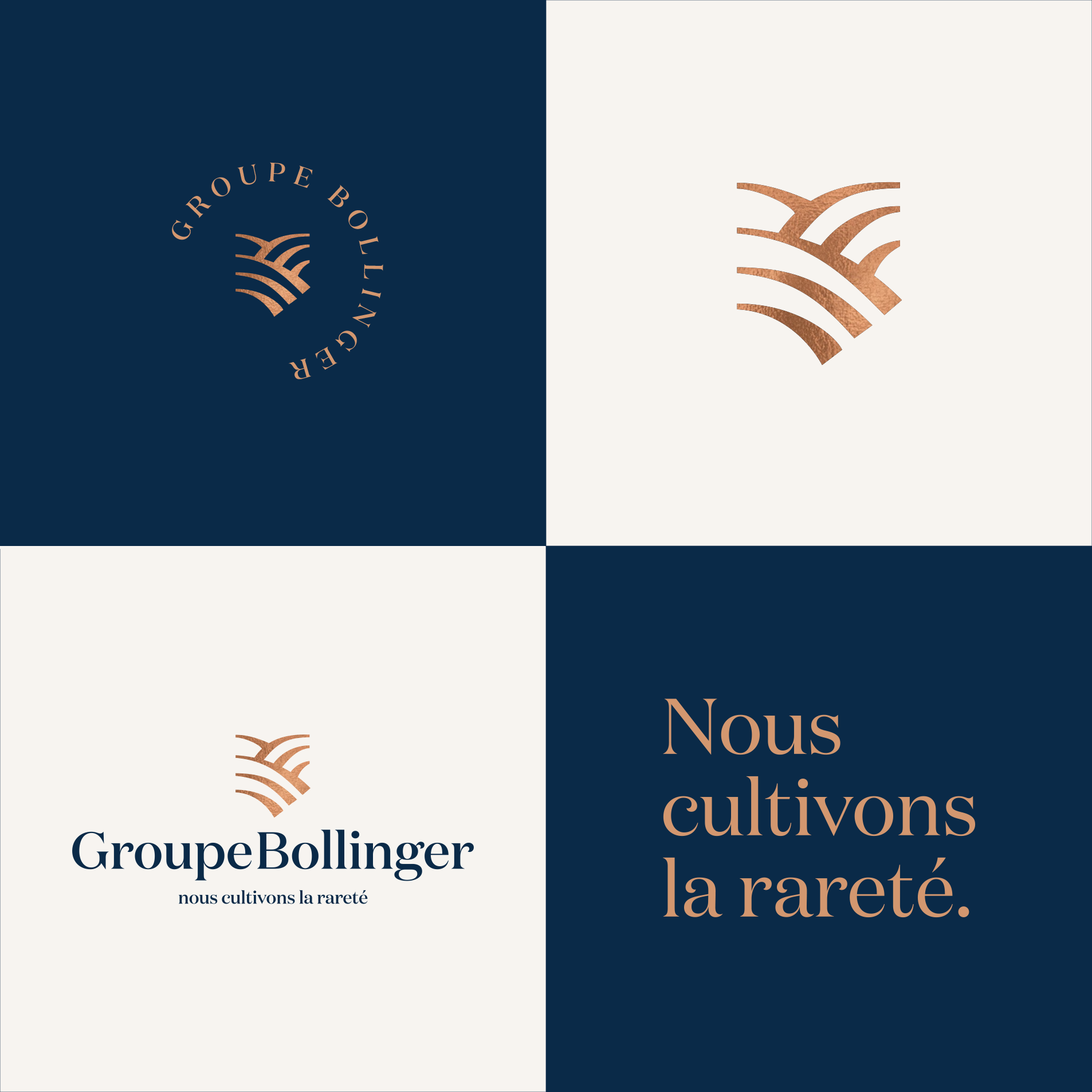
“Cultivating the Rare”: how does this baseline represent the vision and history of the Bollinger Group?
The group had a baseline which was « Families of rare wines ». Having integrated new spirits brands, this phrase no longer represented them. The heart of it was the word « Rare ». And then, associated to the idea of a « culture » and playing on the multiple meaning of this word that carries many rich ideas such as: the idea of an identity, the patrimonies and the cultivation of the land, we created that baseline « Cultivating Rarity ».
This slogan also has an ecological dimension and evokes a respect for the Earth
How did the Bollinger Group website come to life to look like it does today?
A group is not a brand, it’s an institution. As for any serious major institution, the visual grammar must be rich and creative in order to convey a sovereign image. The website revolves around the idea of landscapes and the richness of the land. We created graphic landscapes and designed colored hills with ripped paper.
What were the challenges in developing this corporate website?
This website is a flag in the colors of the group’s ambitions and the “extra-ordinary” quality of its Houses.The website allows the Bollinger Group to present itself and address thousands of people at the same time and not just to isolated interlocutors.
Its goal is to shows the foundations of a serious institution and it indirectly generates interest among the Houses. It highlights the brands and entities and can arouse curiosity. The Group’s website makes it possible to say everything that the brands cannot always express.
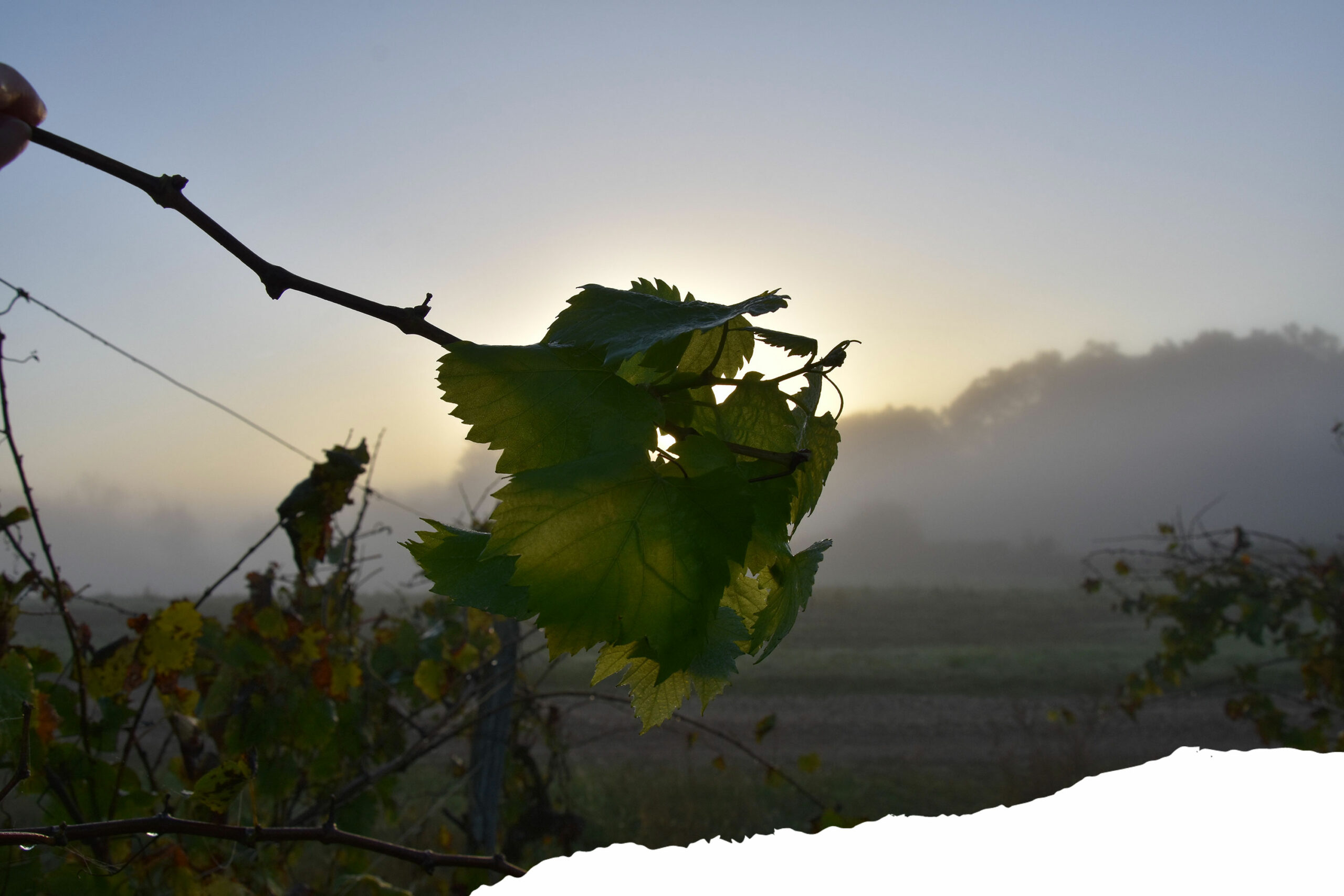
A photographic coverage was done to illustrate the Bollinger Group corporate website. How would you define the artistic direction of this shooting?
We built the entire identity around landscapes. We had created graphic forms that evoked landscapes playing with colored gradients. The render was a very soft visual feeling.
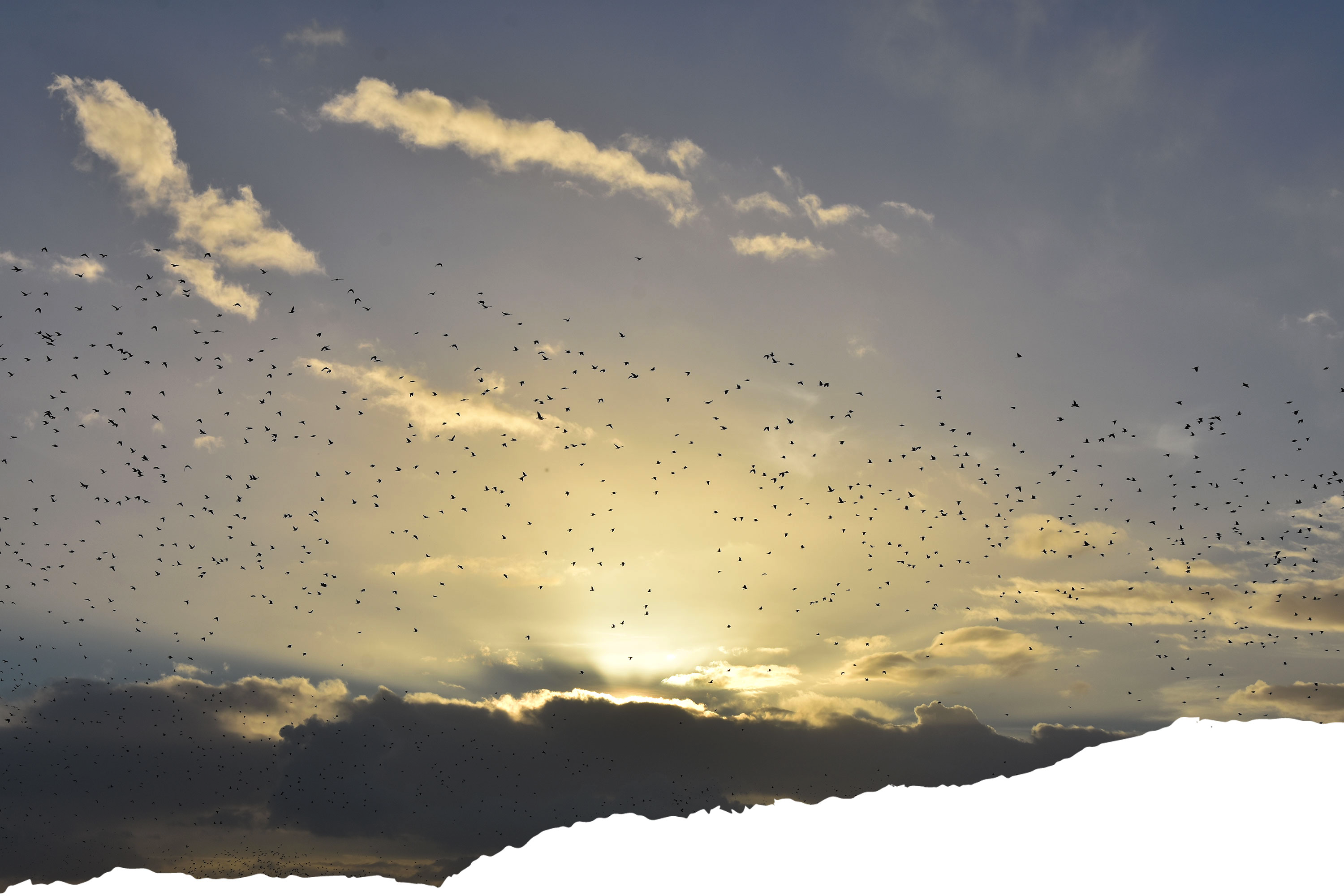
We shot a series of different landscapes, fields of vineyards. The photos were taken at dawn, bringing to us a mysterious rich light and revealing the magic that only nature can provide.
Each photo is a piece of this nature that carries universal ideas. Swarms of birds, mist invading vineyards, sun rising in the hills, the humidity of the night on the vine leaves. We wanted to recreate the feeling of the scent that the earth has when it is filled with the humidity of the night.
Tell us about the research process to define the iconographic identity of the group?
We have created a series of visuals specific to the group that cannot be confused with those of the brands. The purpose of these images is to give a sense of height and symbolize the group’s unifying role.
Brands mainly broadcast and show product images, we never show products. We have shifted the focus. We talk about the Earth.
How does Frontline establish a brand identity through photography?
It is part of a whole. When we start a project, first we look for a general feeling. It often comes from a first image that we find or that we have in mind. This image evokes a style. From this style we develop a whole visual grammar – graphic, photographic, editorial – that will dress the brand and give it the means to express itself in public.