Masha Kontchakova & Emma Brante, Creative directors & founders at Frontline Studio
La Chambre entrusted Emma et Masha with the creation of their global branding. The both worked closely on storytelling, visual identity, web design and photography to position the brand in a competitive e-commerce market.
What was the starting point for this project ?
Alison and Ian came to us with an idea for an e-commerce business that wanted to offer an excellent quality sheets at affordable prices. The original slogan was even considered: “Why should we wait for the sales?
It was our first e-commerce brand and also the first brand that has being created with us. It was very exciting to work from scratch on a concept that is very defined and rooted in French culture.We proposed from the start to change the initial brand name that we found too complicated and came up with a simple name with a very direct connotation, which is La Chambre (room in French). This word had the advantage of being easily remembered and above all opened a very wide field for communication. That was our starting point.
How did your collaboration with Alison Ross and Ian Benton, the founders of the brand, happen?
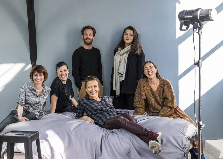
It was an 8-handed collaboration. I don’t think we’ve ever had so much coffee with a client! We see each other 2-3 times a week. It was intense and creative.
Also, we love working with foreigners as we are of foreign origin ourselves. Alison is American, Ian – British, we like this mix of cultural references.
What were your inspirations at the very beginning of the project and how has it evolved during its development?
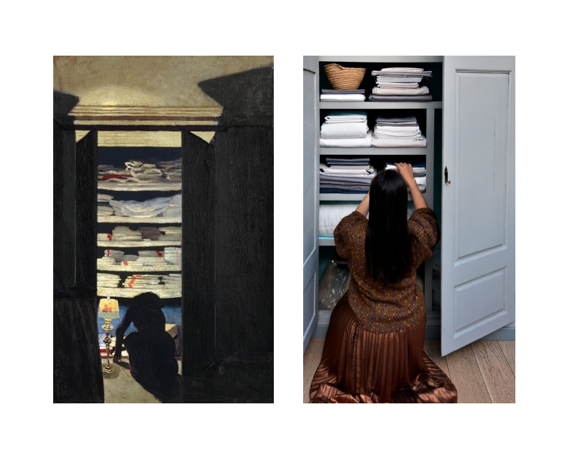
Alison and Ian wanted a very French brand, rooted in French culture, with the idea of one day exporting it abroad. So our inspiration was France. We wanted to bring a vintage feel to the French countryside, so we immersed ourselves in the textiles of our grandmothers: the linen cloths with red lines, cross-stitching red lines, ribbons, buttons, stamps…
All of this is transcribed today in a rich graphic universe: the main logo with its characteristic red line, which recalls the linen towels but also the Hausmanian mouldings. This red line has become a leitmotif that runs through the entire graphic universe.
The second complementary logo is drawn more like a button with the points in a cross. And the design of the labels is conceived as a stamp that would be affixed directly to the fabric, as it was done at the time in laundries and dry cleaners.
You also did the art direction and produced the photographs for La Chambre Paris. What were the main challenges in creating these images?
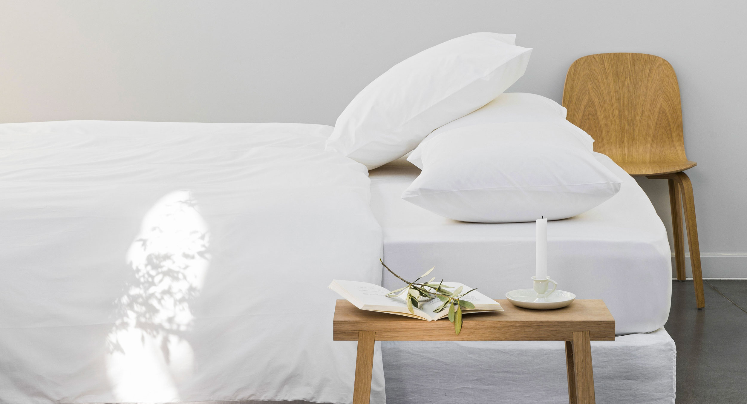
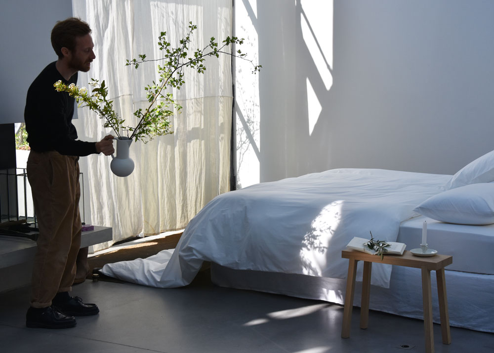
Photography was very important in this project, because the only sales channel for the brand is the web. It was necessary through the screen not only to attract but also to make people feel the material, its quality and its texture.
We had two directions – the first was to immerse the customer directly in the bed! We worked on the sleek, nonchalant yet sophisticated design and the natural light which gave the beautiful part to the material. We also chose the timeless environment – contemporary but devoid of any reference. This allowed the client to easily project themselves and imagine these sheets in their own home.
The second direction was the inspiration of the Nabi and French painters of the late nineteenth century, such as Bonnard, Vallotton, Toulouse-Lautrec who painted the interiors and the everyday environment. This gave rise to some photos and especially a communication axis for social networks.
What are the other particularities of photography for e-commerce?
In addition to inspiration photos, there is also the challenge of presenting the products themselves. We worked on the artistic direction of the packshots. How do you “package pack well”? We relied on a very rigorous and graphic presentation that which allows us to play with lines and colors.
In terms of e-commerce, what were the key points for creating an effective user experience?
At Frontline Studio we believe that the more digital we become, the more relationship with the customer must be personalized and meticulous. That’s why we put a lot of emphasis on the moment the customer receives the sheets: the packaging, the little card, the bags that protect the sheets, all these elements create a mini event and delight the customer. It’s in moments like this that the relationship of affection is created with the brand.
How did you manage to create a strong and recognizable brand identity in such a competitive industry?
We tried to create an identity that was as rich as possible by injecting several ideas and several cultural references.
How would you describe Chambre Paris’ identity in one sentence?
It’s an identity that confirms people’s image of a quality product with traditional French charm.
Lara Mueller, Head of digital marketing & e-commerce design
Lara Mueller is a French-Dutch-American who specializes in digital marketing, e-commerce design and online customer experiences. She creates and optimizes the digital marketing and turnover of the companies she collaborates with, whether it is in the improvement of their website, acquisition, conversion or customer loyalty. For French Bloom she has developed the e-shop platform worldwide.
What are the main challenges in designing an e-shop?
The biggest challenge when building an e-shop is to mix both technical and aesthetic. The digital competition being very strong, we have to bring the best customer experience and distinguish ourselves graphically and visually.
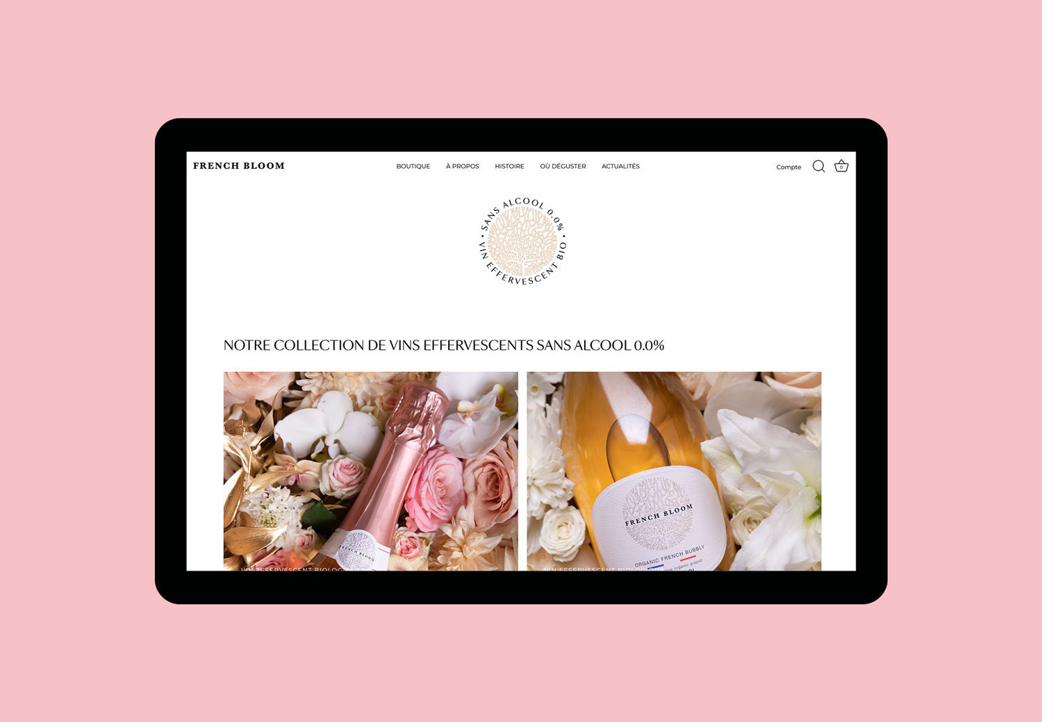
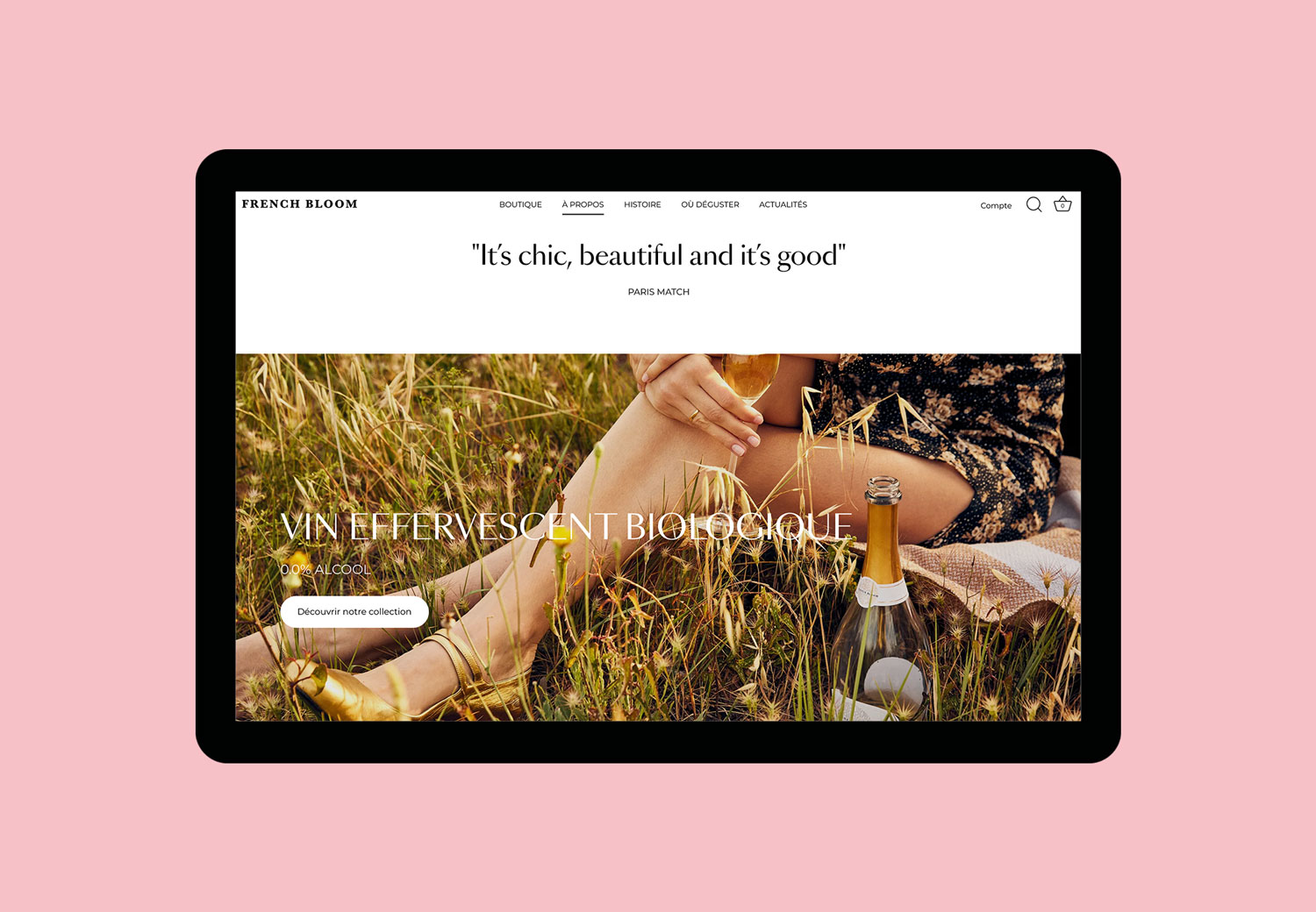
How is the French Bloom e-shop different from other e-commerce websites?
The originality of French Bloom is already made by its products. It was a real challenge to think about the website of this alcohol-free brand. The market being new, we had to show the notion of alcohol-free combined with the codes of luxury – knowing that at first sight these codes do not mix.
So we took all these identity codes to be able to highlight this new and singular product range.
How do you successfully push the brand’s vision into the online customer experience?
Through these codes of luxury, champagne and French know-how. Each word, each photo, each button has been carefully thought out and placed, to keep this high-end image without hindering the e-commerce experience and the discovery of French Bloom products.
The e-shops developed by Frontline Studio can have a worldwide reach. How does this make development more challenging?
We have already developed the Europe, UK and USA area; we are looking forward to develop the e-shop on the other regions of the world. And it is even more interesting to adapt these sites to each area of the world, the way of life, the mood and the habits vary according to the local culture.
Emma Brante, Creative director, graphic designer
& founder at Frontline Studio
Why did you choose to specialize in logo design?
A logo is a lot of content in a very small object.
Logo design seemed to be the most creative and interesting thing there was for me to craft. Most of the design agencies I had worked for were specialized in brand identity and that didn’t stop them from working on other forms of communication tools like we do today with Masha at Frontline Studio. But one day I realized that I needed to specialize in a specific skill that required a specific know-how. Being able to create a strong and effective brand identity/logo is an added value.
From then on, I took a different approach and started to work on my logos in a more ambitious way without ever backing down from the design difficulties that can be encountered during the process. I wanted them all to have something special. Whether the project was small or large, I decided to give the client as much as I could so that each of my logos would be a strong and remarkable creative object.
When did you decide to focus on logo design and its place in brand identity?
I’ve been designing logos for 20 years but the first one I designed with this in mind was for an architects firm. I had already designed fonts for a logo, notably when I created the logo for the ready-to-wear brand Maje, but I wasn’t used to really designing and transforming typography in a complex way, so I spent a considerable amount of time on this project to make it look original and special.
The client wanted to get away from the usual codes associated with architects. The brief was very original, the partners wanted a conquering, rock-inspired attitude. They were ambitious and that inspired me. They loved the logo of the rock band ACDC. They wanted the same strength for their agency. That was the starting point and I designed the logo around the idea of a skyline.
It’s from that project that I’ve allowed myself to transform, draw, distort typography and get into a territory where few people dare to go. In my opinion, if you touch the design of a letter that is perfectly designed and formatted, you have to make it interesting and meaningful, otherwise you ruin it and there is no added value compared to its initial design.
What has this changed in your work?
Based on a highly identifiable logo, the overall visual identity of a brand can gain power without resorting to aesthetic tactics such as expensive printing or often artificial effects.If a logo is very elaborate, rich and complex, it will not cost more to print. On the other hand, it will give strength to the whole brand identity and everyone will enjoy using it.
This is the interesting point of view in logo design. The idea is to draw out what is strongest about the client and then extract it and put the brand into orbit. Whatever the message is, I always thought it was my job to make it extraordinary and unique. To function, a logo must radiate.
What do you think a logo brings to your client?
Firstly, making a logo is like tailoring a suit for someone. The brand is the central character. Often when we meet the client, they have a suit that is too big or too small, or no suit at all. It’s up to us to get it back to the right size so that the brand is legible, looks sincere and is illuminated in its best light.
Then our job is to increase the brand’s potential for success. Of course, the turnover will not be entirely based on the visual identity, but it will play a role in the bundle of qualities necessary for its success.
With a strong identity, the brand will be more recognizable, identifiable, it will express its heritage, history, reputation and ambitions. A visual identity is an opportunity to make a mark and to multiply the brand’s aura.