Client
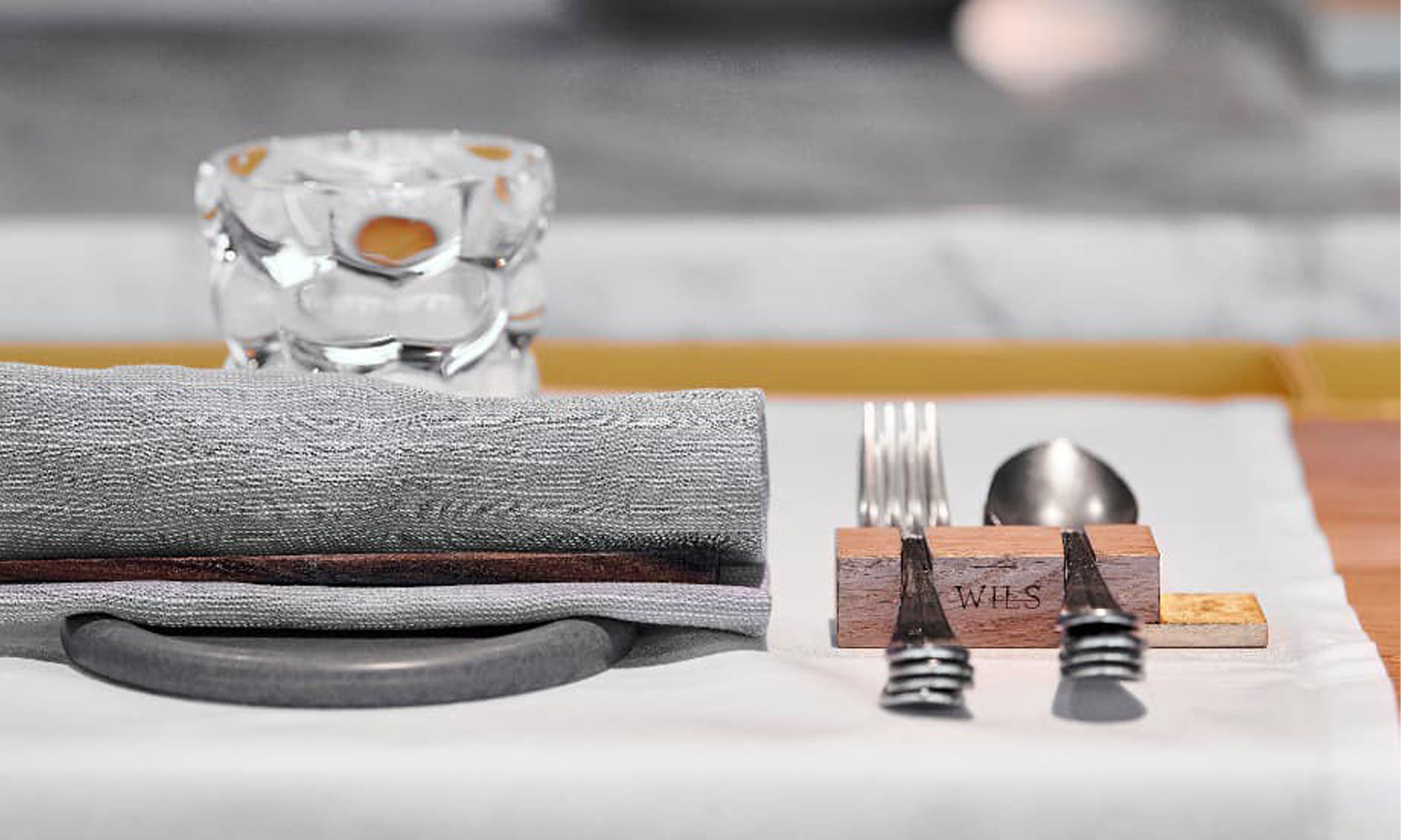
Wils restaurant, Amsterdam
Mission
Logo design, Brand Identity,
Guidelines
Logo & visual identity
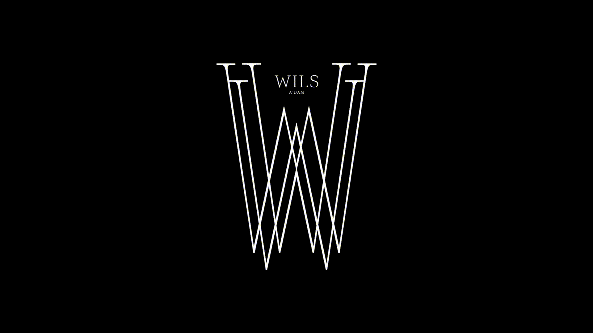
Both chic and relaxed, WILS restaurant signed by young Dutch star chef Joris Bijdendijk, faces the Amsterdam Olympic stadium built by architect Jan Wils, which hosted the 1928 Olympics.
Monogram
The flame that inspired the design of the W monogram refers both to the Olympic flame and to Joris Bijdendijk’s unique wood-fired cooking technique.
Collateral items
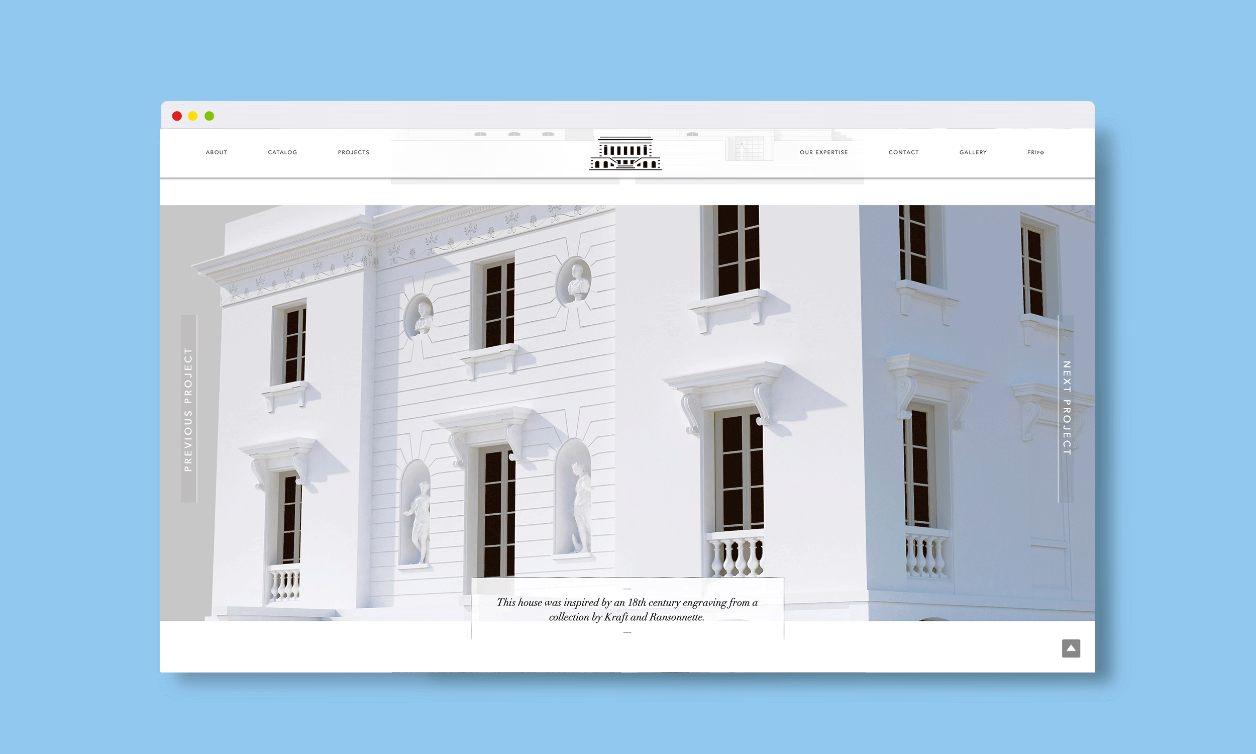
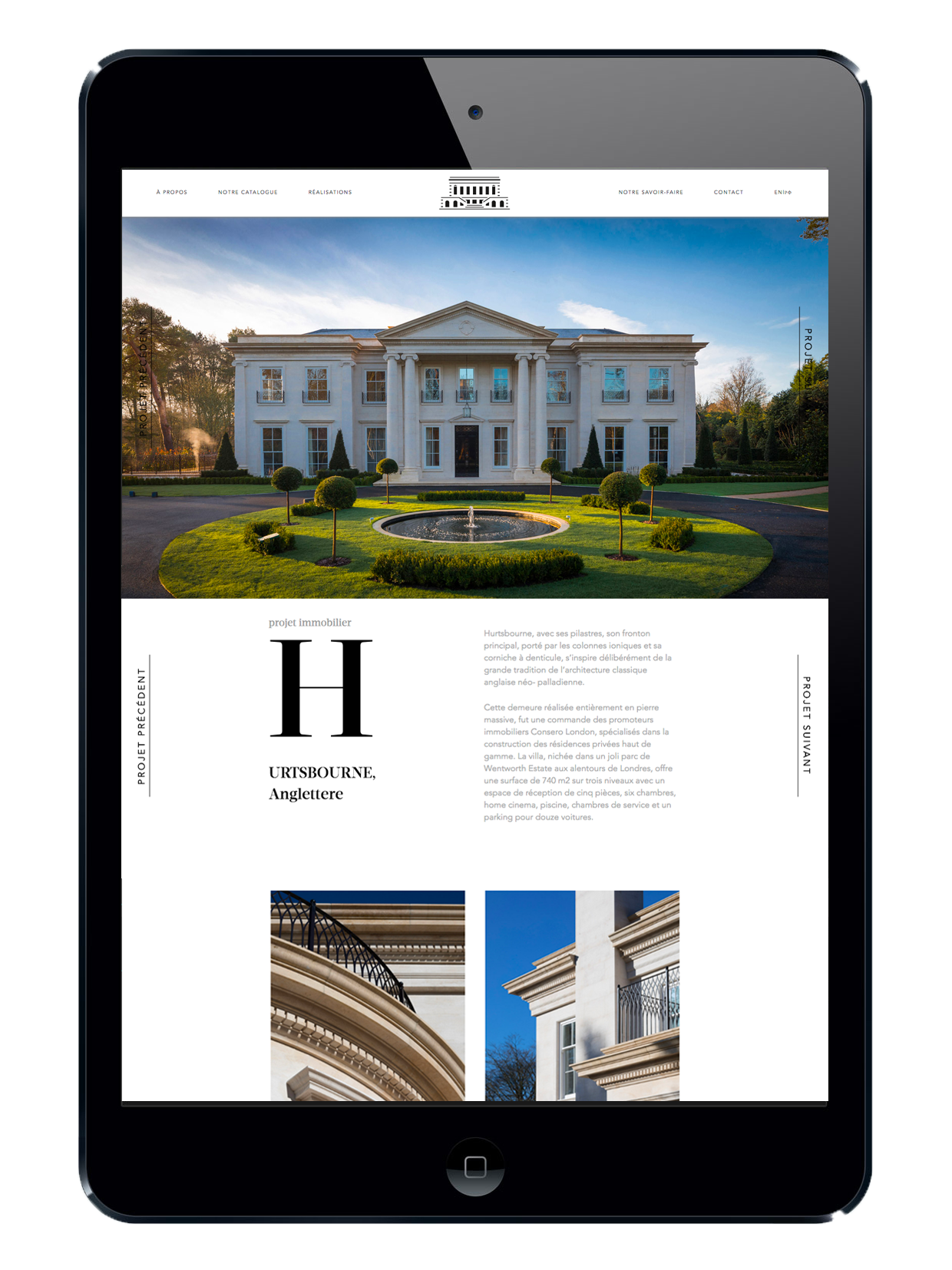
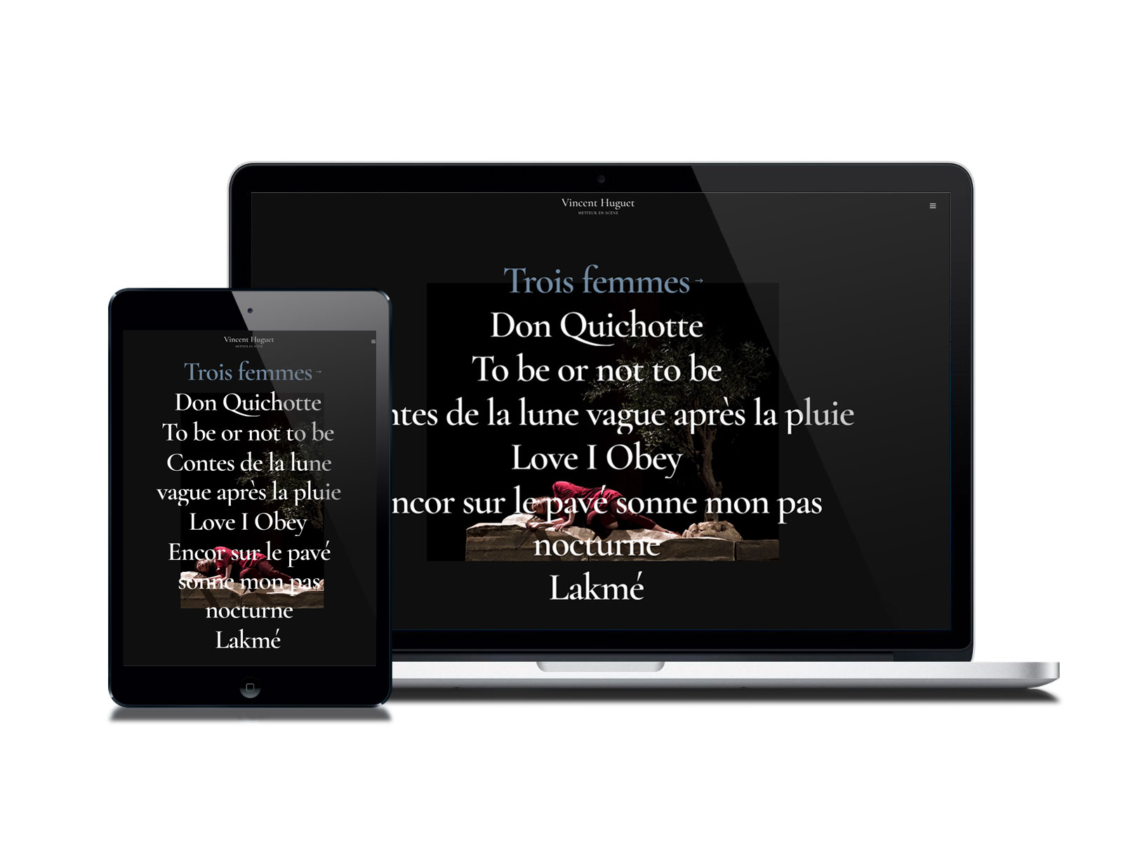
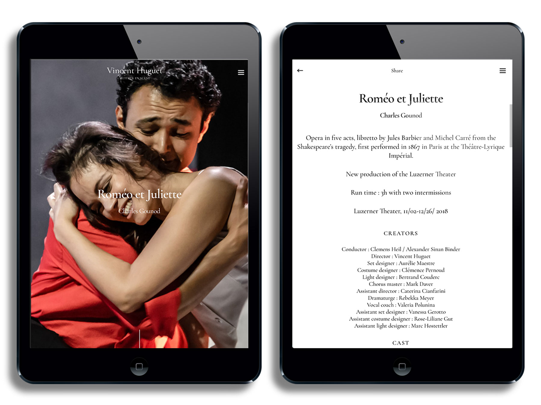
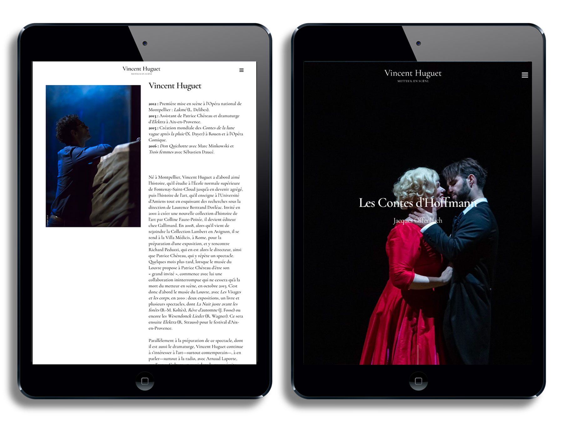
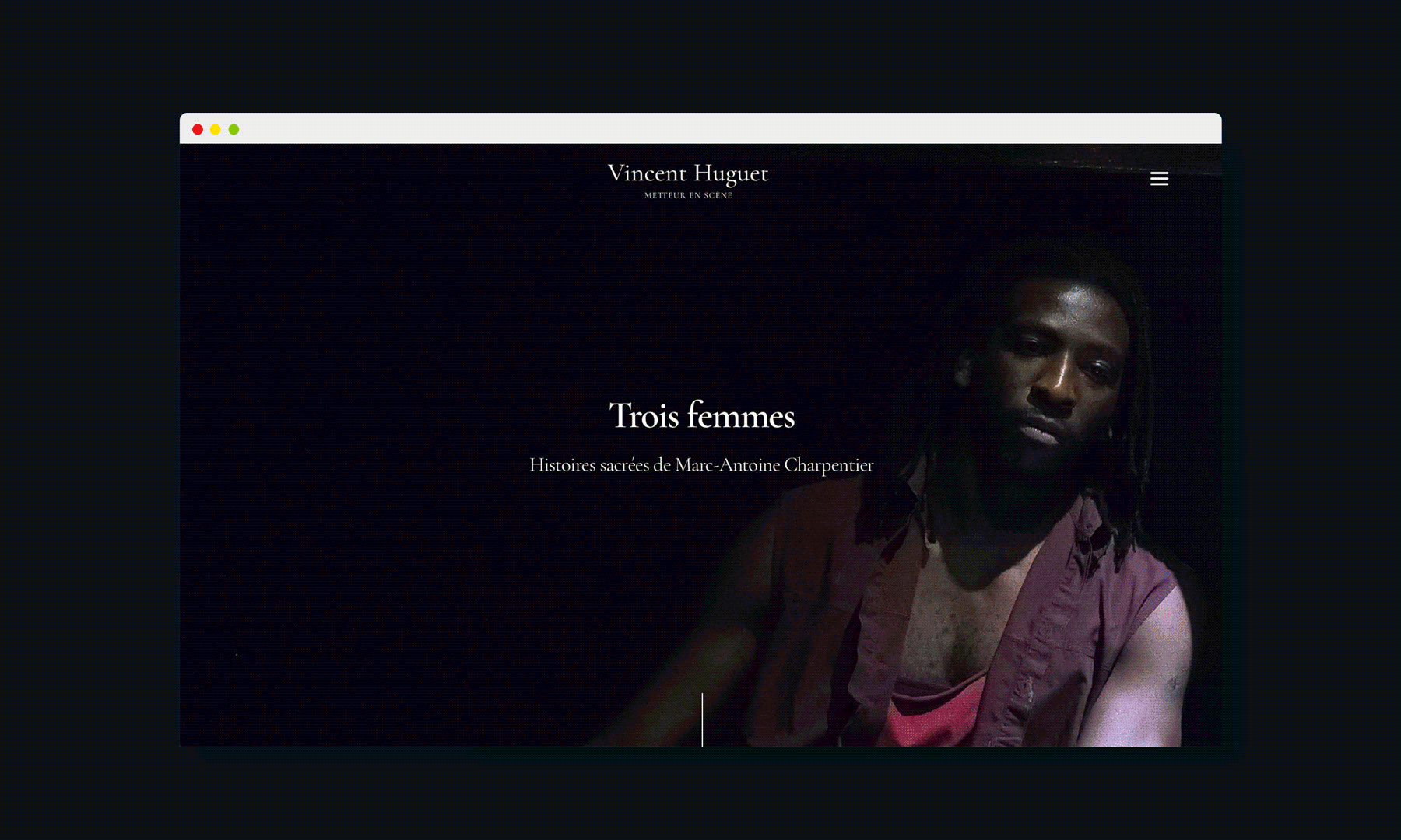
Website