FRONTLINE

Giving a unique look to a functional everyday object

Client
Bassines, France

Mission
Brand Strategy, Brand Identity,
Brand Messaging, Art Direction,
Photography, Copyright

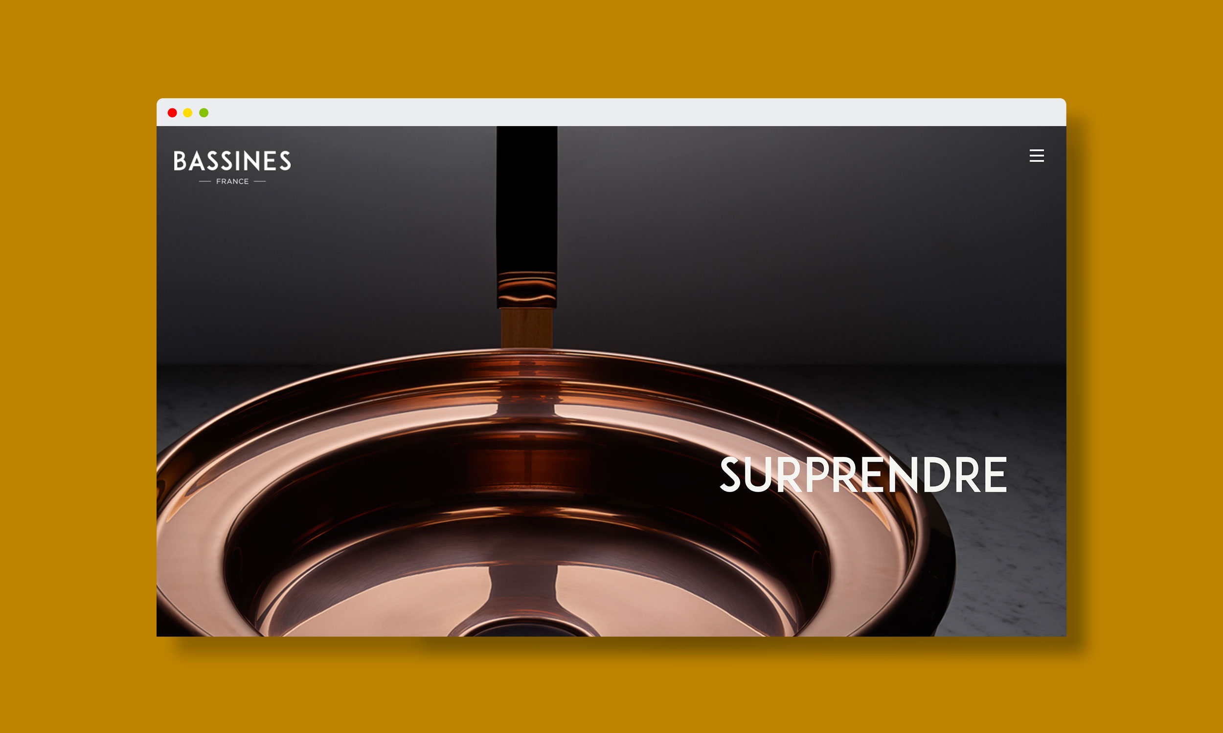
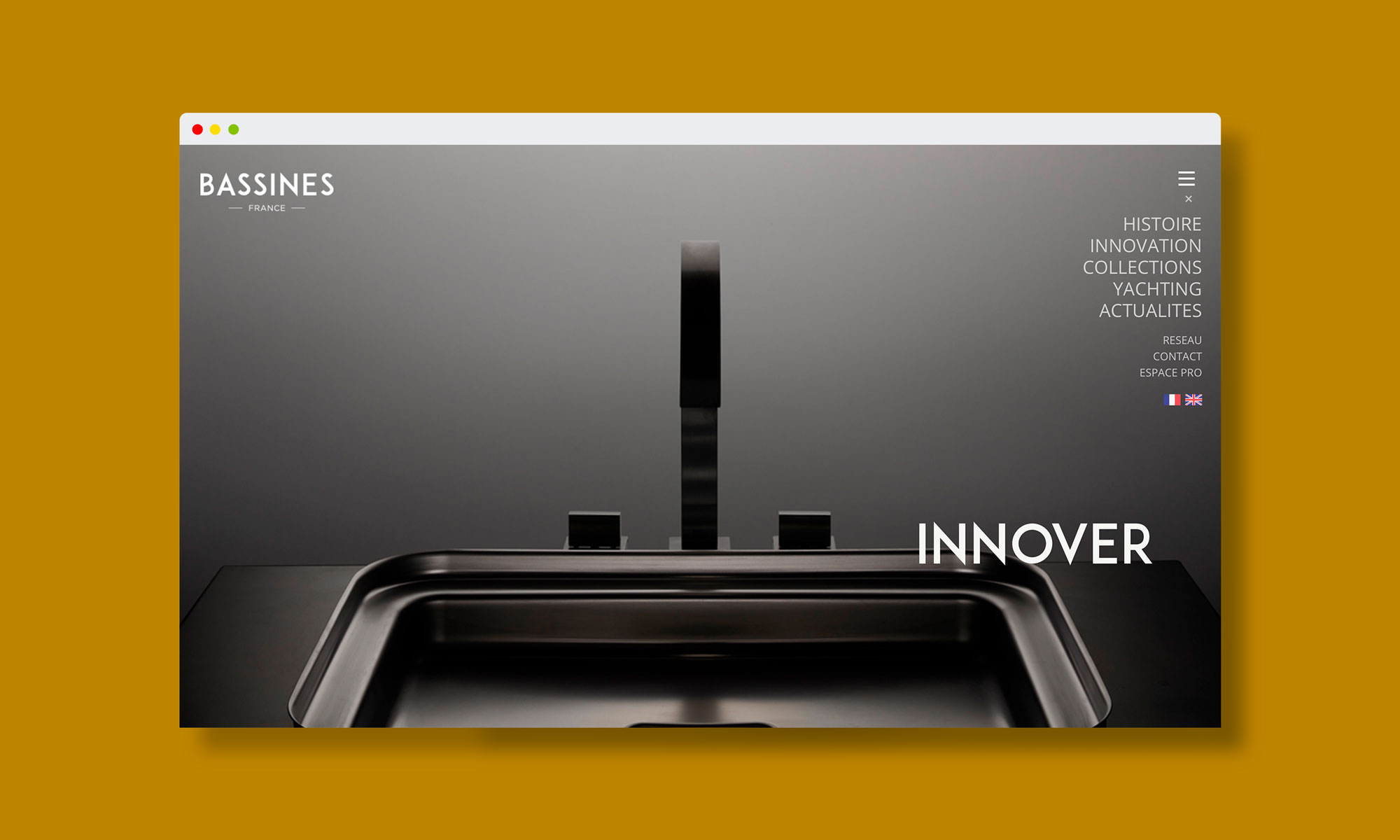
The brand new company in French luxury bathroom, Bassines set a challenge: to reinvent the fine copperware and transform it into a design object.

Creation of
communication tools,
Launching

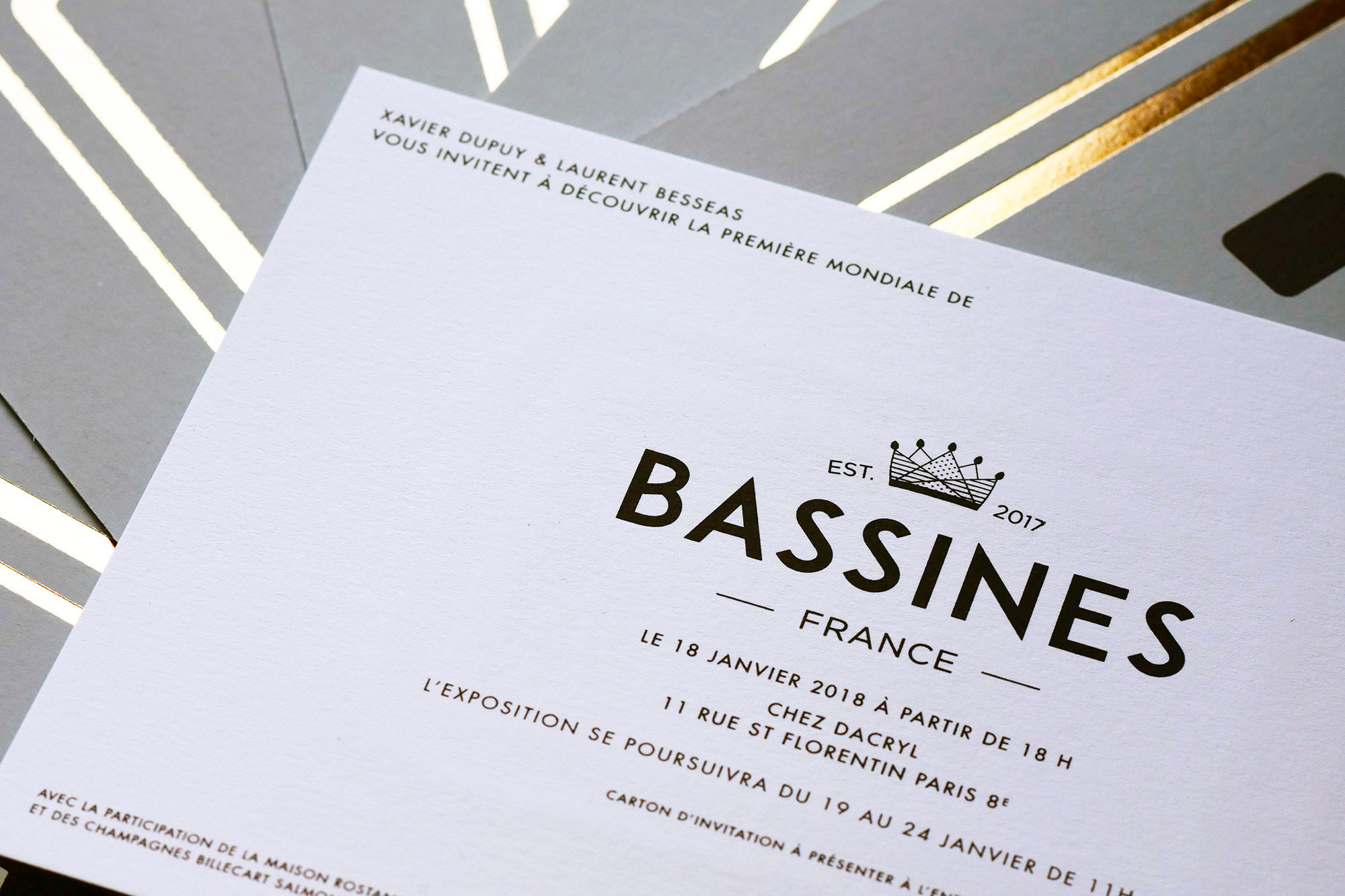
Our mission was to launch the brand and create the total package of communication tools: photos, copyright, press release, invitation cards…

Digital

Photography, Art Direction
Photo shoots

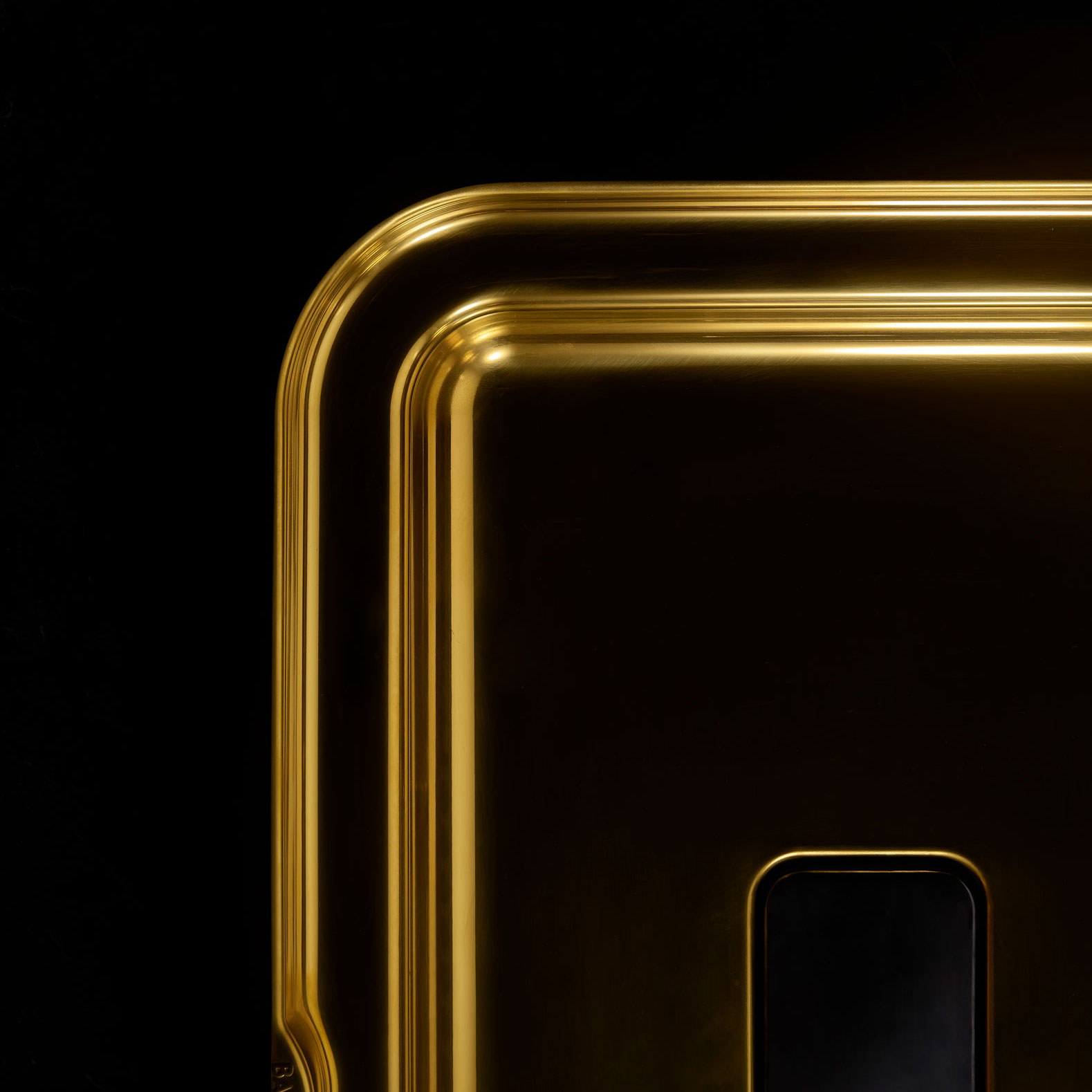
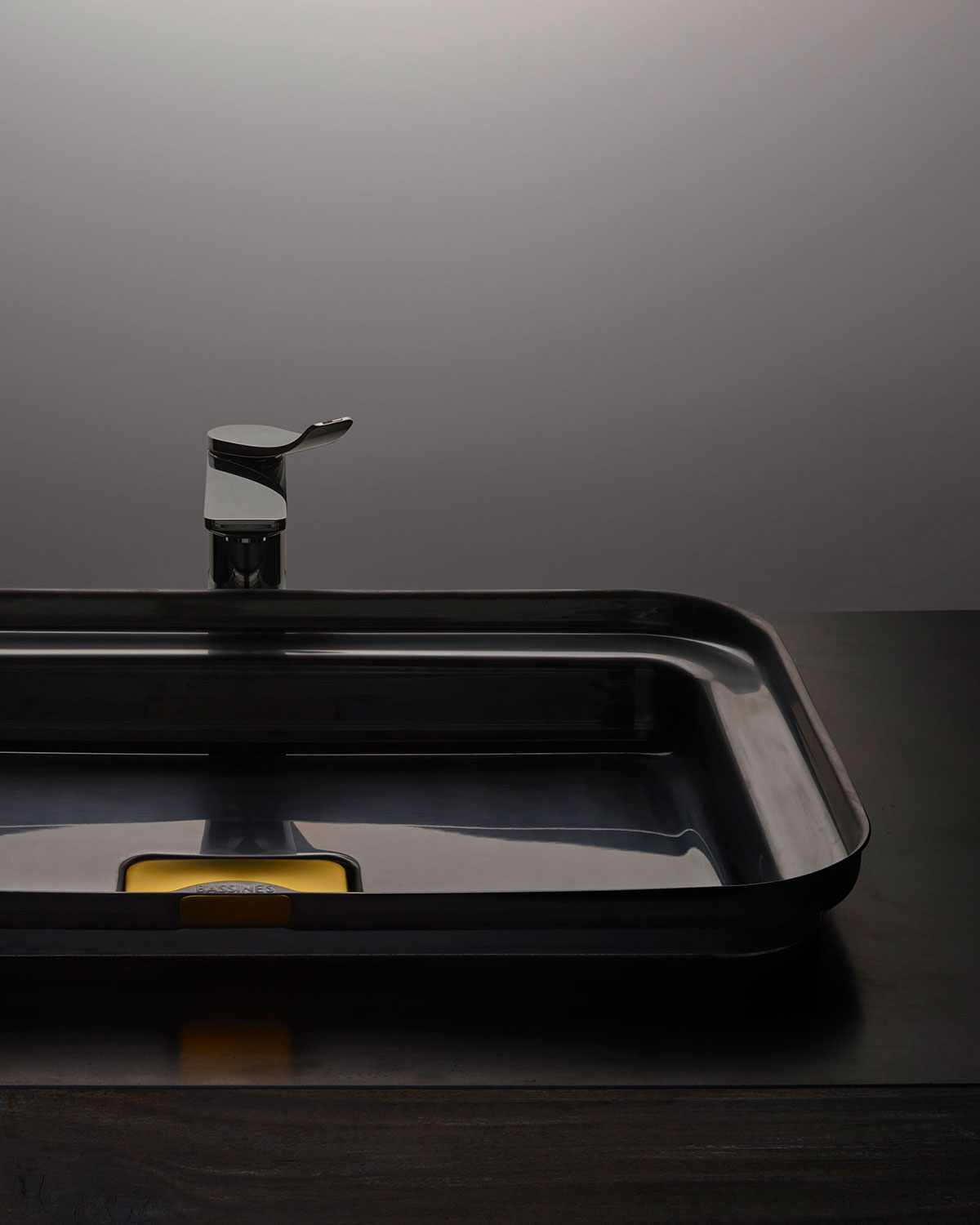
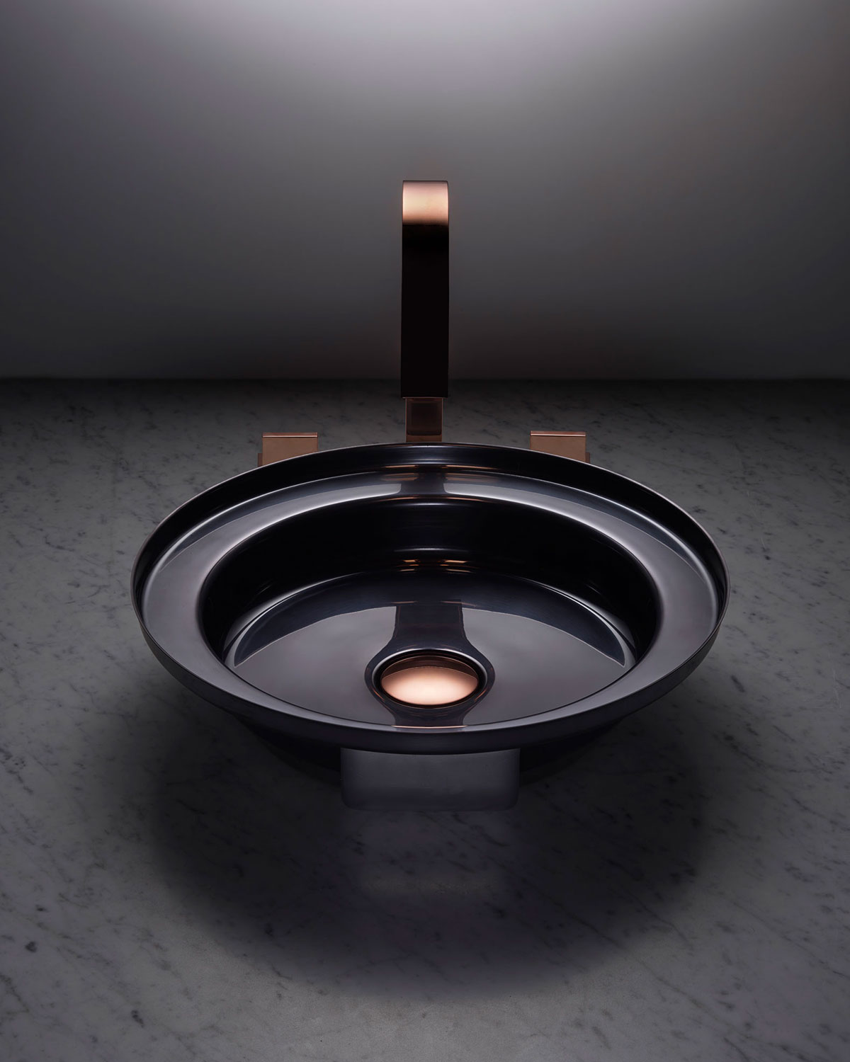
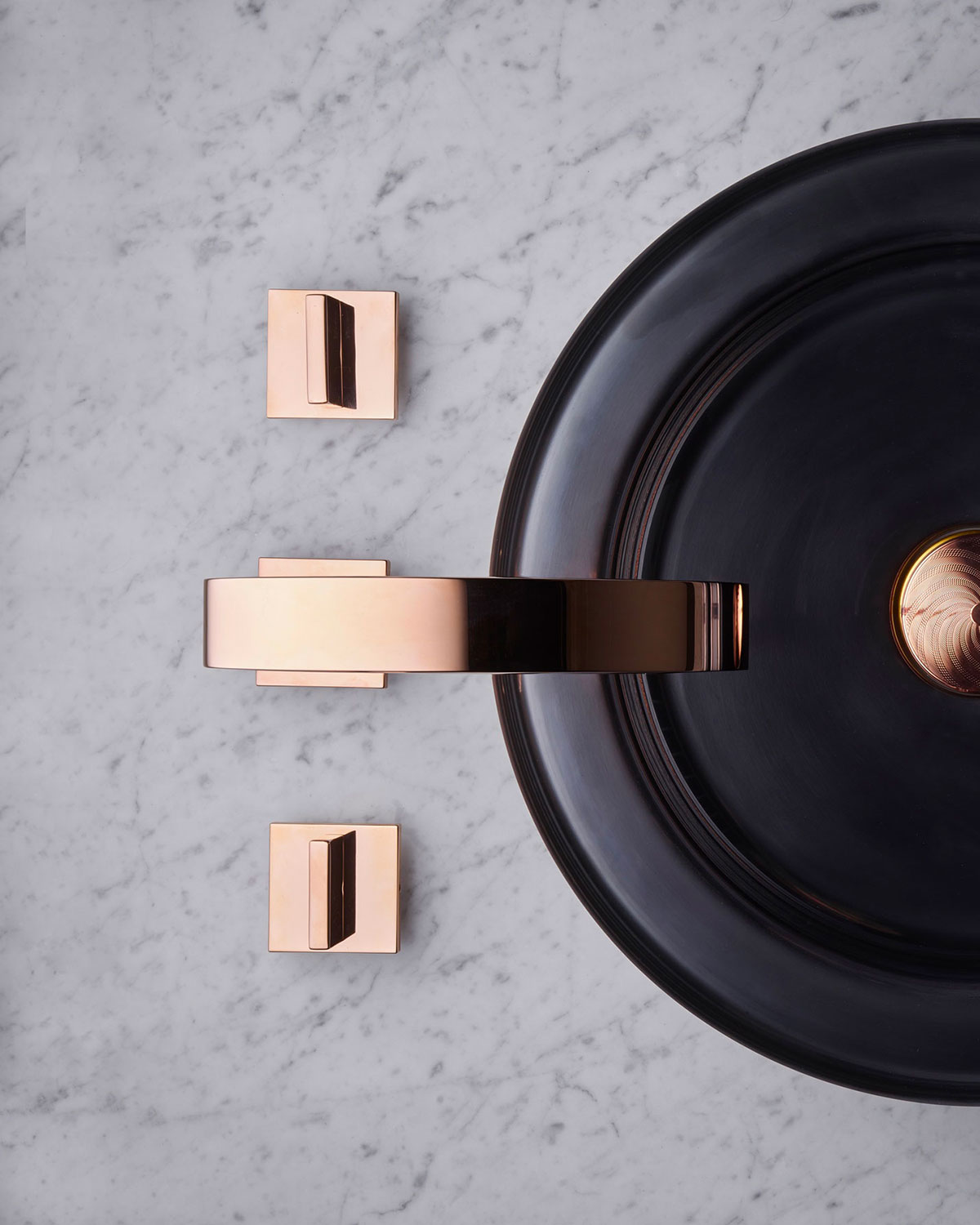
Metal in the heart of artistic direction. Pure form, light, graphic point of view.

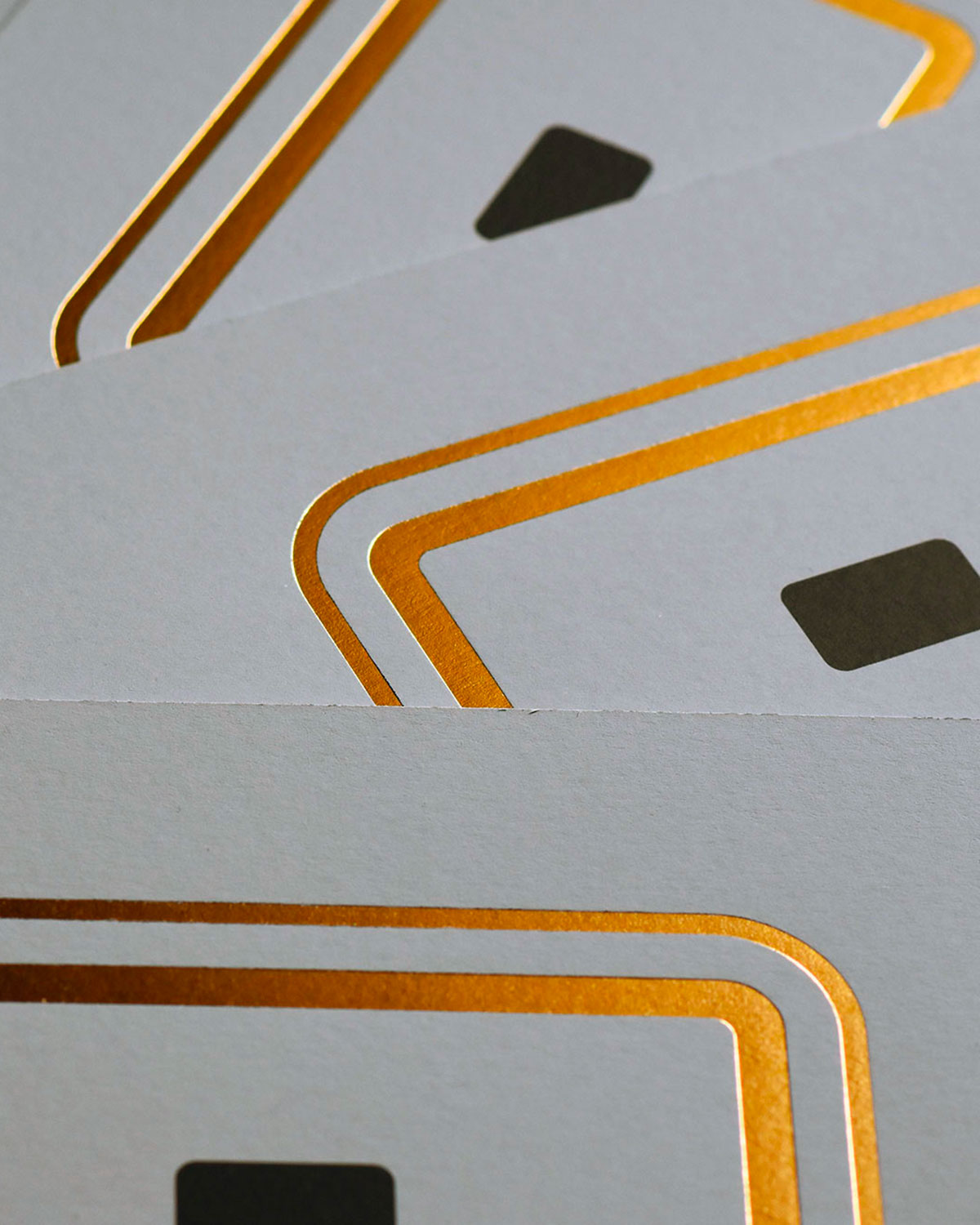
Corporate items

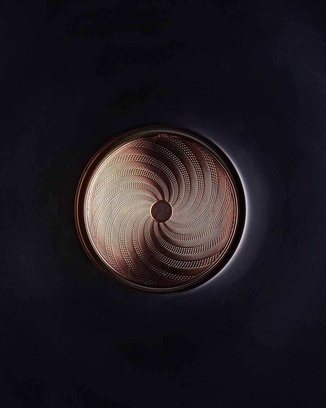
The emblematic shape of metal washbasin  – rectangle and its edge –  focus on essentiel elements of the product: shape, trap and embossing stamp.

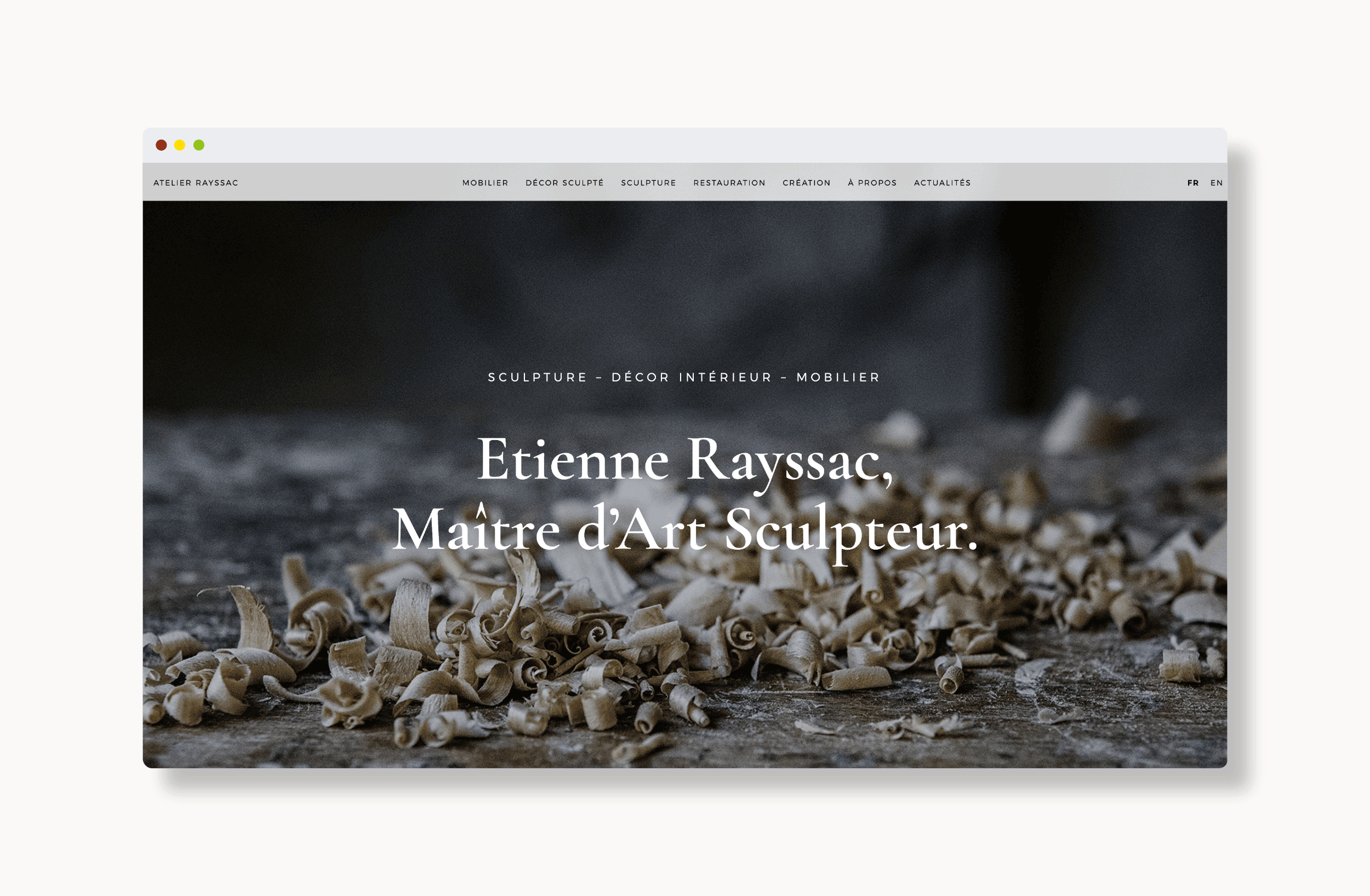
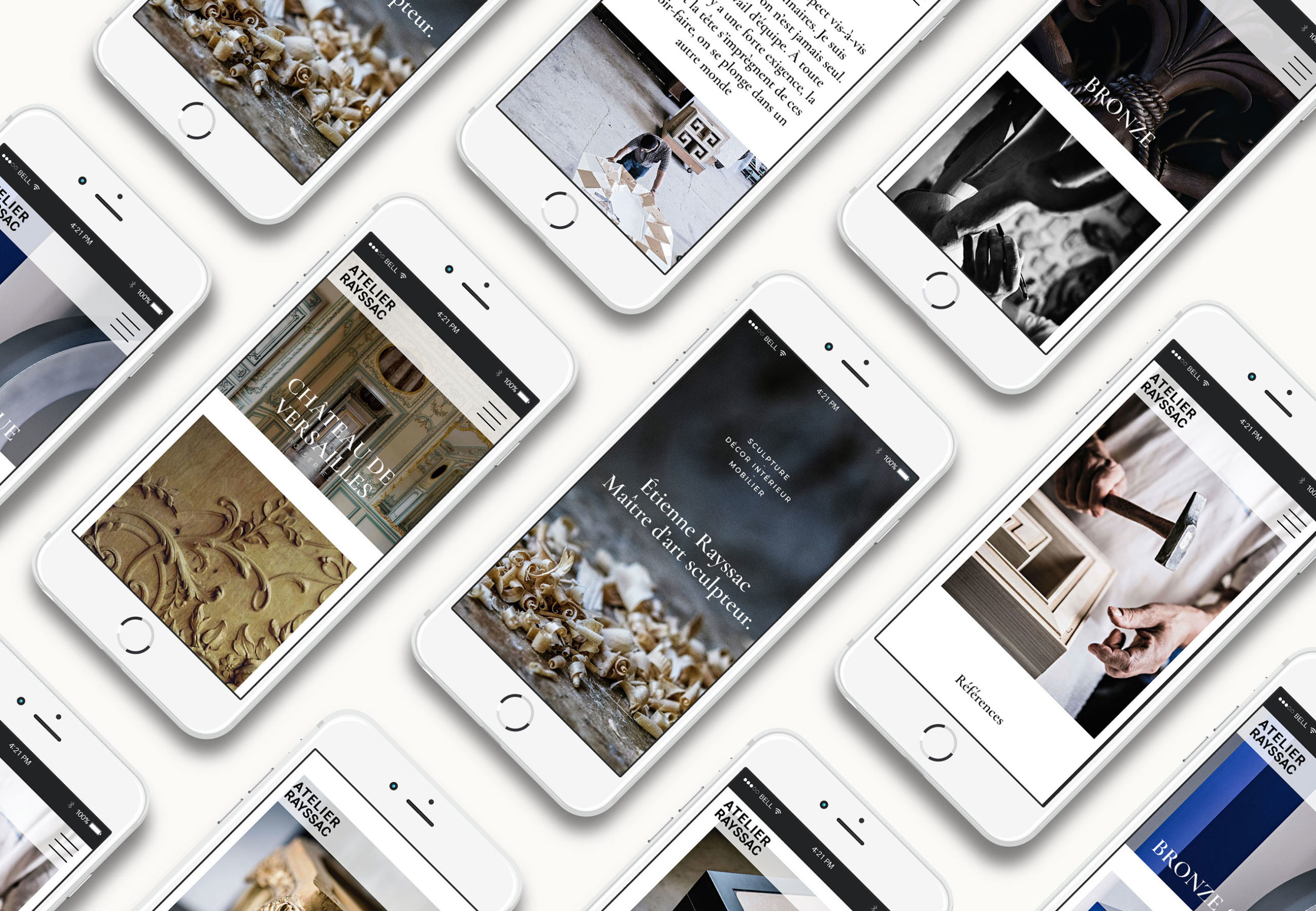
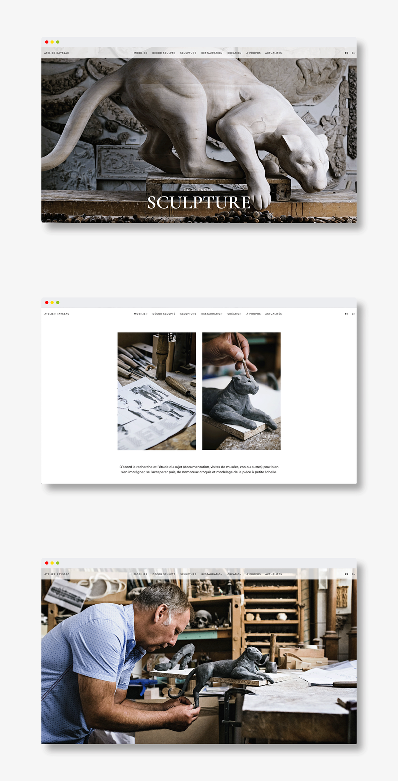
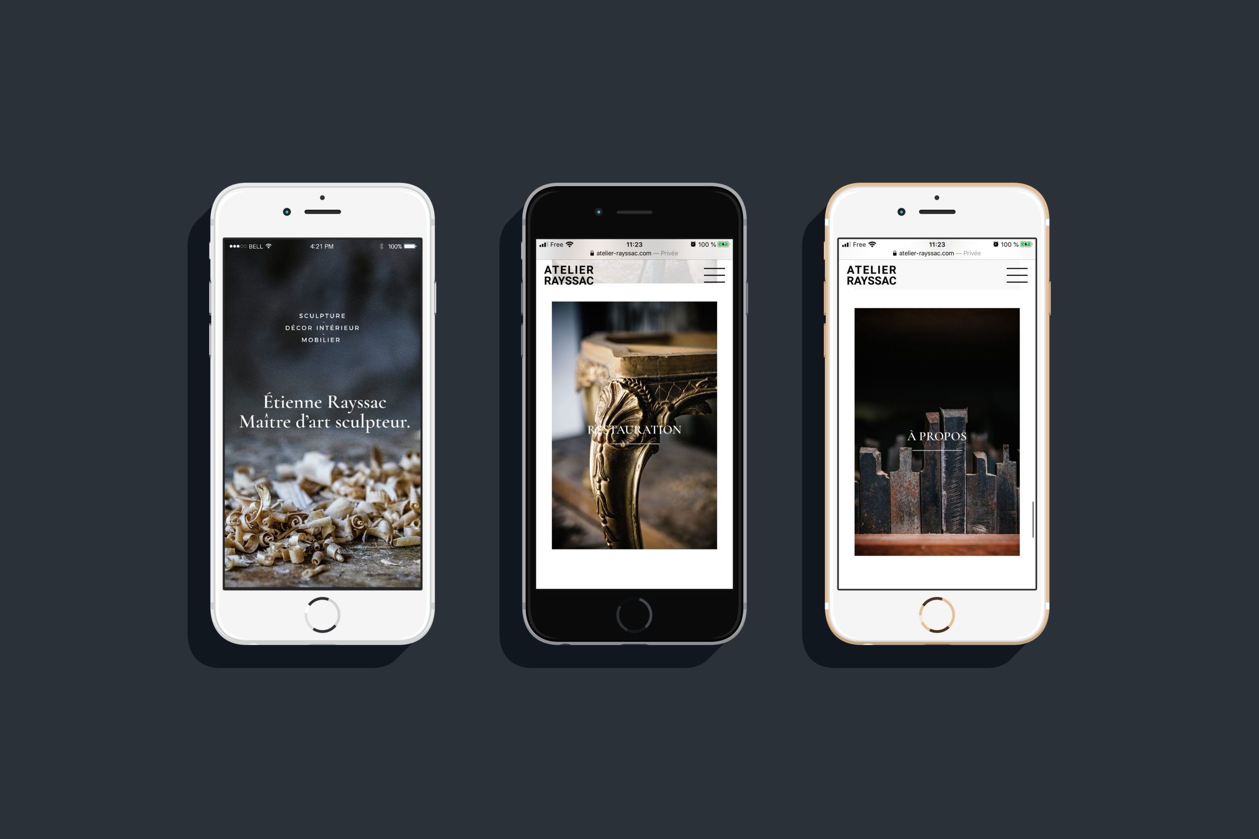
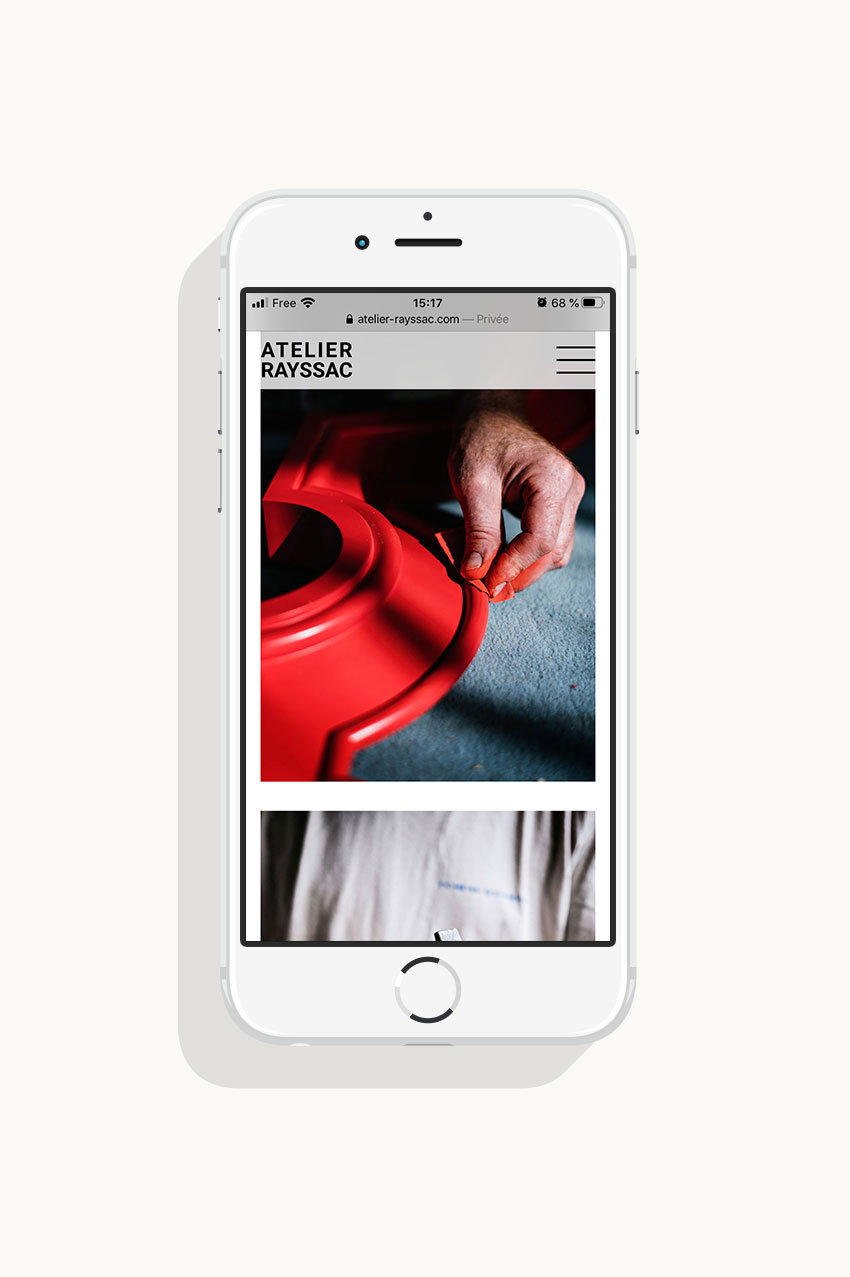
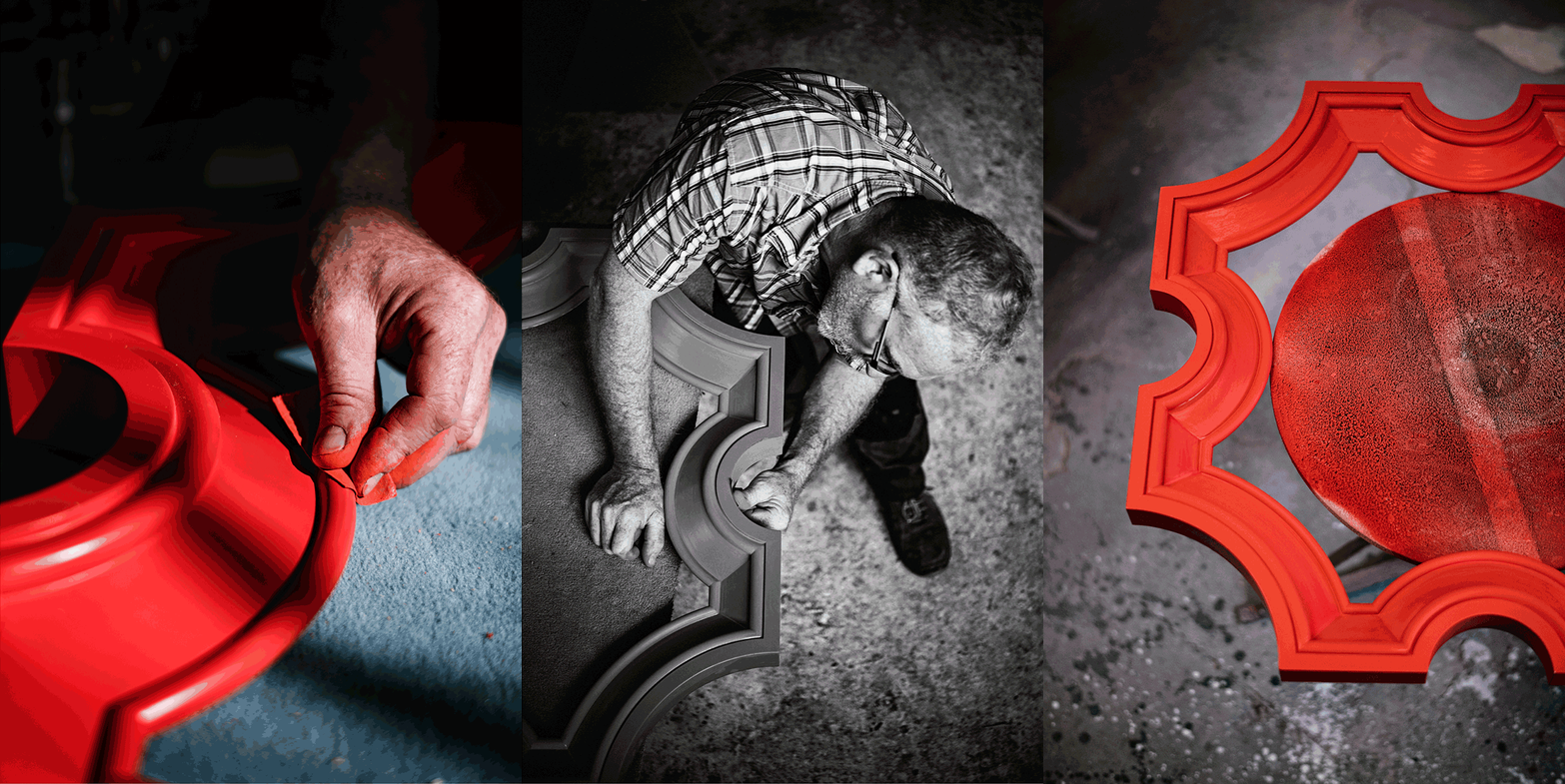
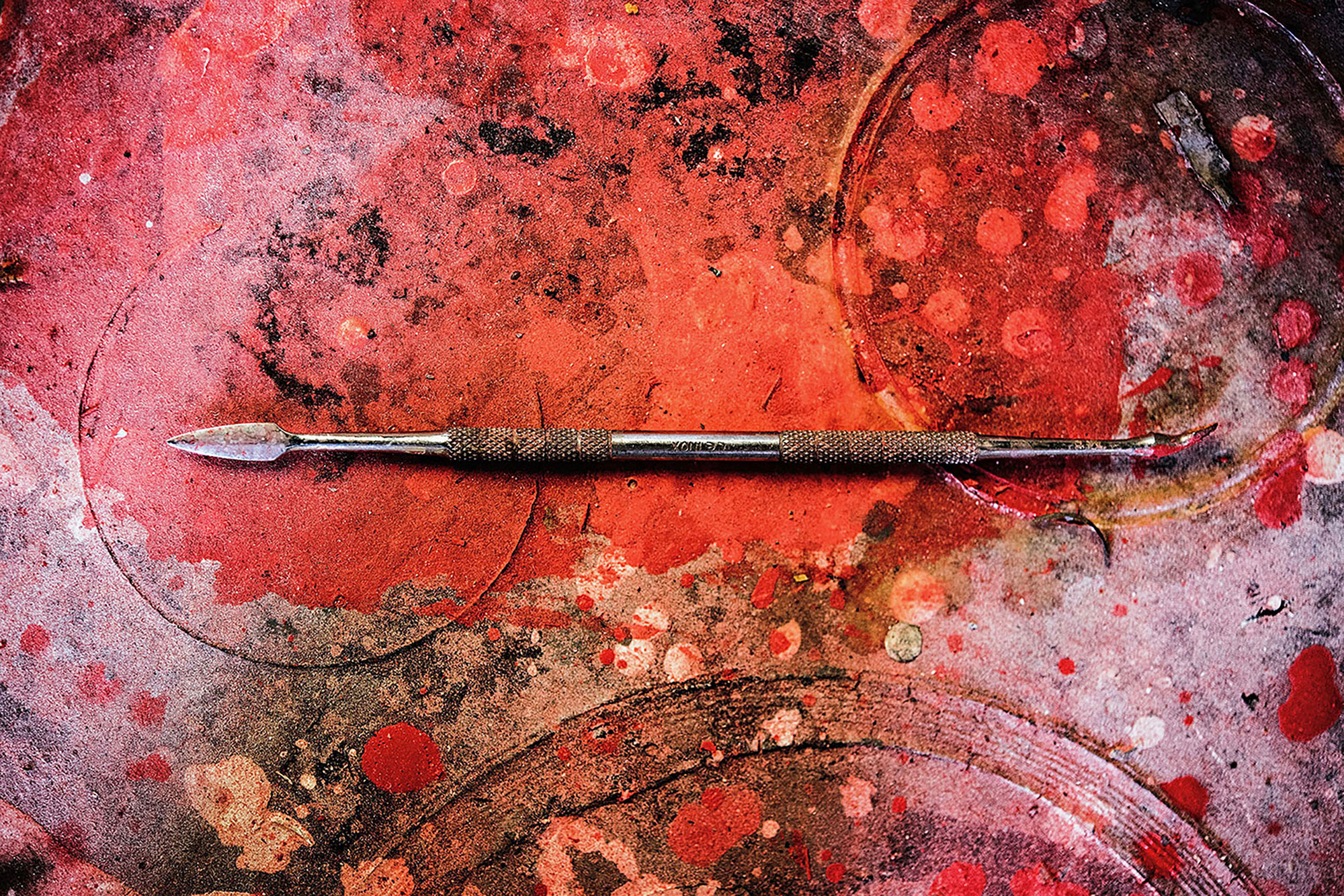
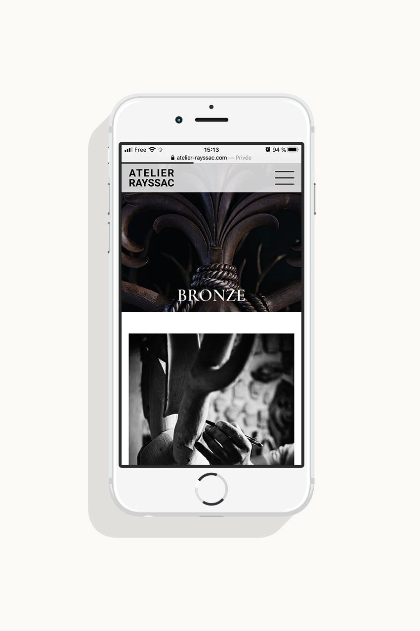
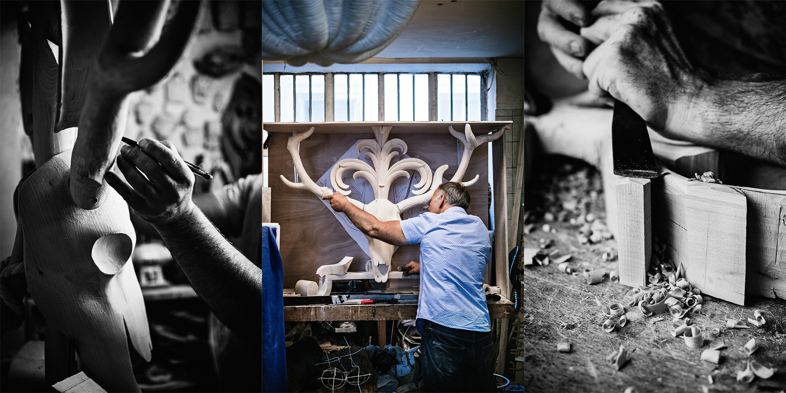
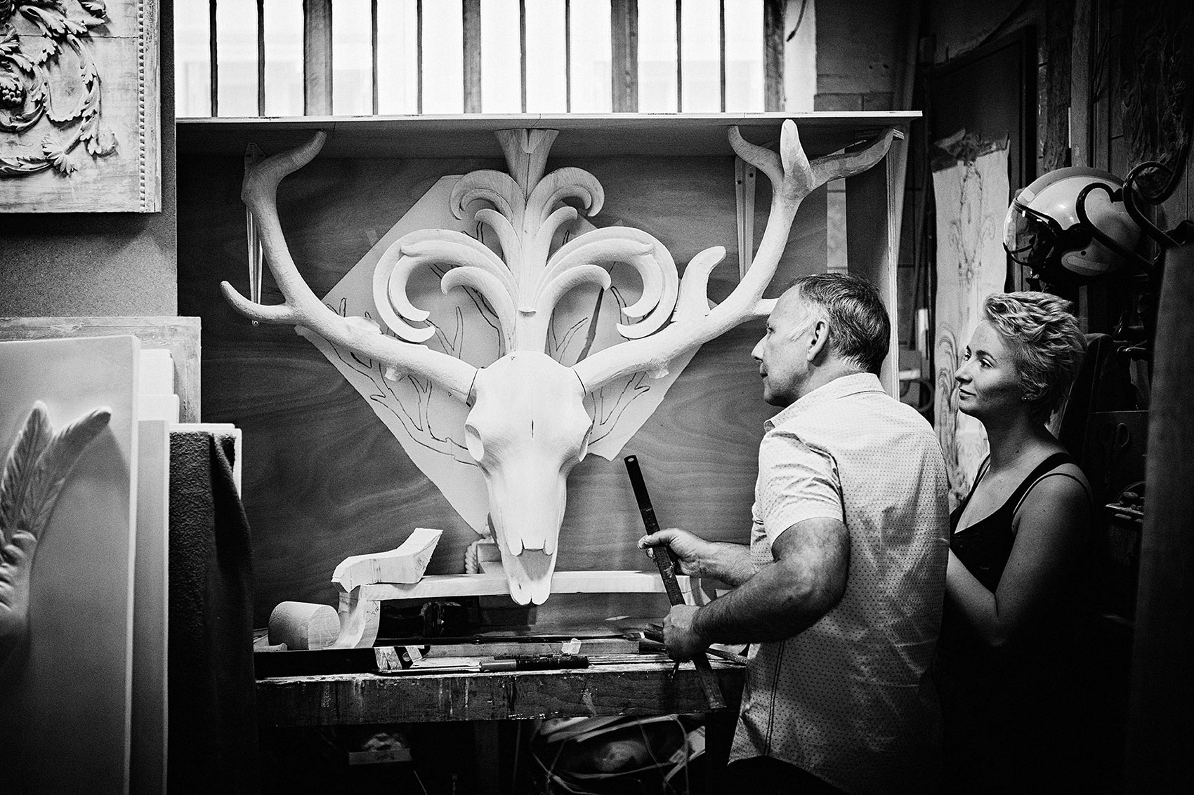
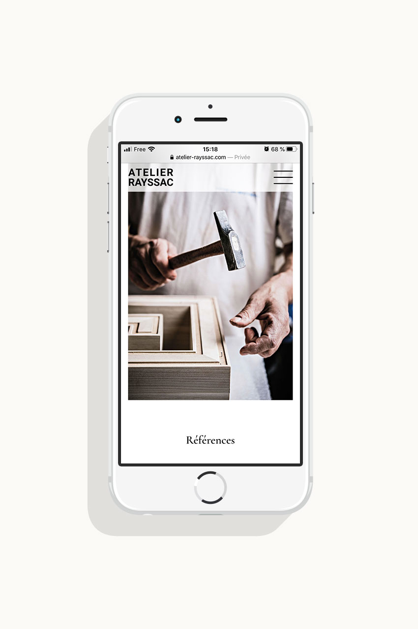
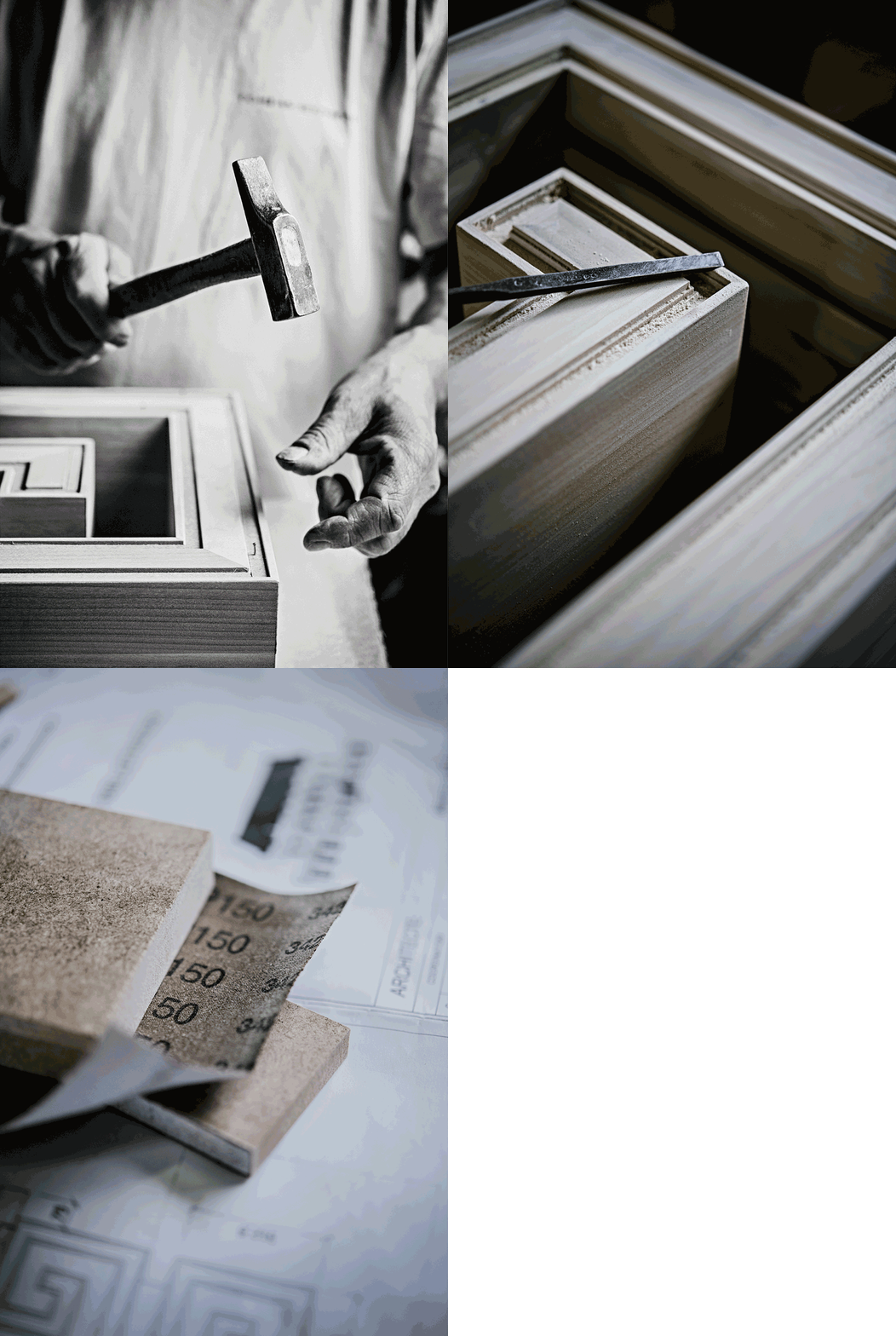
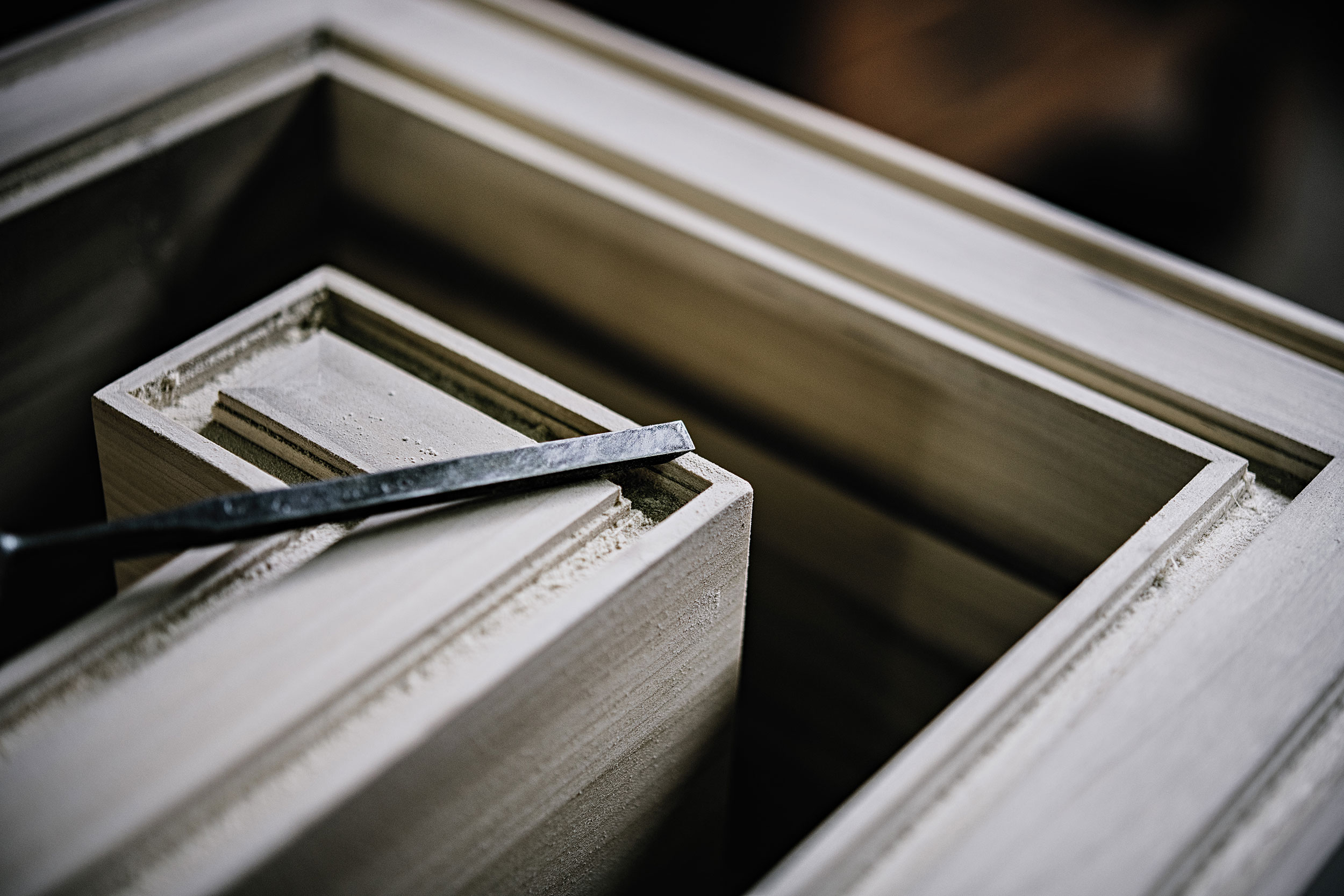
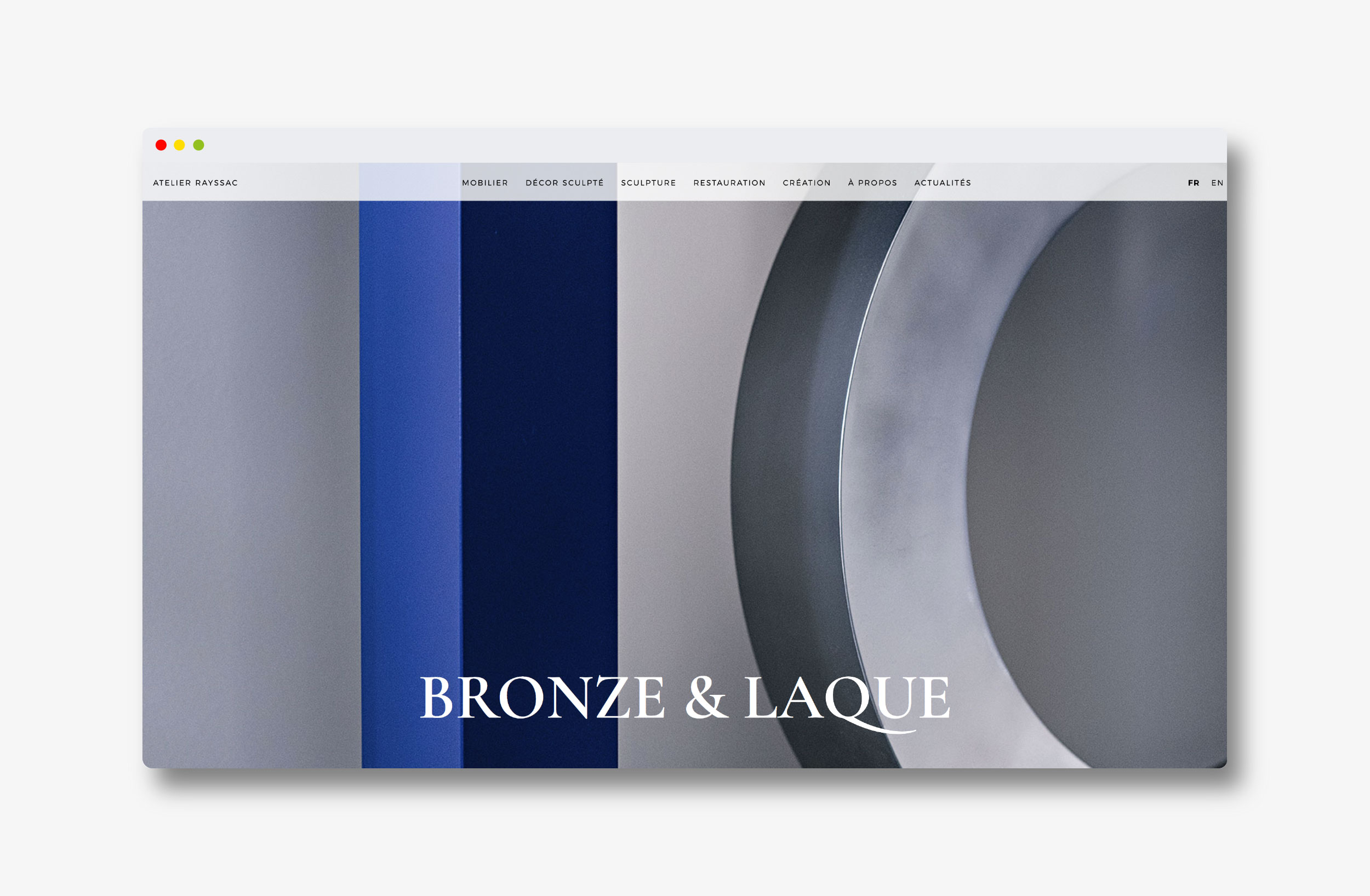
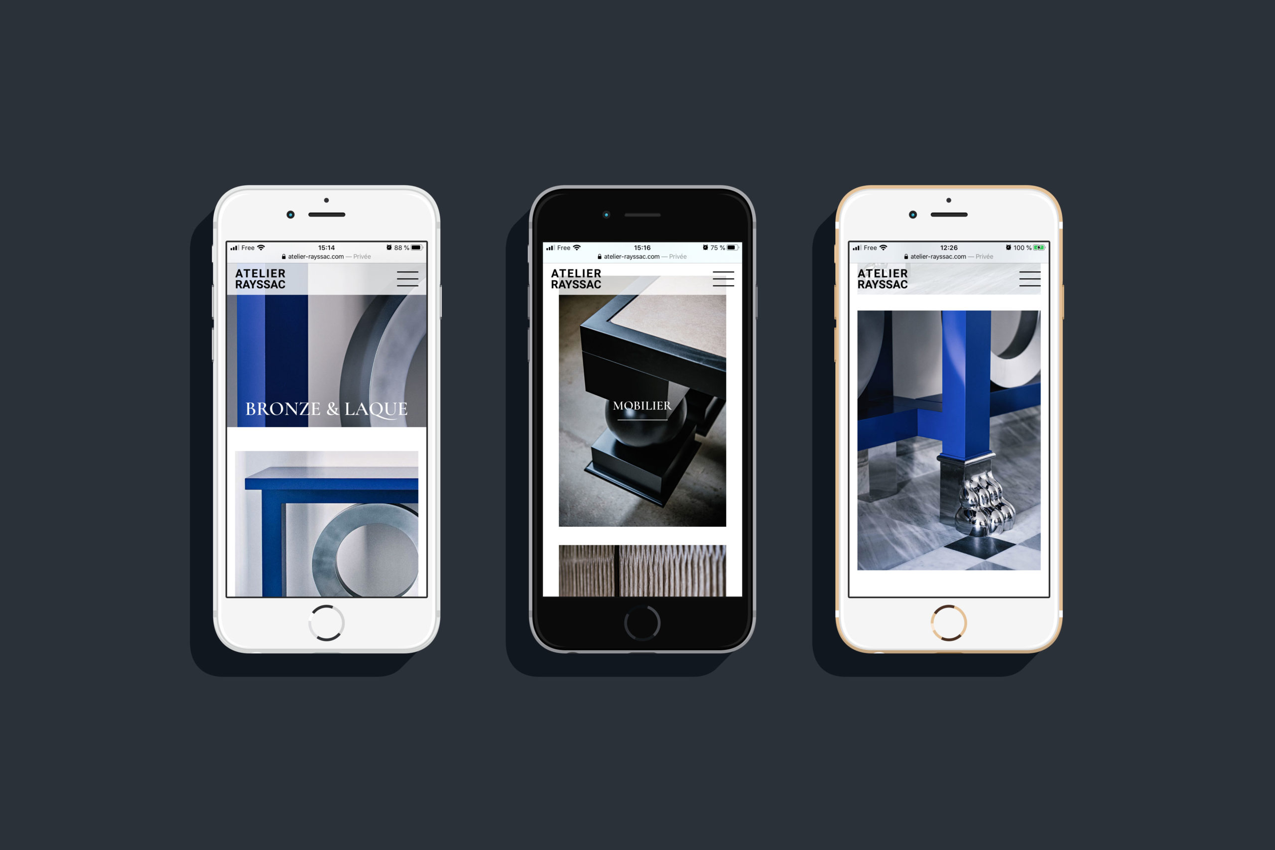
Bringing beauty to the dust: how to create a digital display for Master Artisan

Client
Atelier Rayssac

Mission
Art Direction, Photography,
Website Design

www.atelier-rayssac.com

Credits
Global Art Direction : Masha Kontchakova & Emma Brante
Photography art direction : Masha Kontchakova
Web art direction, Ul, UX design : Masha Kontchakova & Emma Brante
Photography : Franck Juery

Website & photography production

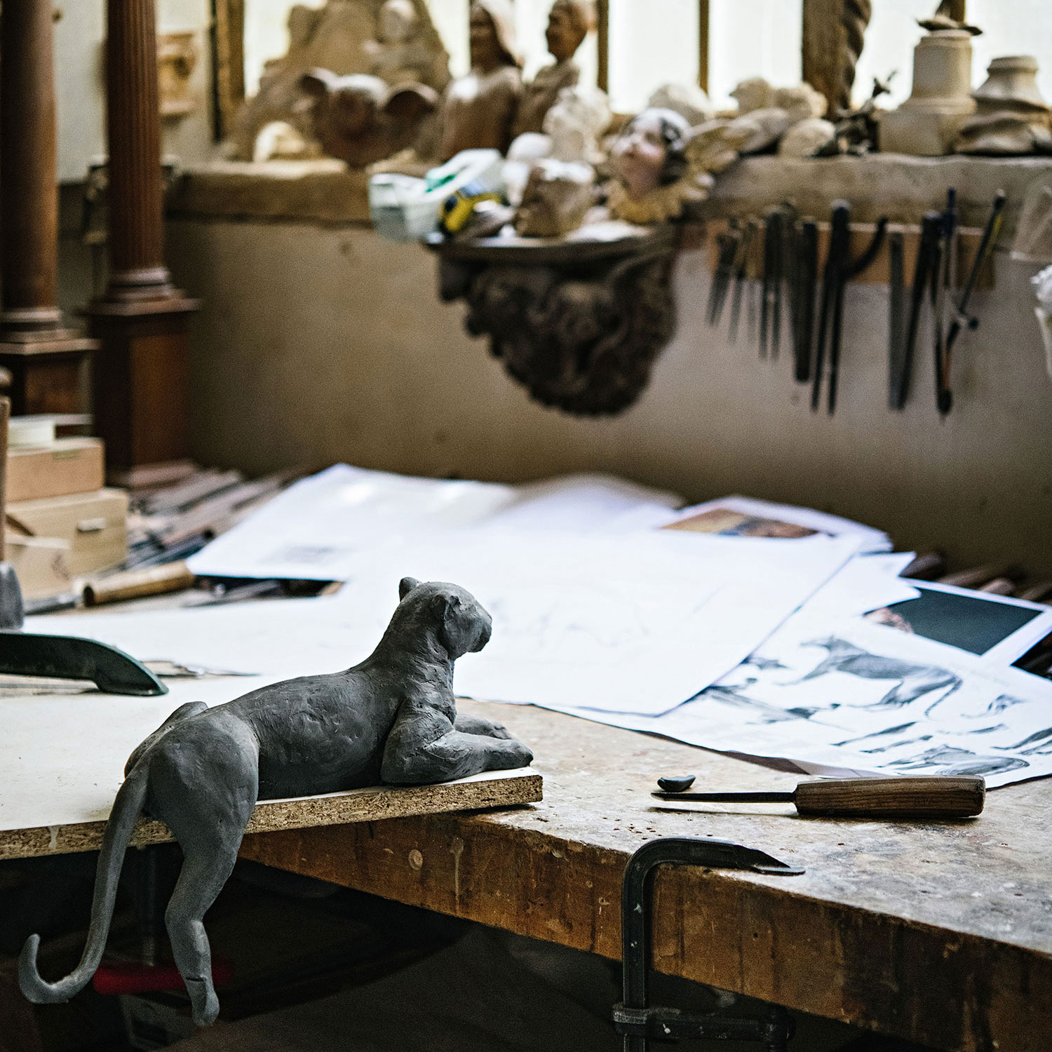
Photo report in the workshops

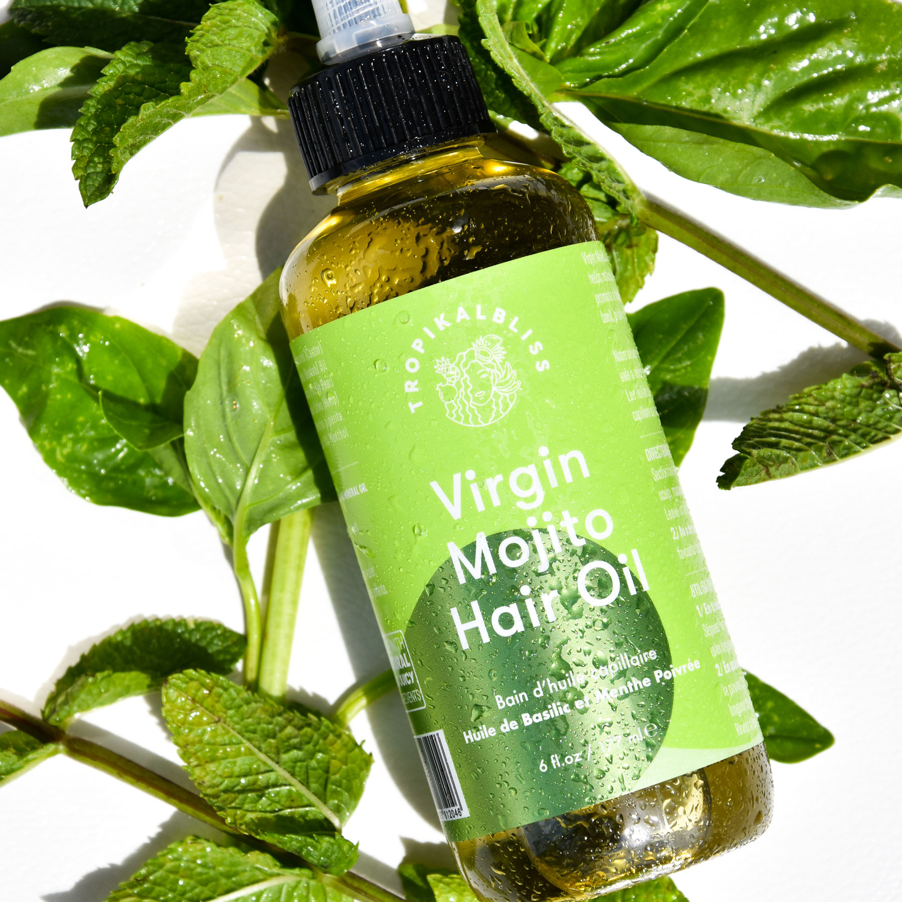
Haircare, for curls only.
Client
Tropikal Bliss

Mission
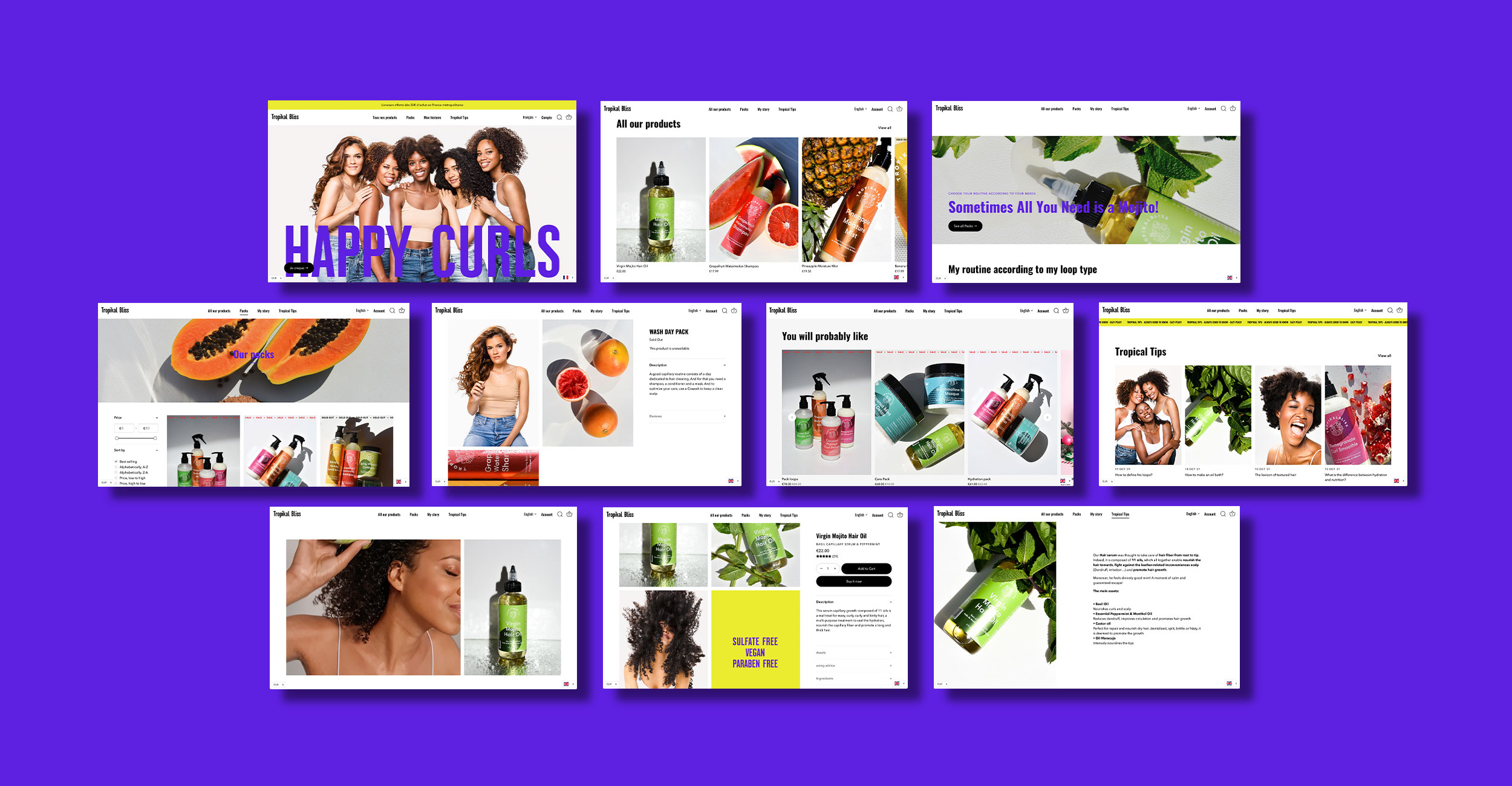
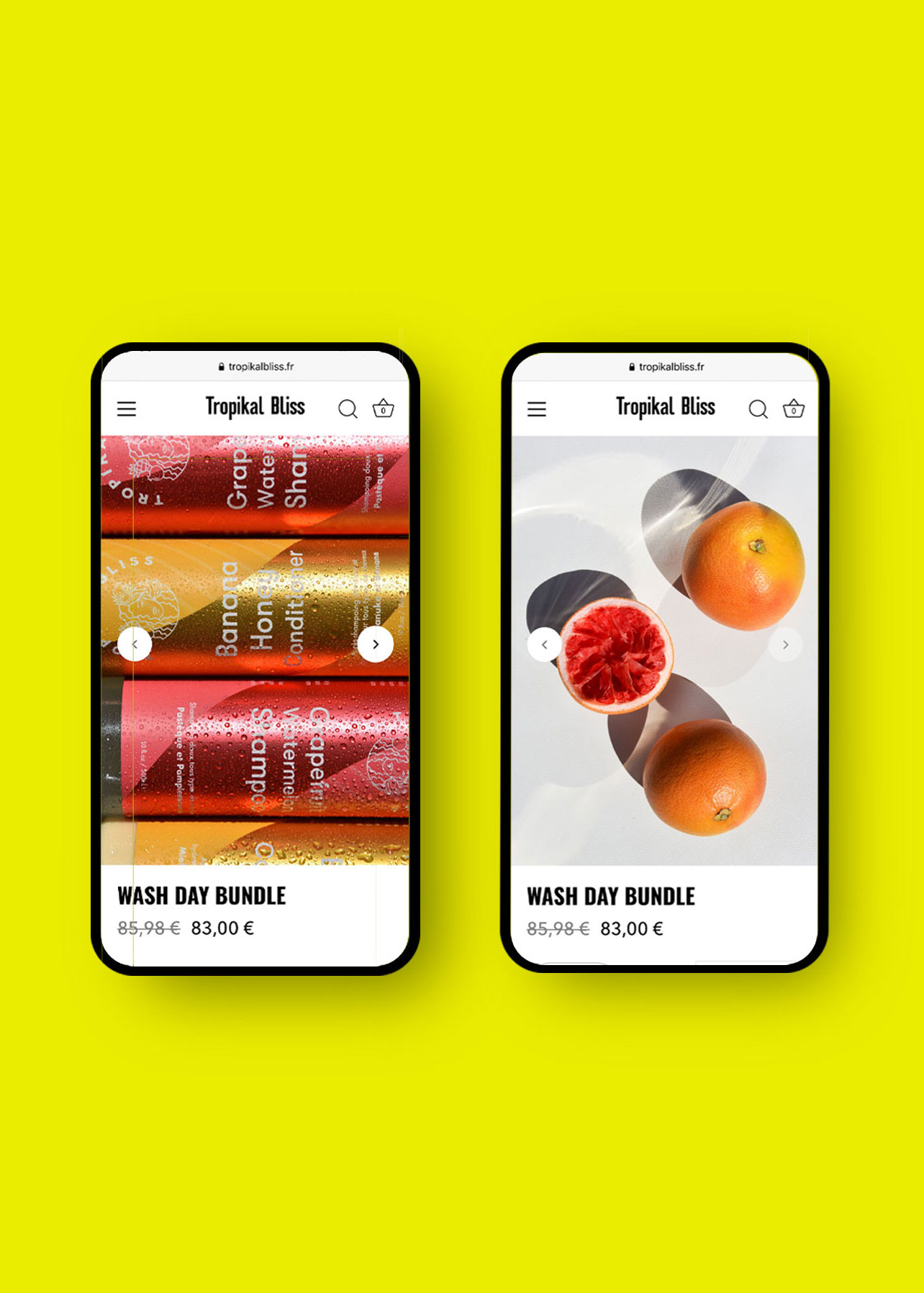
Brand Strategy, E-shop, Web Design,
Brand Messaging, Client Experience,
Art Direction, Photography

Web site
www.tropikalbliss.fr

Photo © Masha Kontchakova Frontline Studio, © Kasia Matenska

2-Frontline-Studio-branding-webdesign-photo-production-shooting-communicaiton-agency-paris
5-Frontline-Studio-branding-webdesign-photo-production-shooting-communicaiton-agency-paris

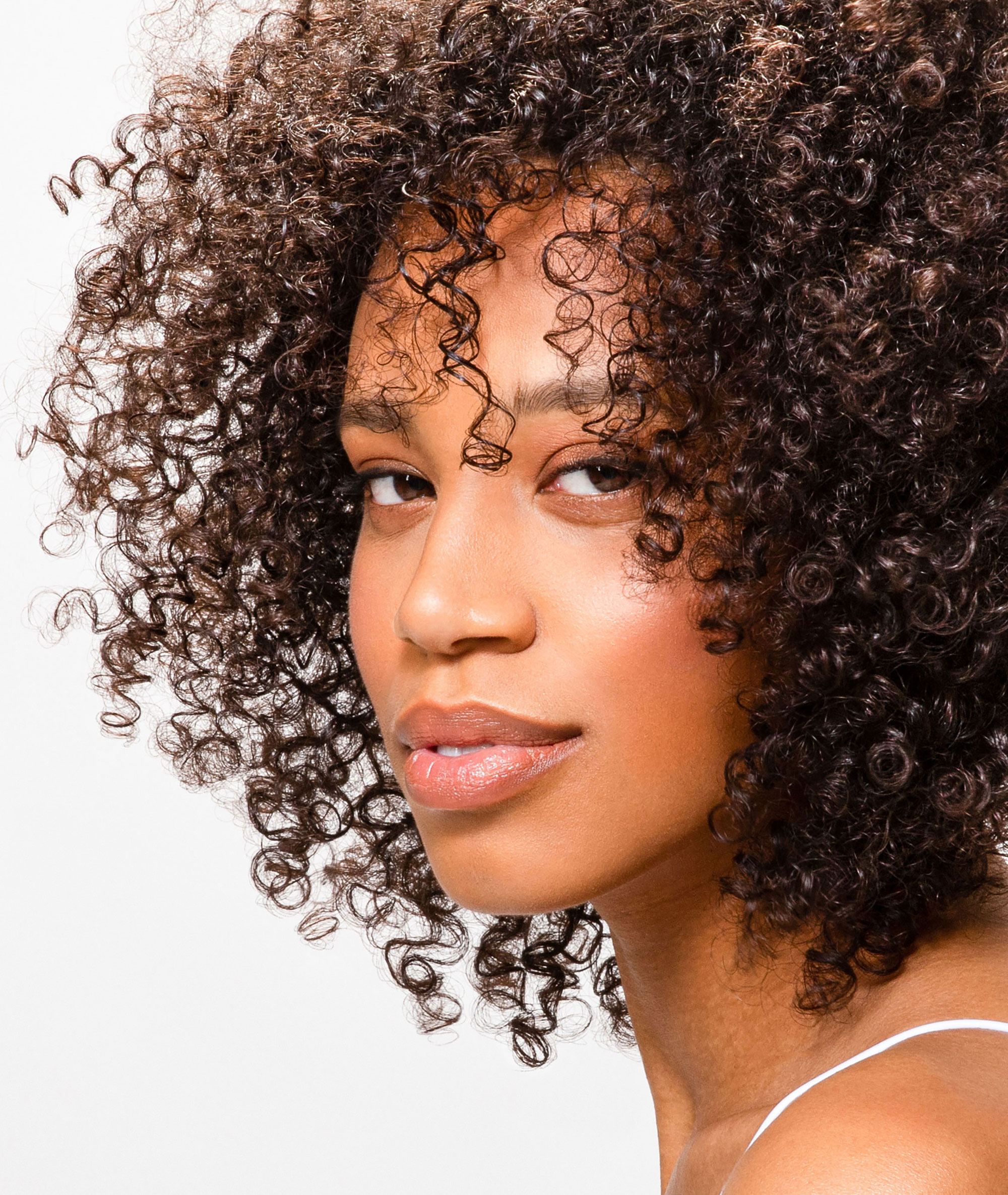
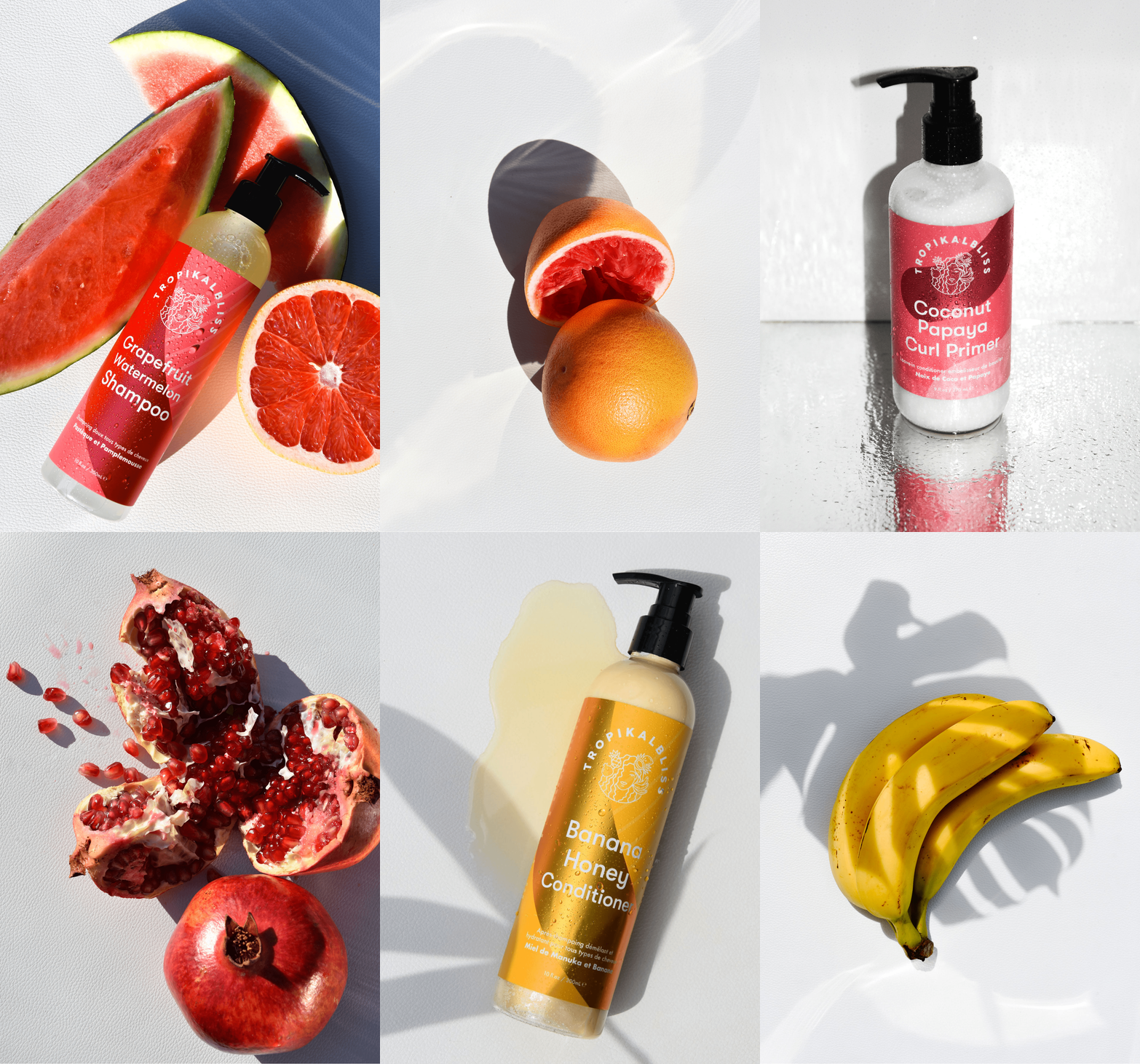
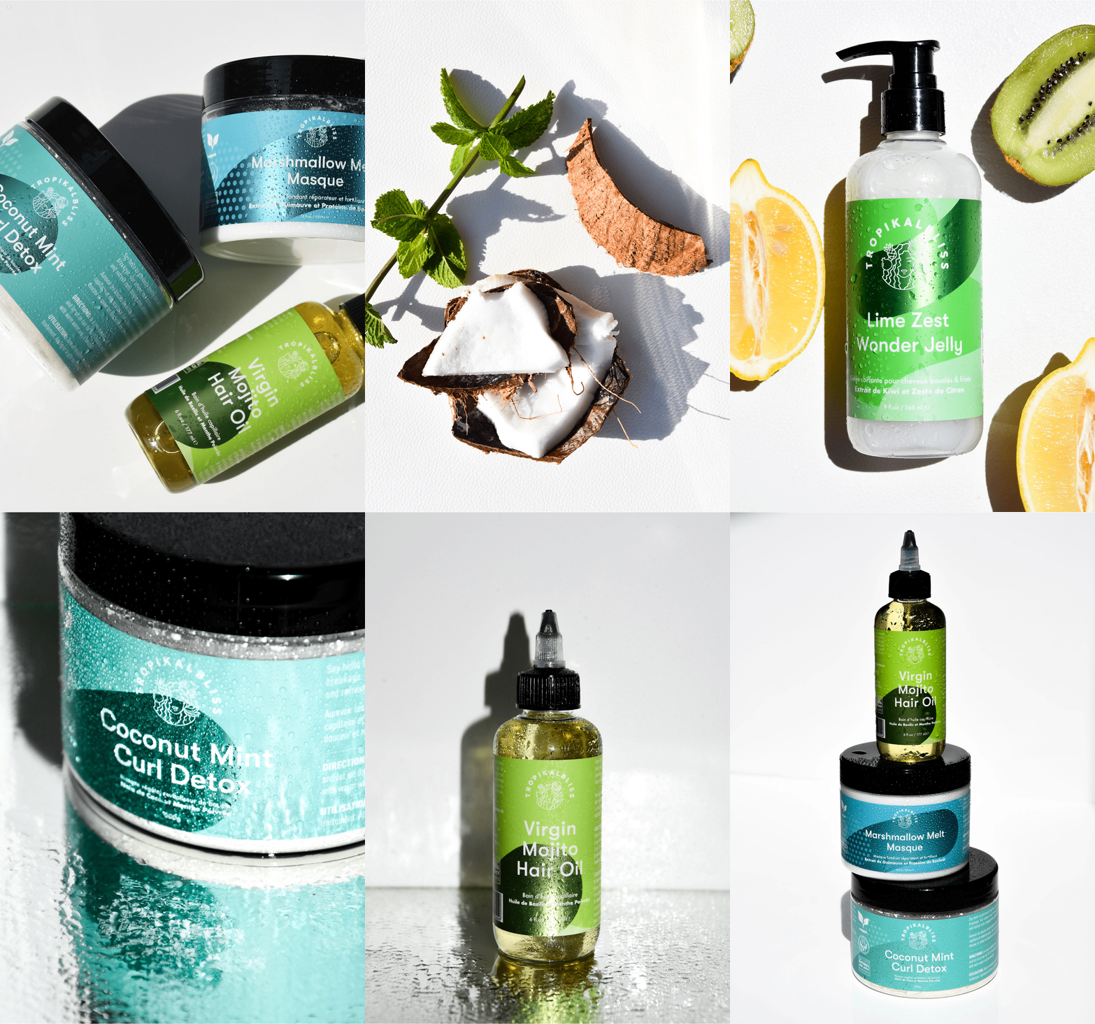
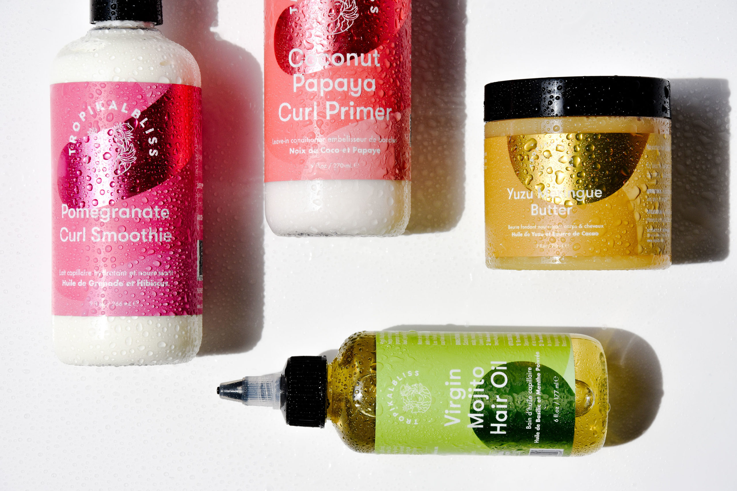
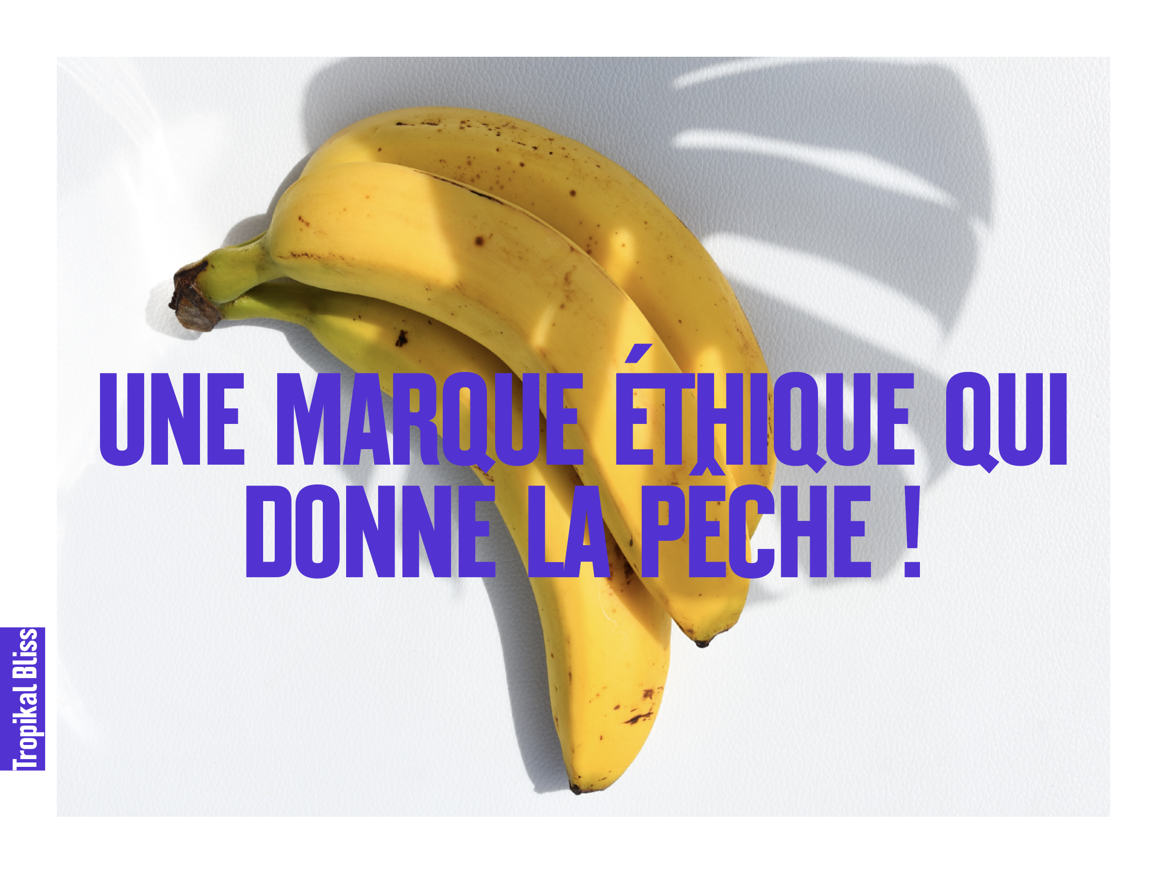
The position of Tropikal Bliss is clear: vegan products based on fruits for all types of curly hair. That was a good start!
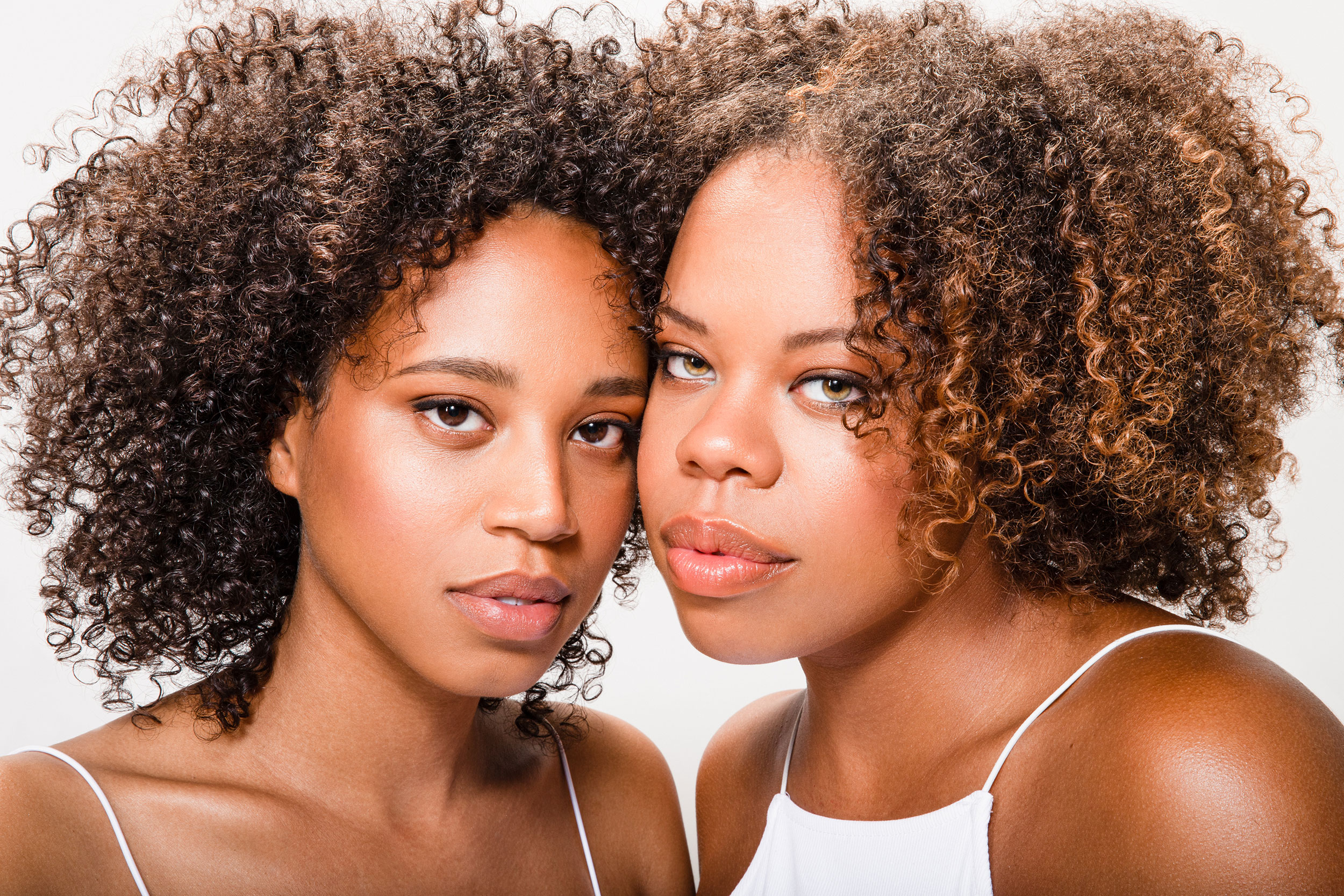
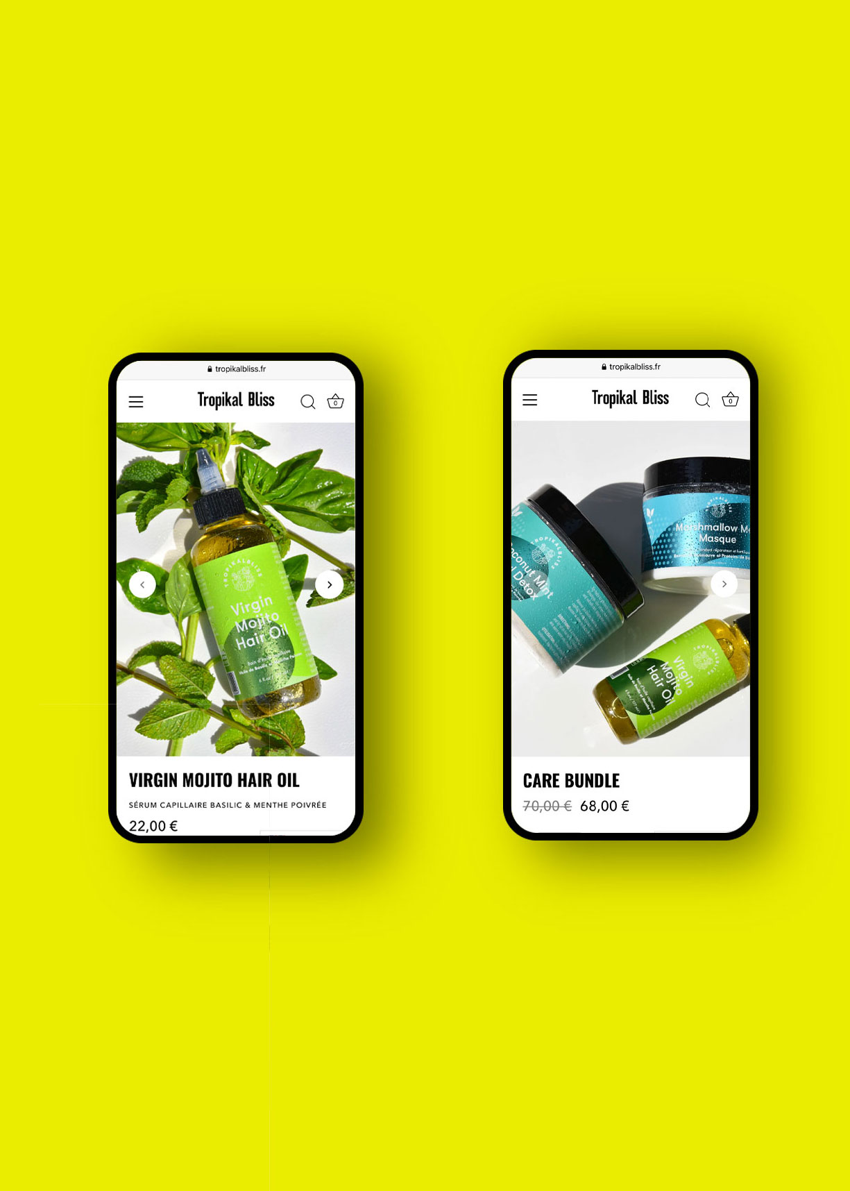
Our job was to create a visual world that could express all of these ideas in one image.

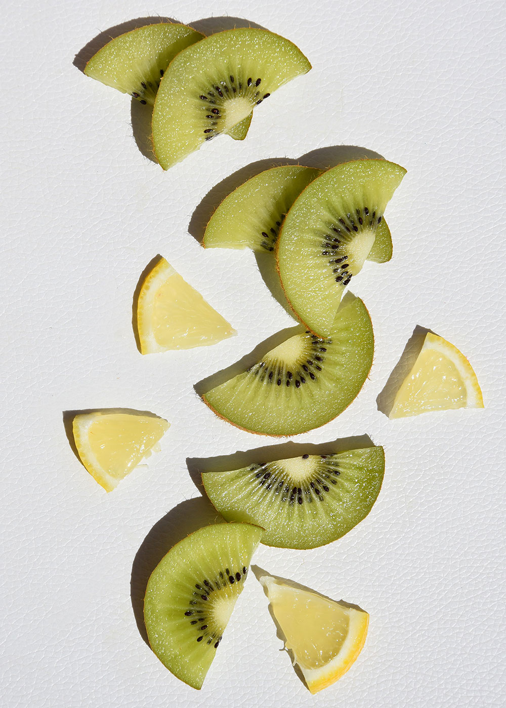
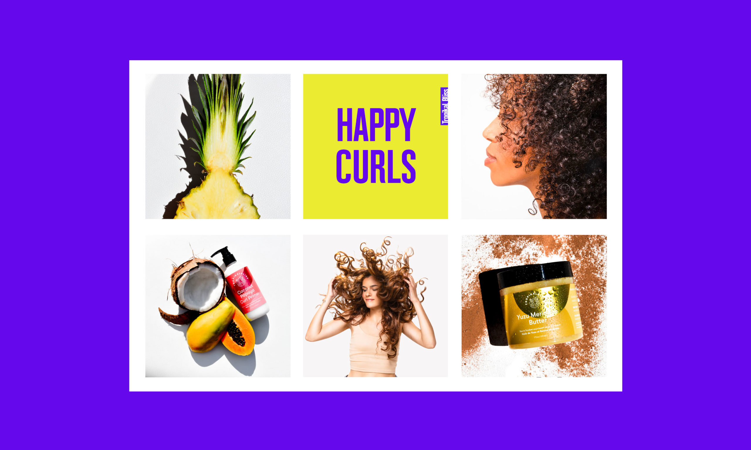
Happy Curls – was our answer.  It meant happy girls, fresh fruits, sunny light and a dynamic feeling of joy and health.

Dynamic, fun, fresh!

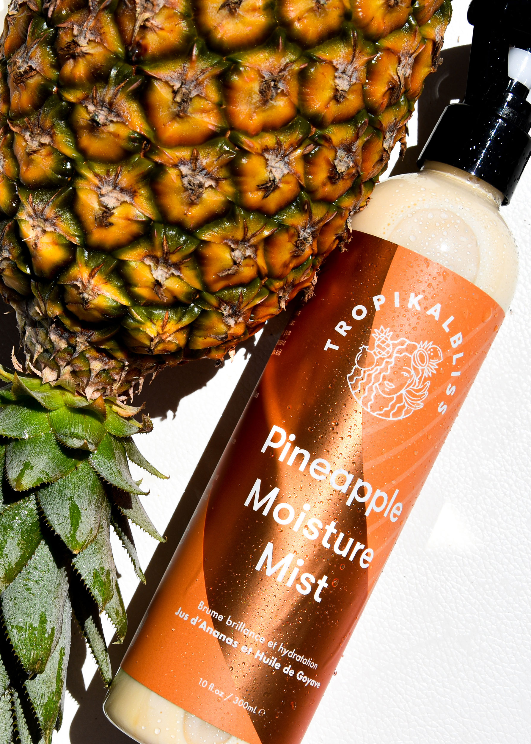
We based the Tropikal Bliss’s brand identity on striking and lively photography where fruits look so fresh that you want to eat them and girls look so happy that you want to know them.

The artistic direction is based on a spontaneous feeling of happiness and joy.

frontline-studio-branding-website-design-photography
10-Frontline-Studio-production-shooting-communicaiton-agency-paris-tropikal-bliss
24-Frontline-Studio-branding-webdesign-photo-production-shooting-communicaiton-agency-paris
25-Frontline-Studio-branding-webdesign-photo-production-shooting-communicaiton-agency-paris
26-Frontline-Studio-branding-webdesign-photo-production-shooting-communicaiton-agency-paris
25-Frontline-Studio-branding-webdesign-photo-production-shooting-communicaiton-agency-paris

Managing the brand image in order to bring it to new young consumers

Client
La Cornue

Mission
Brand Strategy, Brand Identity,
Brand Messaging, Brand Communication,
Art Direction, Photography,
Press, Public relations,
Launch Conception & Organisation

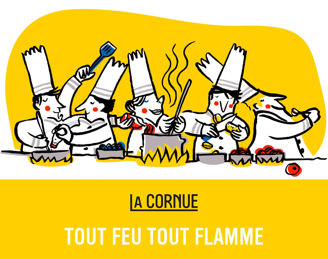
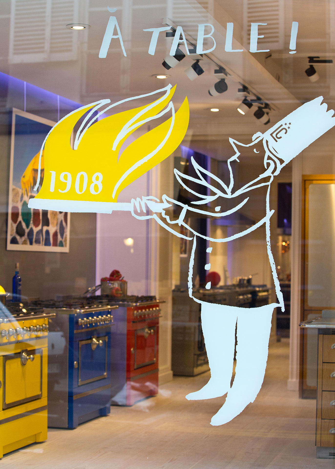
For five years we created and managed the worldwide image and PR department for La Cornue, a benchmark for excellence in the world of gastronomy. Managing the company’s French heritage and its representation throughout the world were the objectives of my mission as was the development of contemporary products for a new audience.

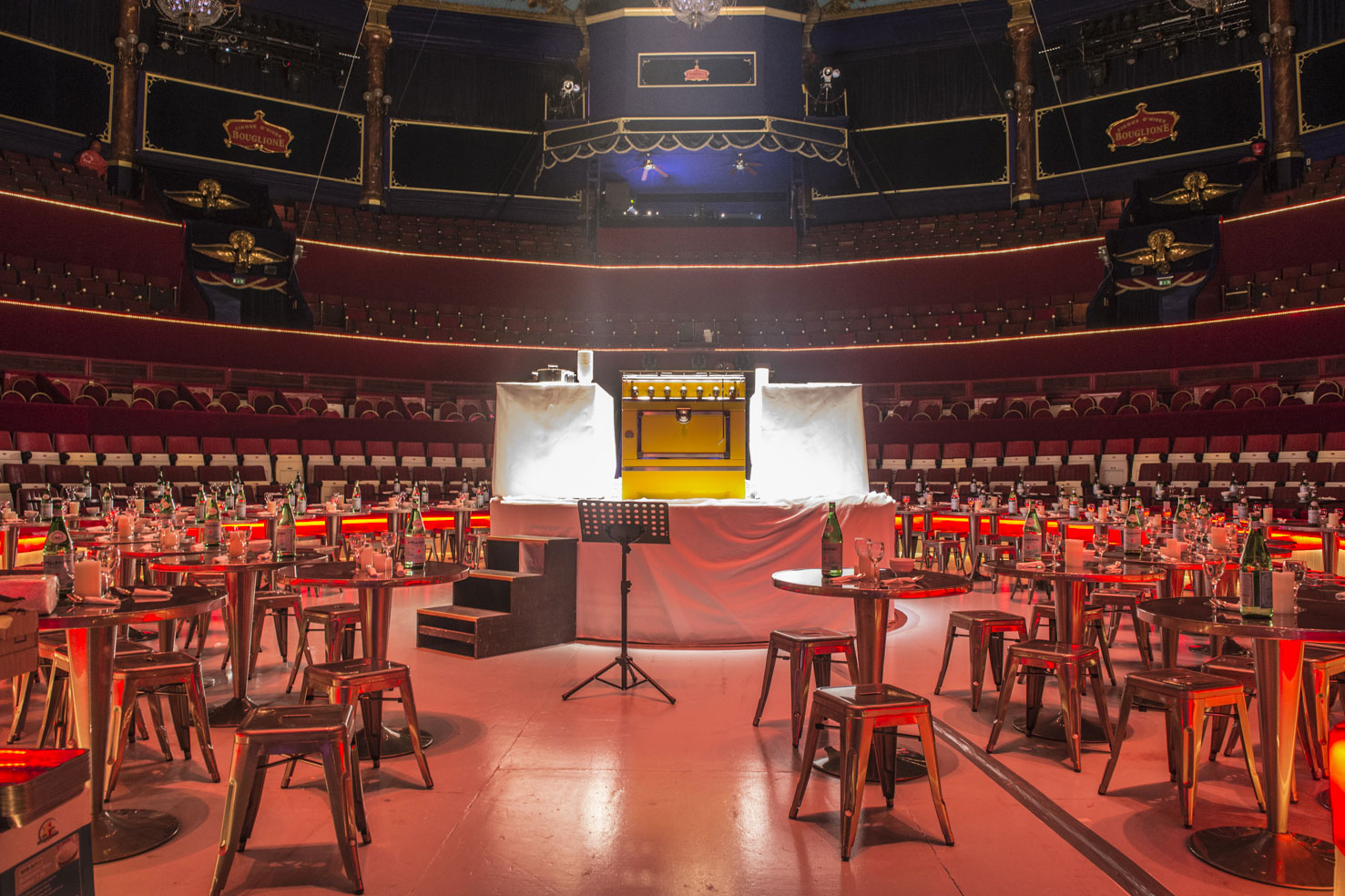
Drawing up marketing plans and new products, managing press agencies around the world, creating communication tools, launching new products, running events in the retailer network, public relations… I managed these missions and actions all over the world.

We designed with the help of a graphic design studio all the brand’s PR tools: sales offers, sales tools, cooking lessons, invitations, press kits…

The most relevant projects are explained in more detail on other pages on the website.

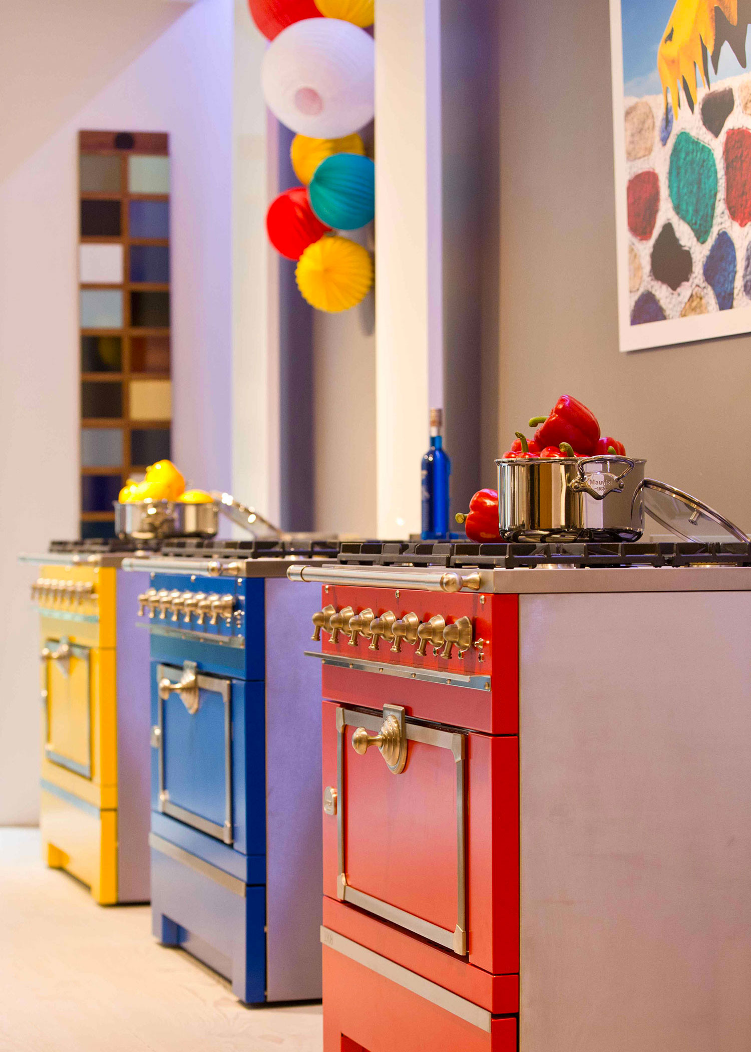
Showing the product as one would show a piece of jewelry

Advertisement campaigns & press images

How to enrich the historical world famous brand and bring them further: collab La Cornue & Lex Pott

Collab La Cornue by Jean-Michel Wilmotte

Launch a traditional brand into a world of design 

The creation of the “La Cornue by Wilmotte” line was a challenge for this manufacturer known for its traditional style. MKGB was consulted to organise a global launch with the press, retailers and customers.

La Cornue attended the Milan Furniture Show for the very first time. MKGB centralised the work of over ten PR agencies for the press international coverage.

Feeding the press, art direction, shooting, production…

Variation for the Foodistas generation

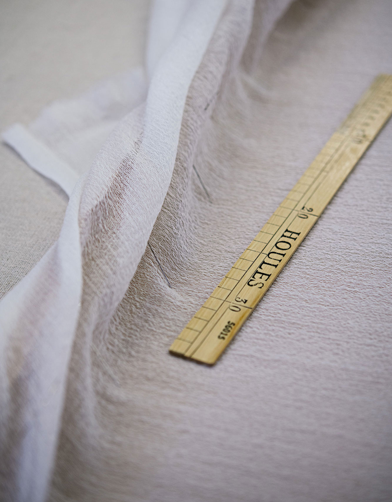
Revealing a world of softness. Photo & Website for Parisian upholsterer Philippe Coudray.

Client
Ateliers Philippe Coudray

Mission
Web Design, Editorial, Copywriting

www.ateliersphilippecoudray.com

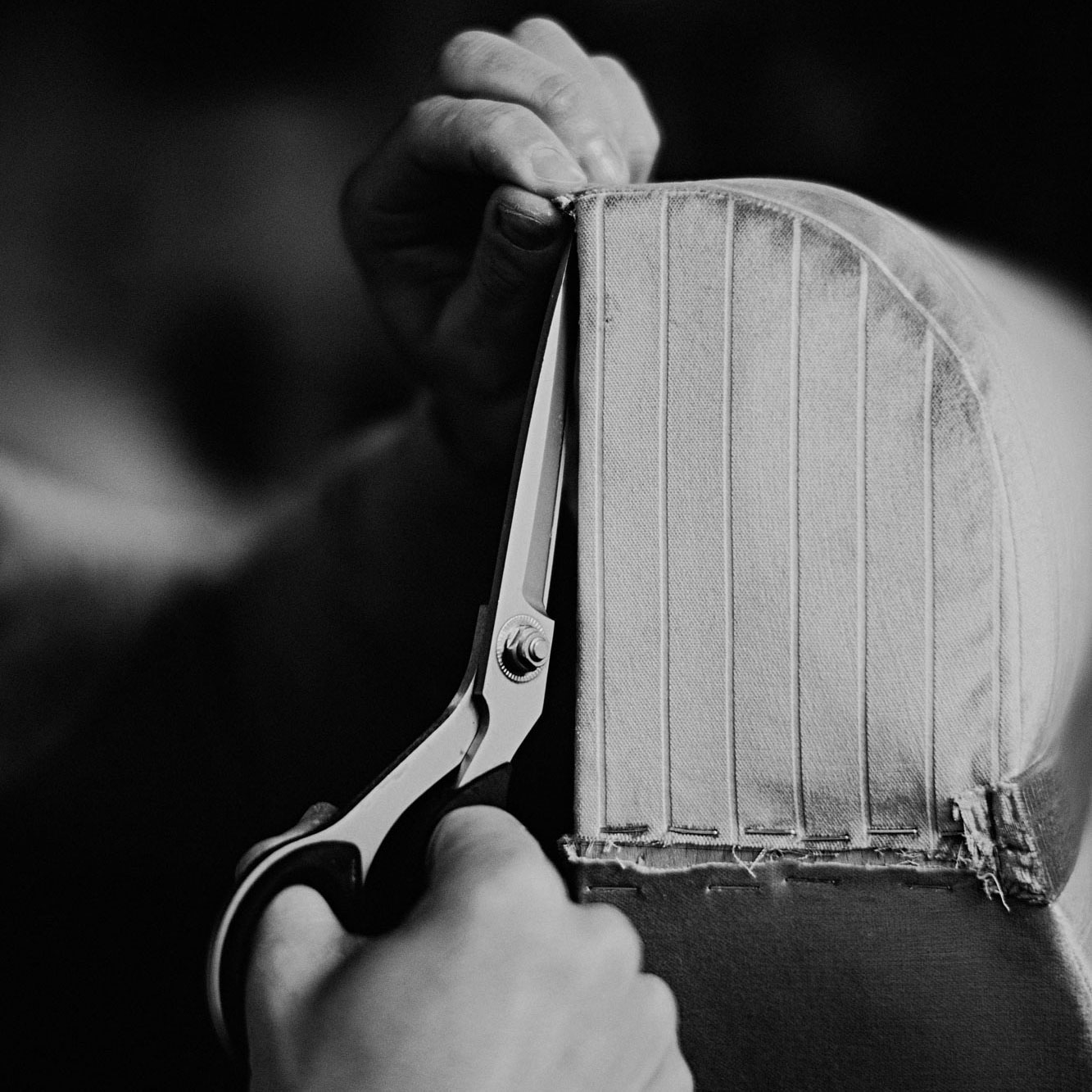
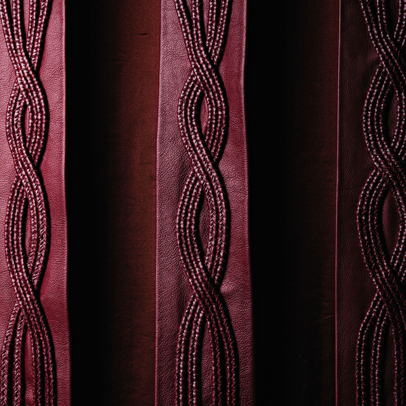
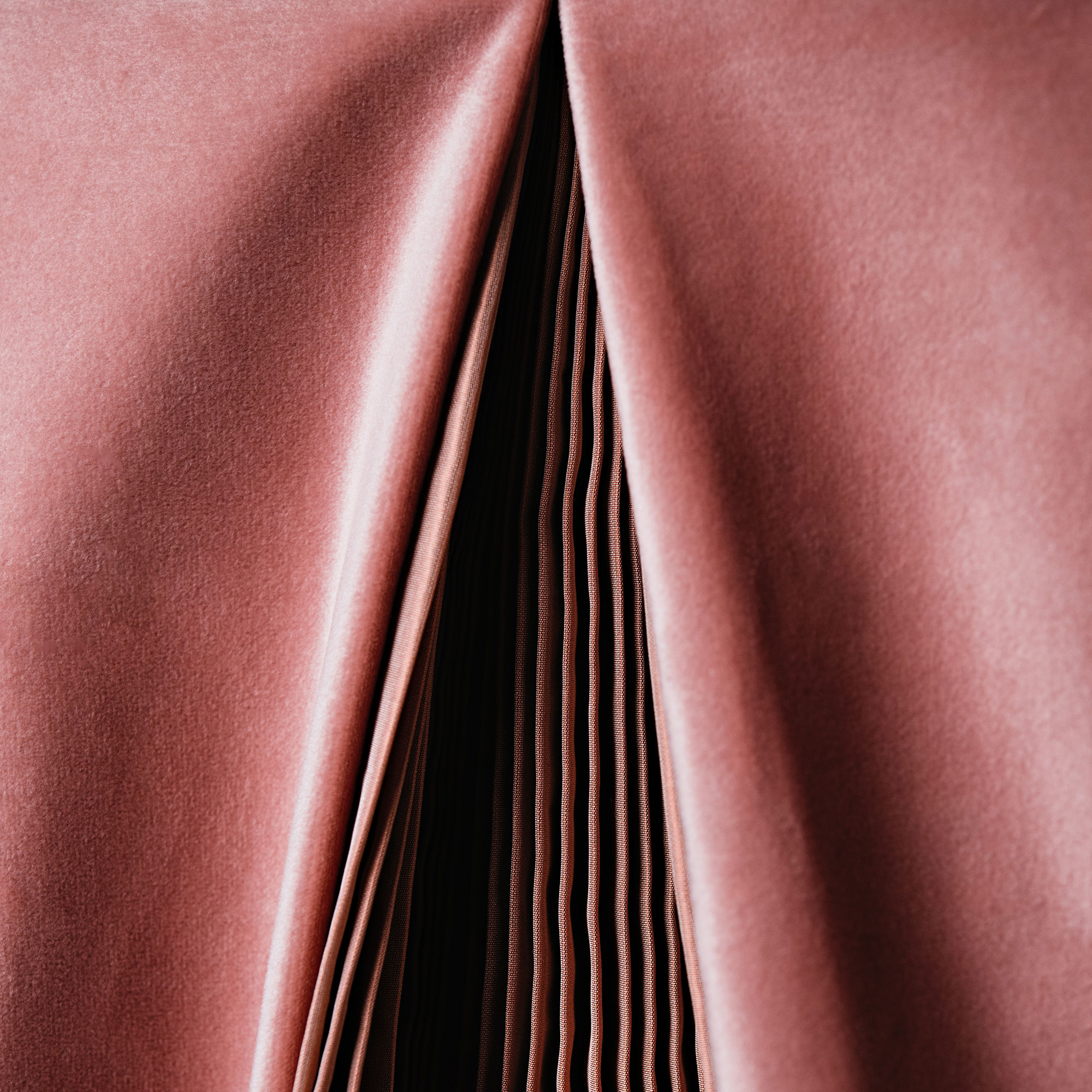
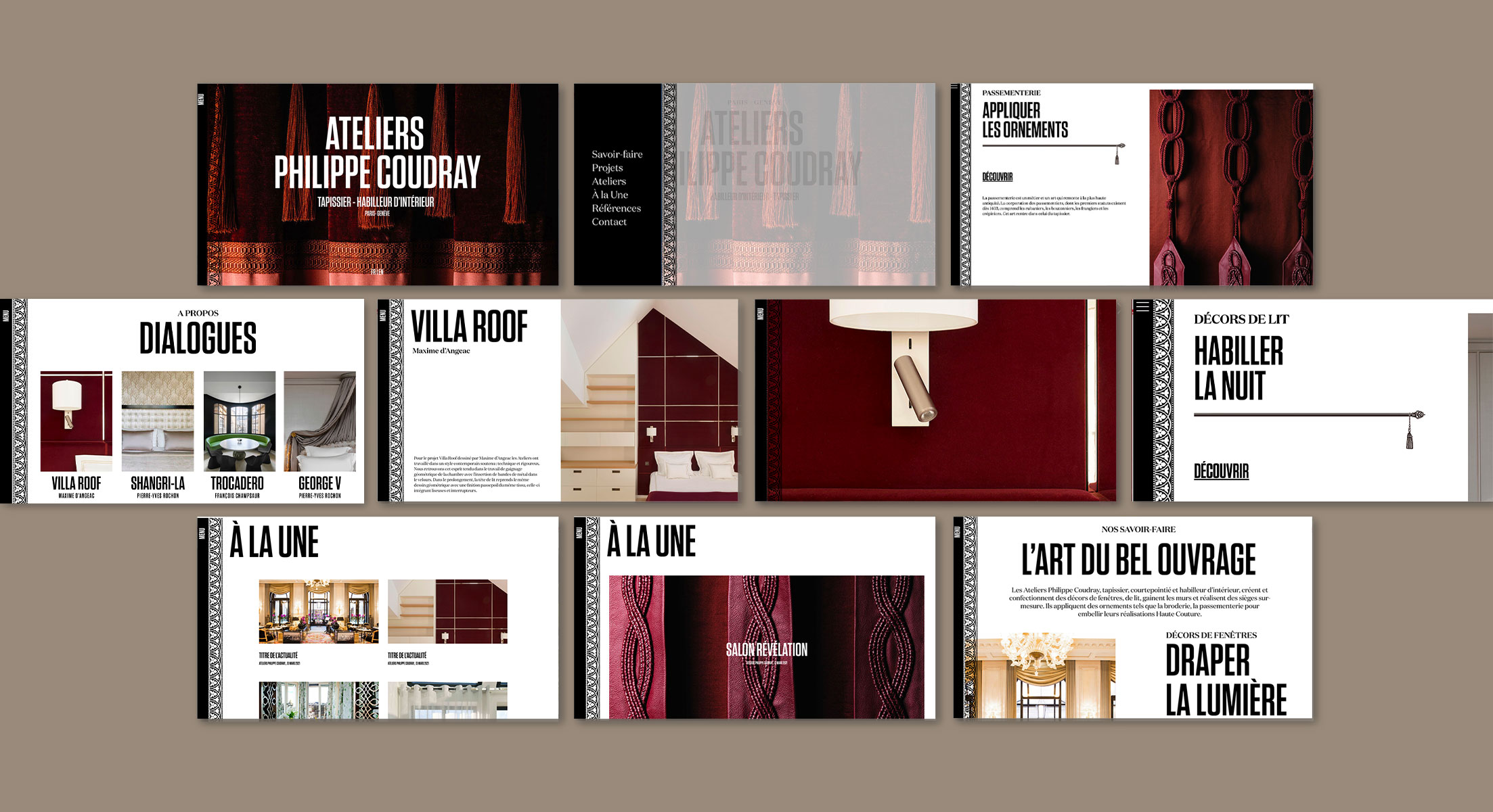
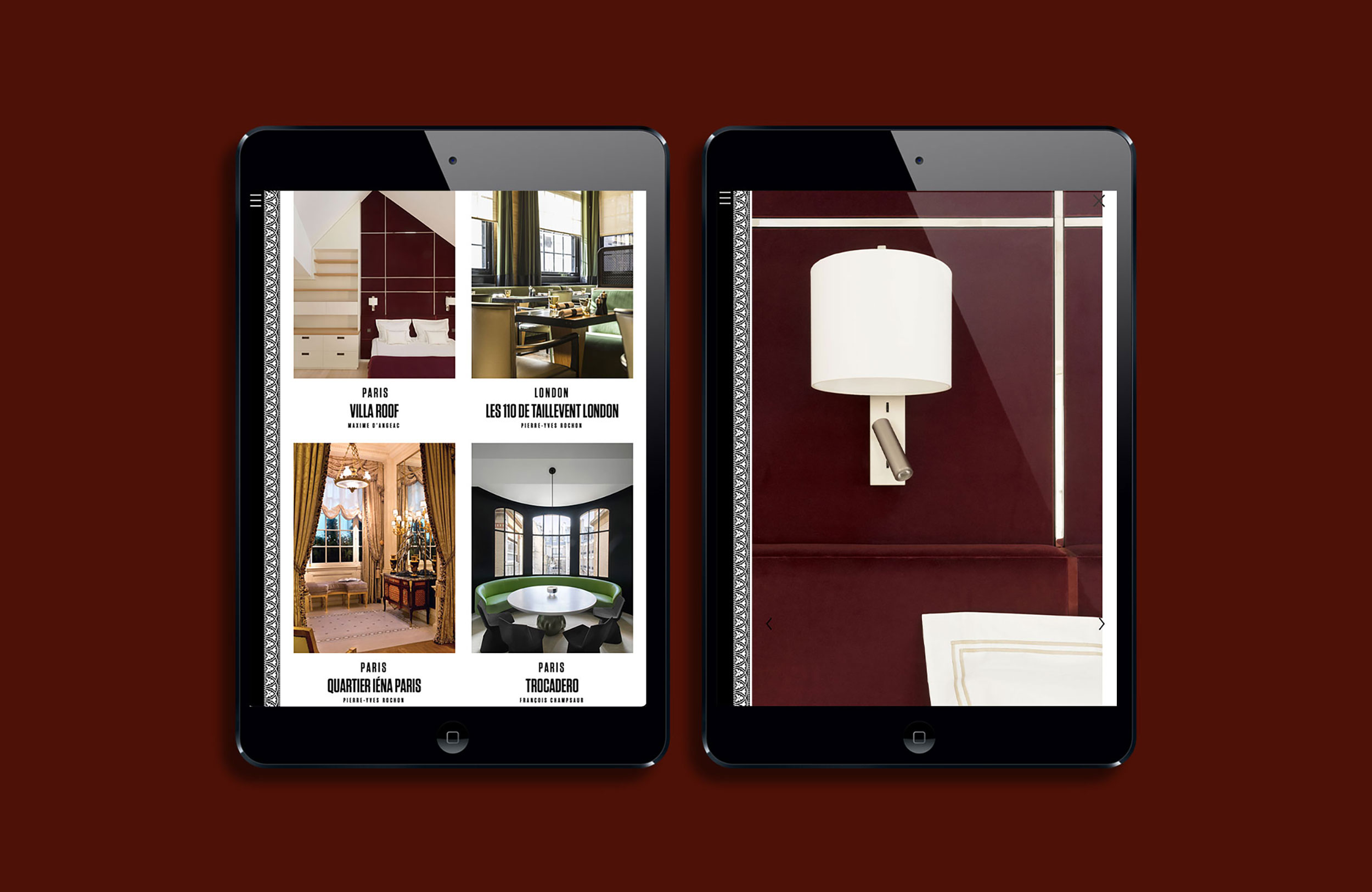
Frontline Studio showcases the best craftsmen in the world of decoration.  Tapestry workshops Philippe Coudray, a major player in the French interior scene, entrusted us with the creation of his website.

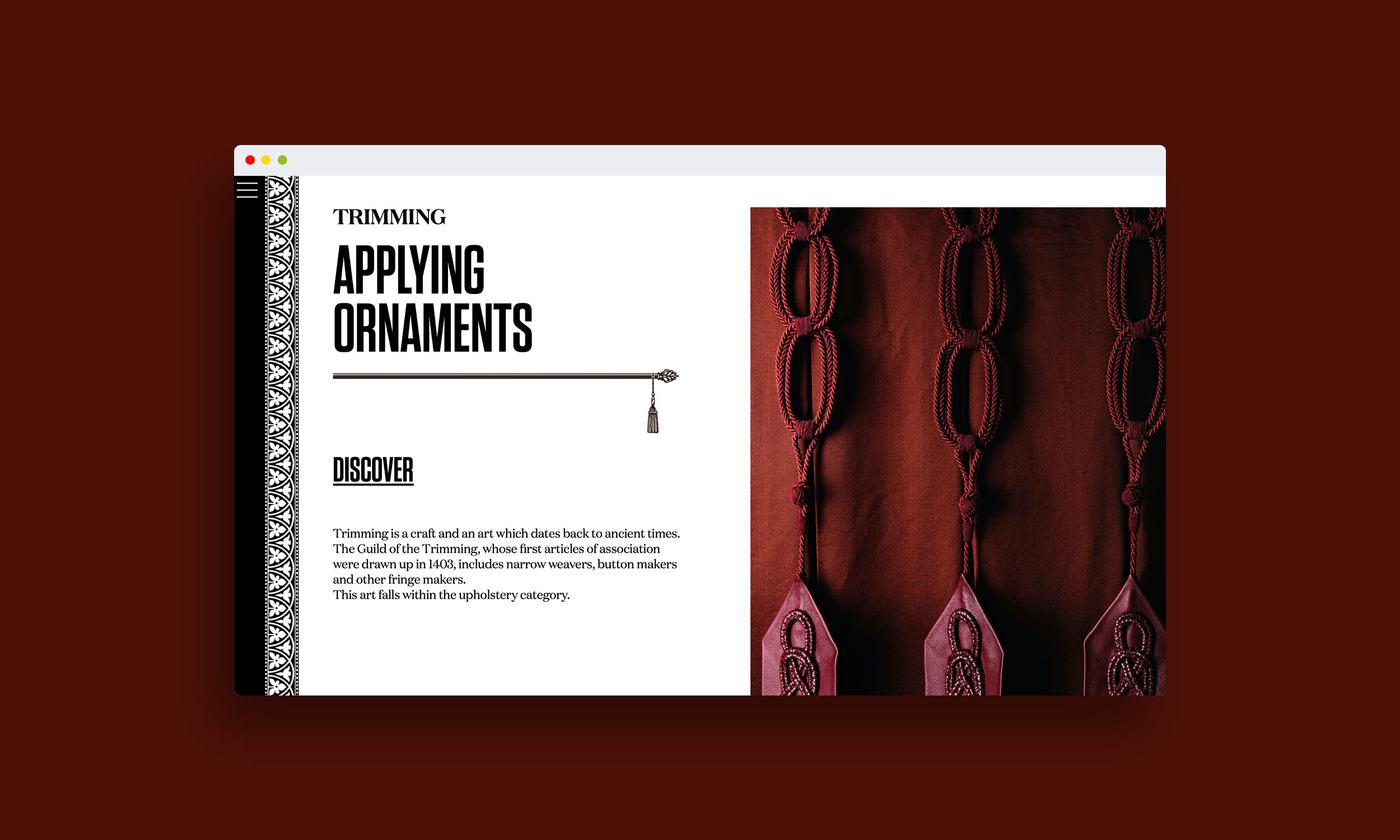
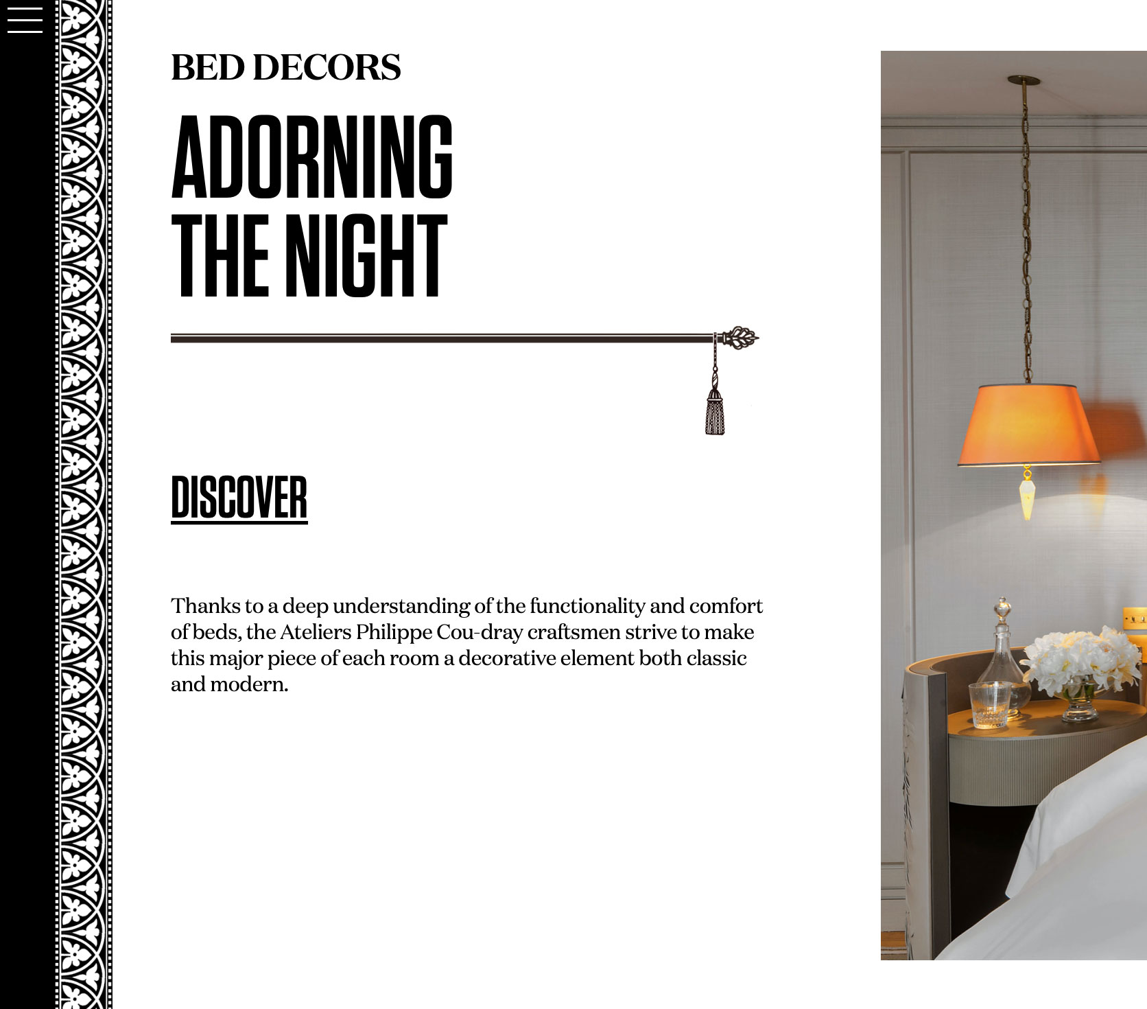
Philippe Coudray is a lover of beautiful fabrics and sophisticated classical tapestry techniques.  His colorful personality is translated with a contrasted graphic language, a strong brutalist typeface in a world of softness.

28-frontlinestudio-philippe-coudray-webdesign-french-artisan-branding-brand-content
1-frontlinestudio-philippe-coudray-webdesign-french-artisan-branding-brand-content
17-frontlinestudio-philippe-coudray-webdesign-french-artisan-branding-brand-content

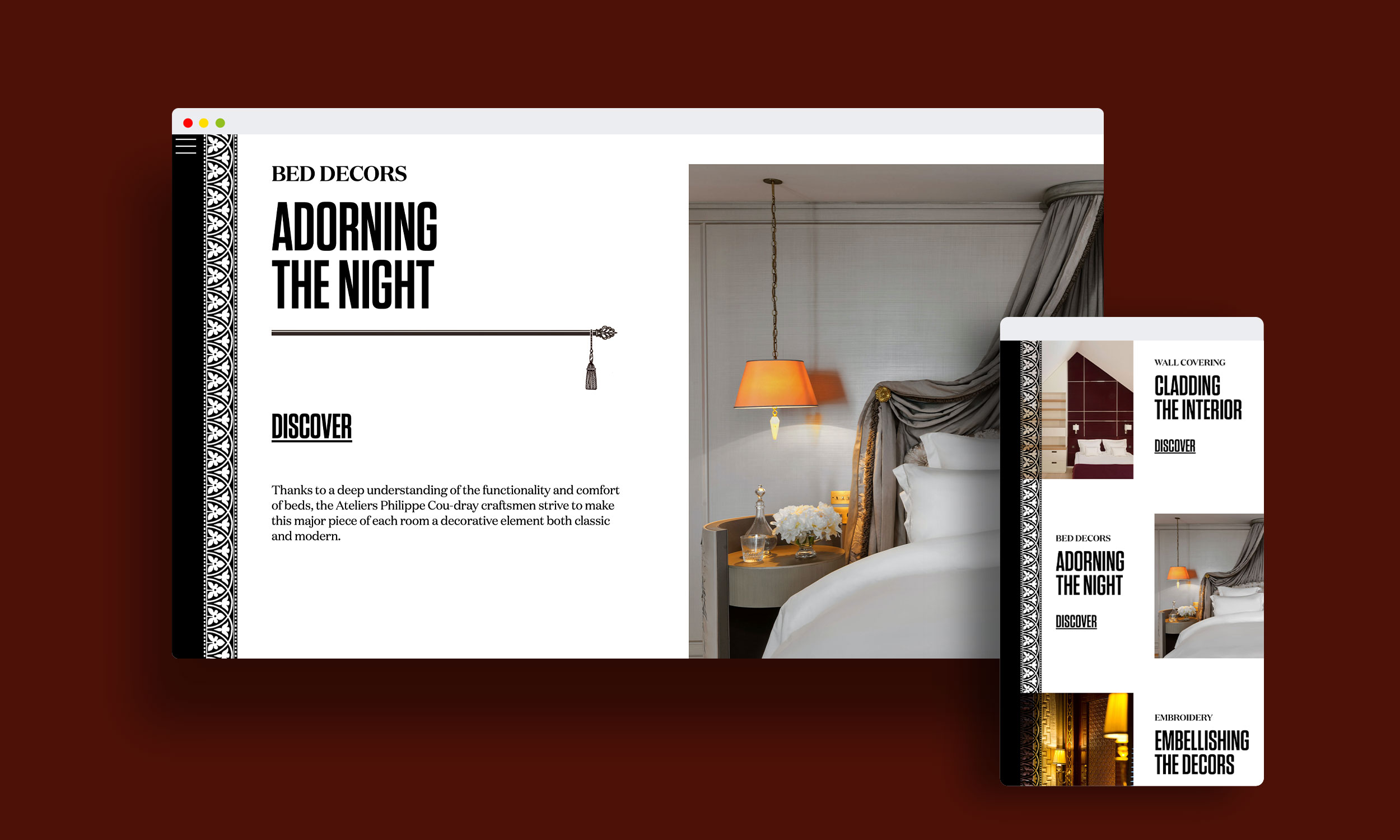
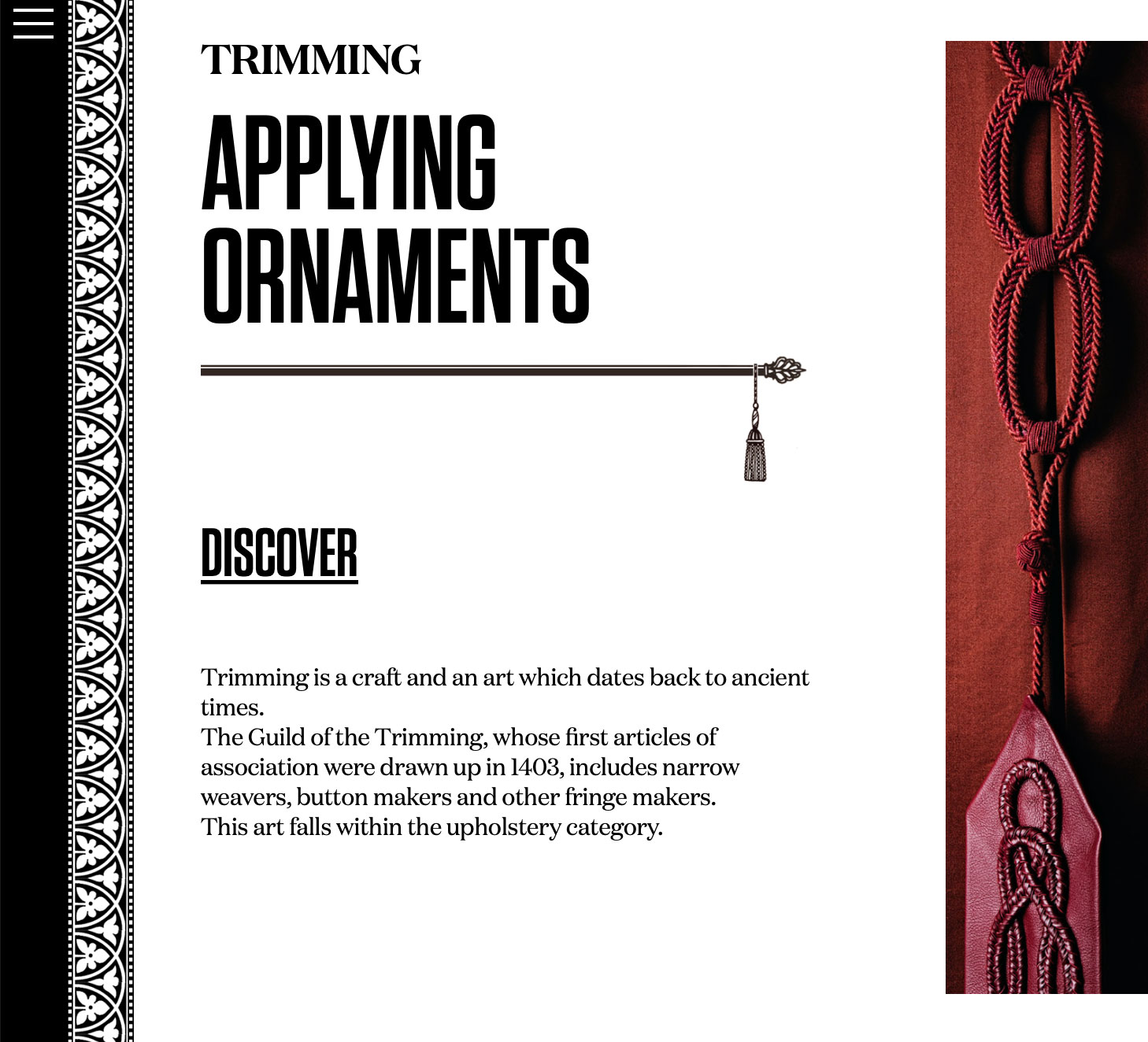
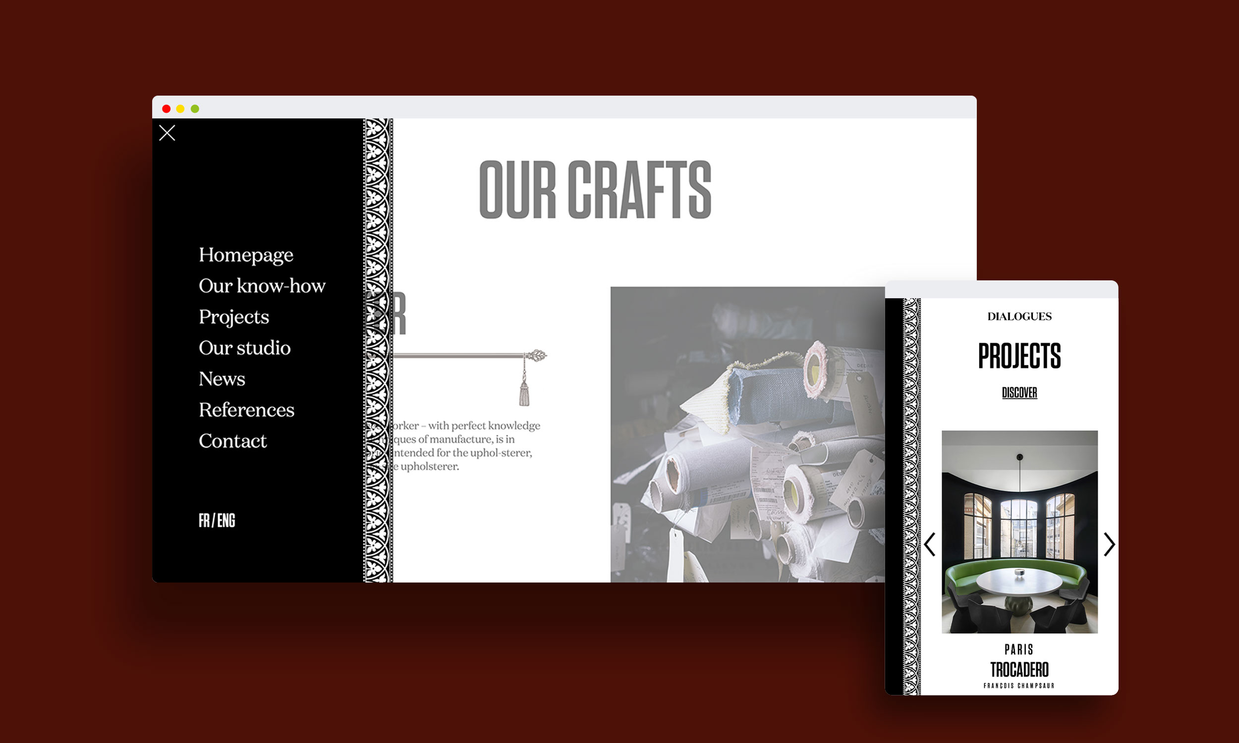
Like trimmings that would dress up a window decoration, a lace ribbon runs through the entire website. Rods with tiebacks punctuate the titles of the different sections.

42-frontlinestudio-philippe-coudray-webdesign-french-artisan-branding-brand-content
2-frontlinestudio-philippe-coudray-webdesign-french-artisan-branding-brand-content
18-frontlinestudio-philippe-coudray-webdesign-french-artisan-branding-brand-content

Baroque, bold, rock

5-frontlinestudio-philippe-coudray-webdesign-french-artisan-branding-brand-content

Throughout the website, we opposed to this baroque world, a strong and brutalist kind of typeface.  The font is imposing, thus creating a beautiful dynamic as well as a spectacular visual effect.

12-frontlinestudio-philippe-coudray-webdesign-french-artisan-branding-brand-content